
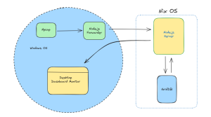


はじめに
パート1のブログでは、GridDBのPythonスクリプトを実装して、Twitterデータの保存と取得を行いました。今回のブログでは引き続き、感情分析と感情データの可視化を行います。各ツイートの感情値を計算し、感情値を保存し、人気ファッションブランドに役立つ洞察を得るためにそれらを視覚化します。さらに、階層クラスターなどのデータサイエンス・アルゴリズムを実装し、デンドログラムを用いて可視化します。最終的には、python folium ライブラリを使用して、ポジティブなツイートとネガティブなツイートを地理的に可視化し、ファッションブランドが特定の地域で効率的に市場成長するために役立てることを目的とします。
前提条件
TextblobなどのPython3ライブラリを使用して、各ツイートテキストの極性や主観性の定量的な値を算出する予定です。また、感情を可視化するためのチャートツールとして、matplotlibとfoliumを使用します。また、scipyライブラリを使用して、感情データセットの階層的クラスタリングを行います。
データ構造スキーマ
| Field Name | Data Type(GridDB) | Notes |
|---|---|---|
| Serial No | INTEGER | |
| Screen Name | STRING | Twitter Author Name |
| Twitter ID | STRING | Twitter handle |
| Tweet | STRING | Tweet text |
| Date | STRING |
ブログのパート1では、Twitterのデータを保存・取得するためにGridDBコンテナを実装しました。取得したツイートデータは、以下のようにデータフレーム変数に格納されます。
# Define the container names
tweet_dataaset_container = excel_sheet_name
# Get the containers
tweet_data = gridstore.get_container(tweet_dataaset_container)

# Fetch all rows - tweet_container
query = tweet_data.query("select *")
rs = query.fetch(False)
print(f"{tweet_dataaset_container} Data")

# Iterate and create a list
retrieved_data = []
while rs.has_next():
   data = rs.next()
   retrieved_data.append(data)

print(retrieved_data)

# Convert the list to a pandas data frame
tweet_dataframe = pd.DataFrame(retrieved_data,
                                 columns=['sno', 'twitter_name', 'twitter_id', 'tweet', 'date'])

# Get the data frame details
print(tweet_dataframe)
tweet_dataframe.info()
今後も続けて、まずセンチメントスコアを求め、その後でデータを可視化してセンチメント分析を行います。
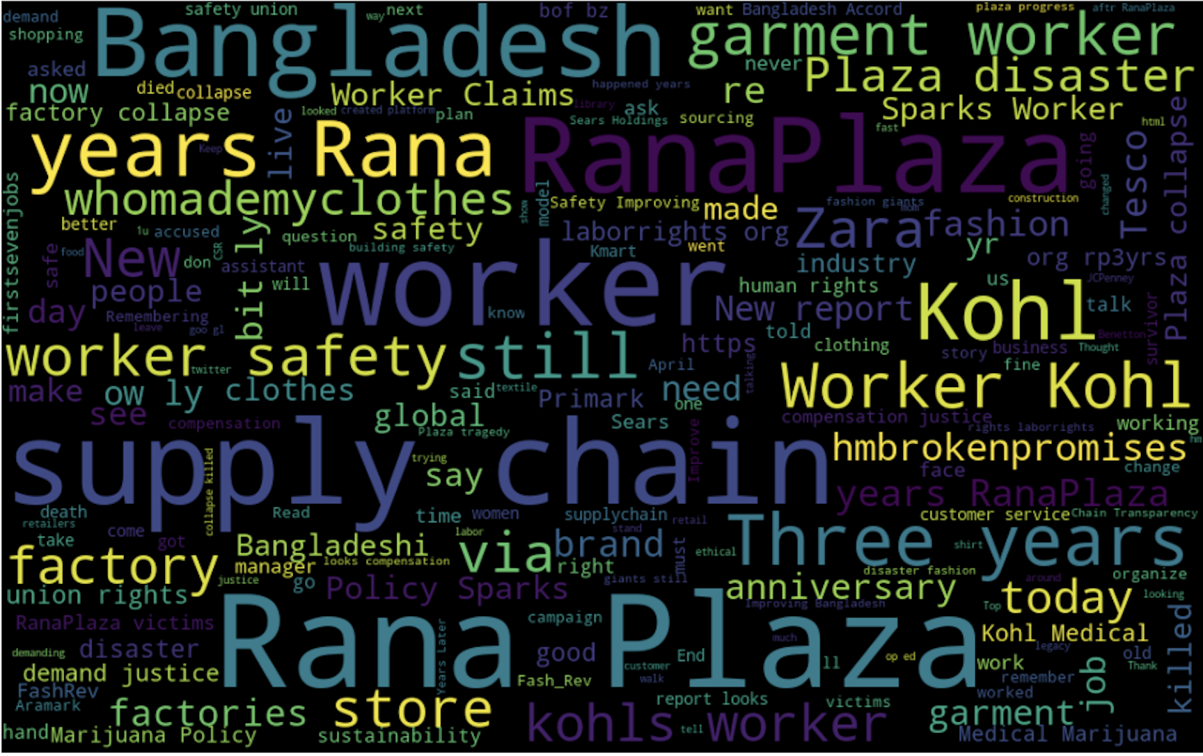
ツイートデータをWordCloudsで表示する
ファッションブランドのツイートマイニングでよく使われるキーワードの概要を把握するために、データセット全体にワードクラウドを実装します。
from wordcloud import WordCloud, STOPWORDS
import matplotlib.pyplot as plt
stopwords = set(STOPWORDS)

def show_wordcloud(data, title = None):
    wordcloud = WordCloud(
        background_color='white',
        stopwords=stopwords,
        max_words=200,
        max_font_size=40,
        scale=3,
        random_state=1 # chosen at random by flipping a coin; it was heads
    ).generate(str(data))

    fig = plt.figure(1, figsize=(12, 12))
    plt.axis('off')
    if title:
        fig.suptitle(title, fontsize=20)
        fig.subplots_adjust(top=2.3)

    plt.imshow(wordcloud)
    plt.show()

show_wordcloud(tweet_dataframe)
データセット全体に相当するワードクラウドには、「Worker Safety」「Supply Chain Disaster」「Bangladeshi Worker」などの重要なキーワードが含まれています。
ツイートデータセットの感情値を算出する
ツイートの極性と主観性の値は、記載されているツイートの個々の語彙に依存します。最終的な感情スコアは、ツイートに含まれるすべての語彙の感情値の合計となります。Textblobは、上記のようなロジックで動作し、ツイートの感情値を数値で返すPythonライブラリです。それでは、textblobを使って、各ツイートを繰り返し検索して、感情値を計算してみましょう。
from textblob import TextBlob  # For getting the quantitative value for the polarity and subjectivity

import re  # For the calculation of regular expressions

# a function to clean the tweets using regualr expression
def clean_tweet(tweet):
    '''
    Utility function to clean the text in a tweet by removing
    links and special characters using regex.
    '''
    return ' '.join(re.sub("(@[A-Za-z0-9]+)|([^0-9A-Za-z  \t])|(\w+:\/\/\S+)", " ", tweet).split())


for tweet in tweets:
        analysis = TextBlob(clean_tweet(tweet))
        pol = analysis.sentiment.polarity
        sub = analysis.subjectivity
        pol_round = '%.3f' % pol
        sub_round = '%.3f' % sub
上記のコードスニペットでは、ツイートをクリーニングした後に、極性の値と主観性の値を計算しています。主観性の値はツイートが与えられた文脈にどれだけ一致するかを定義しますが、極性の値は特定のツイートのスコアの最終的な感情とみなされることに注意してください。引き続き、matplotlibを使ってこれらの極性の値を可視化します。
Matplotlibを用いてセンチメントデータを可視化する
ツイートの感情値の数値が分かったので、2013年から2018年にかけての傾向を見つけるために、matplotlibを使ってプロットしてみましょう。
import matplotlib.pyplot as plt  # For plotting the graphs and charts

# plotting the line-chart for the average polarity with the supply-chain-incidents
plt.title("Average Sentiment for Fashion Supply Chain")
plt.xlabel("Year")
plt.ylabel("Average Yearly Sentiment Score")
plt.ylim(-0.3, 0.3)
plt.plot(list_sheetnames, average_polarity_sheets)
plt.show()
上のコードスニペットの折れ線グラフは、感情の値をそれぞれの年で表しています。
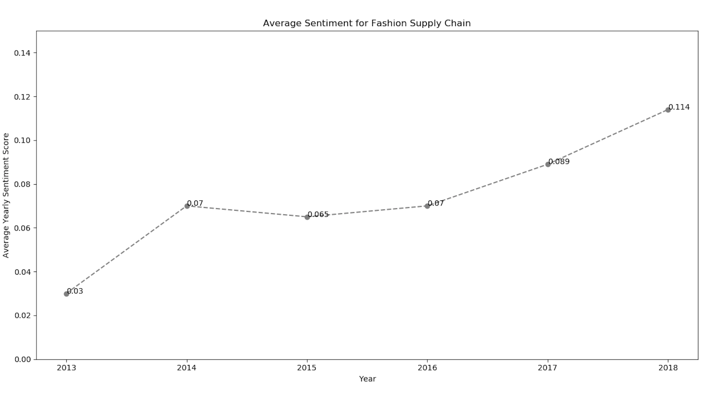
また、各ファッションブランドの感情値を視覚化するために、matplotlibライブラリを実装しました。上記のmatplotlib line-chartのコードスニペットを使用すると、ZARAやGapなどのブランドに対するポジティブな感情の傾向を得ることができました。
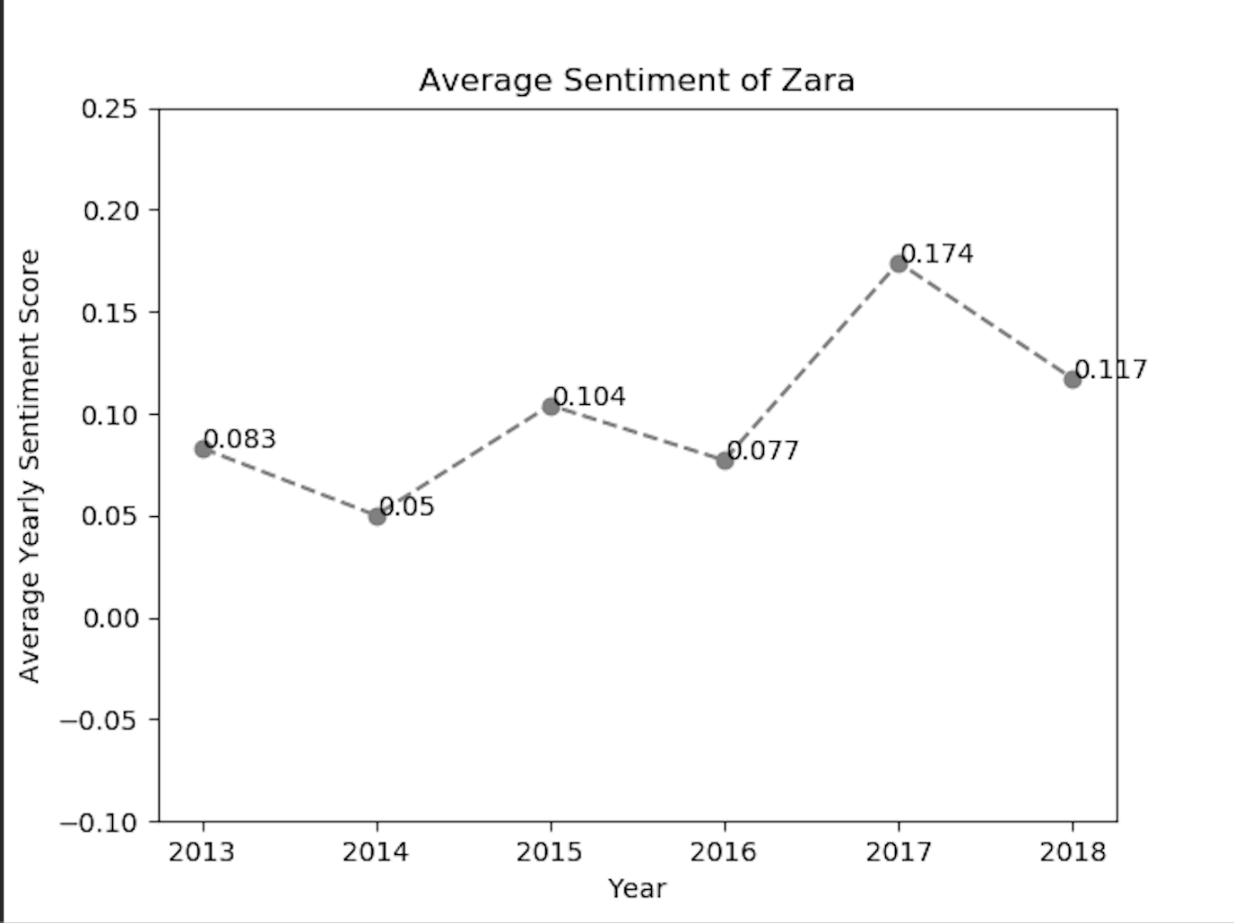
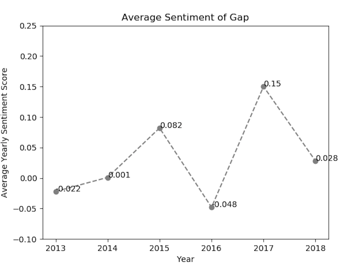
上記の感情ラインチャートから分析できるように、ファッションブランドのtwitter利用者の感情は、ある年にポジティブまたはネガティブに反応しています。
階層的クラスタリングとデンドログラム
センチメントデータからより多くの分析結果を得るために、センチメントデータの値に対して階層的なクラスタリングを行い、さらにそれぞれのデンドログラムをプロットすることができます。これは、データサイエンスの観点から、与えられたツイートのセンチメント値のクラスターを作成するのに役立ちます。まず、与えられたデータからデンドログラムを描くためのpython関数を定義しましょう。
from scipy.cluster.hierarchy import cophenet  # used in hierarchical clustering
from scipy.cluster.hierarchy import dendrogram, linkage  # used in making dendrograms
from scipy.spatial.distance import pdist  # calculating the correlative distance
from sklearn.cluster import MeanShift


def fancy_dendrogram(*args, **kwargs):
    max_d = kwargs.pop('max_d', None)
    if max_d and 'color_threshold' not in kwargs:
        kwargs['color_threshold'] = max_d
    annotate_above = kwargs.pop('annotate_above', 0)

    ddata = dendrogram(*args, **kwargs)

    if not kwargs.get('no_plot', False):
        for i, d, c in zip(ddata['icoord'], ddata['dcoord'], ddata['color_list']):
            x = 0.5 * sum(i[1:3])
            y = d[1]
            if y > annotate_above:
                plt.plot(x, y, 'o', c=c)
                plt.annotate("%.3g" % y, (x, y), xytext=(0, -5),
                             textcoords='offset points',
                             va='top', ha='center')
        if max_d:
            plt.axhline(y=max_d, c='k')
    return ddata
matplotlibを用いて階層型クラスタリングを可視化するためのpythonスクリプトを以下に示します。
 # performing heirarchical clustering on the each of the supply chain events
    X = array(get_polarity_subjectivity_list(polarity, subjectivity))
    ms = MeanShift()
    ms.fit(X)
    labels = ms.labels_
    cluster_centers = ms.cluster_centers_
    n_clusters_ = len(np.unique(labels))
    # now saving it in the "hierarchical_clustering_data.xls" file
    pol_x = (cluster_centers[0][0] + cluster_centers[1][
        0]) / 2  # applying the coordinate geometry centre of two coordinates for the first two cluster points
    sub_y = (cluster_centers[0][1] + cluster_centers[1][1]) / 2
    ws2.write(i + 1, 0, i + 1)
    ws2.write(i + 1, 1, list_sheetnames[i])
    ws2.write(i + 1, 2, pol_x)
    ws2.write(i + 1, 3, sub_y)
    ws2.write(i + 1, 4, n_clusters_)
    # writing all the cluster points
    result_point = ""
    for k in range(n_clusters_):
        result_point = result_point + " ( " + str(round(cluster_centers[k][0], 3)) + " , " + str(
            round(cluster_centers[k][1], 3)) + " )"

    ws2.write(i + 1, 5, result_point)
    # now plotting the hierarchical clustering with the cluster points
    colors = 10 * ['r.', 'g.', 'b.', 'c.', 'k.', 'y.', 'm.']
    for j in range(len(X)):
        plt.plot(X[j][0], X[j][1], colors[labels[j]], markersize=10)

    plt.scatter(cluster_centers[:, 0], cluster_centers[:, 1], marker='x', color='k', s=150, linewidths=5, zorder=10)
    plt.title(list_sheetnames[i])
    plt.xlabel("Polarity---------------------->")
    plt.ylabel("Subjectivity------------------>")
    plt.show()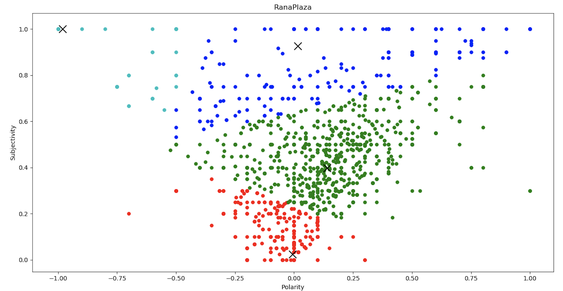
クラスタリングチャートから、感情値は、センチメントの極性と主観性の値に応じて、4つのクラスターに分類できると結論付けることができます。 4つのクラスターとその平均距離が分かったので、これをデンドログラム関数に入力して同じものをプロットします。
 Y = pdist(score)
    Z = linkage(Y, 'ward')
    c, coph_dists = cophenet(Z, Y)  # c contains the coorelative distance for the clusters
    # calculating the full dednrogram
    plt.figure(figsize=(25, 10))
    plt.title("Dendrogram : " + list_sheetnames[i])
    plt.xlabel('sample index')
    plt.ylabel('distance')
    fancy_dendrogram(
        Z,
        truncate_mode='lastp',
        p=12,
        leaf_rotation=90.,
        leaf_font_size=12.,
        show_contracted=True,
        # annotate_above=10,
        max_d=1.5
    )
    plt.show()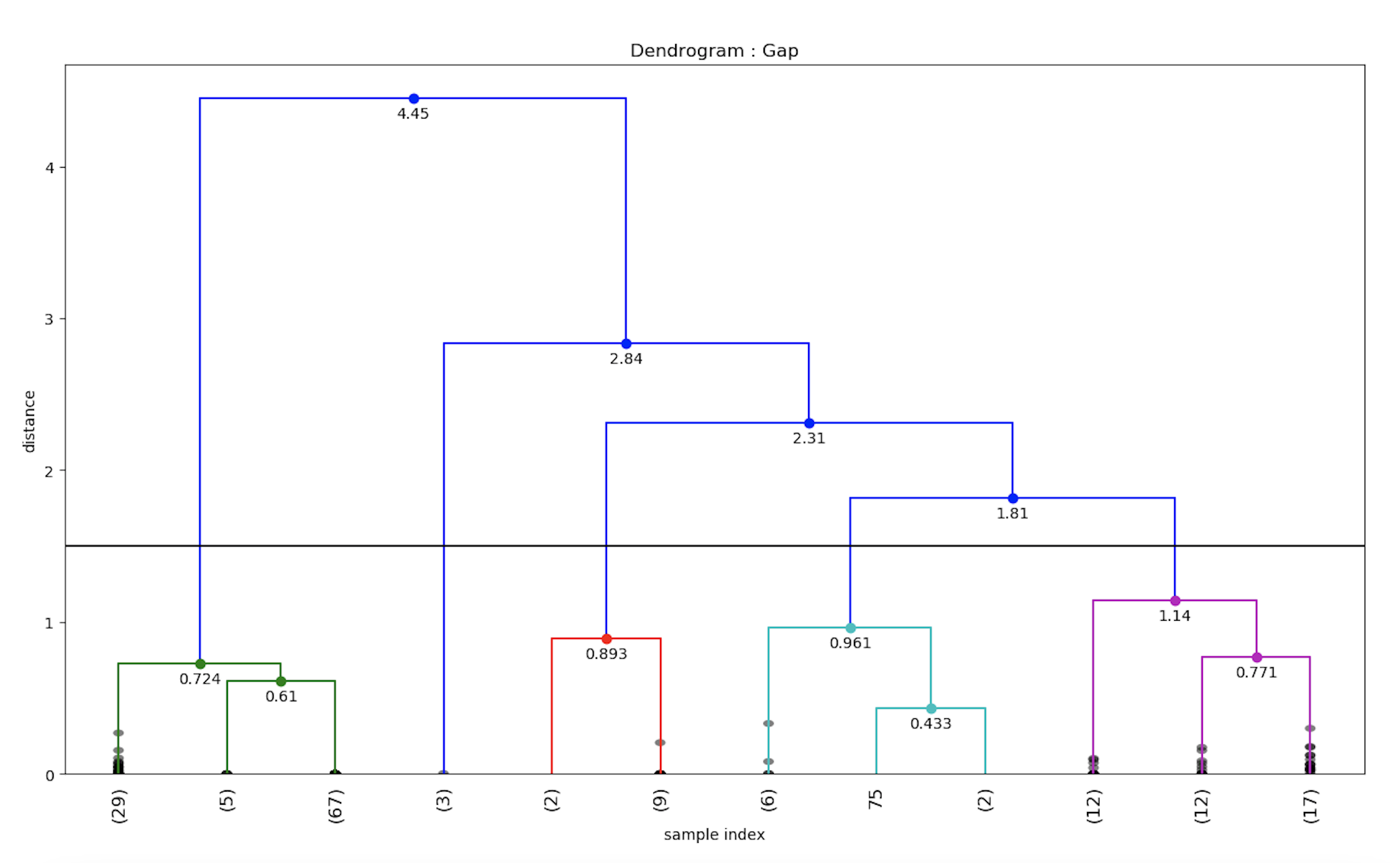
同様に、ZARAブランドの感情値のデンドログラムも計算することができます。

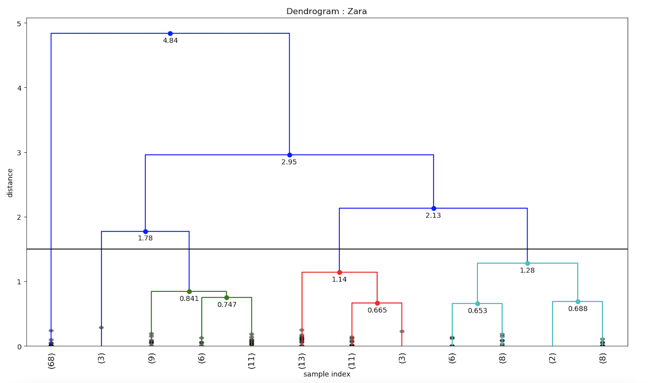
そこで、我々はtwitterのデータセットに一般的な階層型クラスタリングを実装し、デンドログラムを用いて可視化しました。
Twitter感情データを地理的に可視化する
感情データを地理的に可視化するために、pythonのfoliumライブラリを使って、地理的座標と対応する感情値をプロットします。
import folium  # plotting the coordinates on the map

# now making a data-frame with markers to show on the map
    data = pd.DataFrame({
        'lat': latitudes,
        'lon': longitudes,
        'name': places,
        'sentiment': sentiments,
    })
    # now make an empty map
    m = folium.Map(location=[20, 0], zoom_start=2)
    # popup will be used when a particular marker will be clicked,
    # it will display the sentiment value along with the corresponding place

    for j in range(0, len(data)):
        try:
            if data.iloc[j]['sentiment'] > 0:
                folium.Marker([data.iloc[j]['lat'], data.iloc[j]['lon']],
                              popup="Sentiment :  " + str(round(data.iloc[j]['sentiment'], 3)) + " \nLocation :" + str
                              (data.iloc[j]['name']),
                              icon=folium.Icon(color='green')).add_to(m)
            elif data.iloc[j]['sentiment'] < 0:
                folium.Marker([data.iloc[j]['lat'], data.iloc[j]['lon']],
                              popup="Sentiment :  " + str(round(data.iloc[j]['sentiment'], 3)) + " \nLocation: " + str
                              (data.iloc[j]['name']),
                              icon=folium.Icon(color='red')).add_to(m)
            else:
                folium.Marker([data.iloc[j]['lat'], data.iloc[j]['lon']],
                              popup="Sentiment :  " + str(round(data.iloc[j]['sentiment'], 3)) + " \nLocation : " + str
                              (data.iloc[j]['name']),
                              icon=folium.Icon(color='blue')).add_to(m)
        except:
            # print("error"+str(j))
            pass
    m.save(list_sheetnames_geo[i] + "_geo.html")
上記のpython foliumスクリプトを実行すると、地理的な地図がhtmlファイルに格納されます。これで、ファッションブランドごとの地理的な可視化マップを作成することができました。
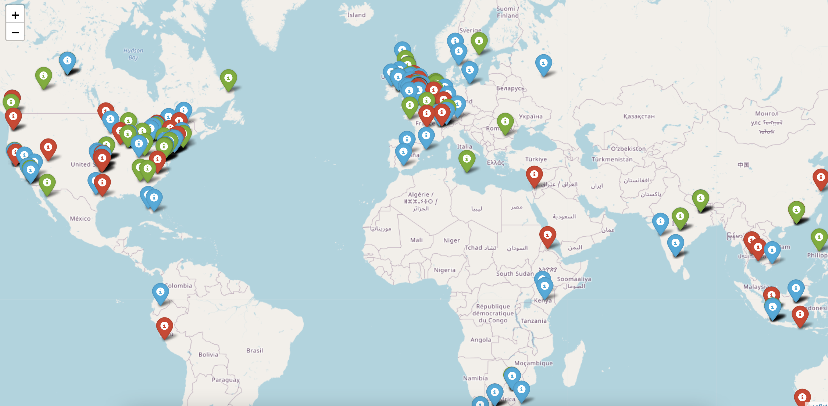
ラナプラザの事故への対応について、世界中の感情の分布は次のようになっています。赤色のマーカーは否定的な感情を表し、緑色のマーカーは肯定的な感情を表していることがわかります。特定のエリアにズームインすると、感情値の詳細な分布を見ることができます。例えば、英国のファッションブランドの詳細な感情の分布は次のようになります。
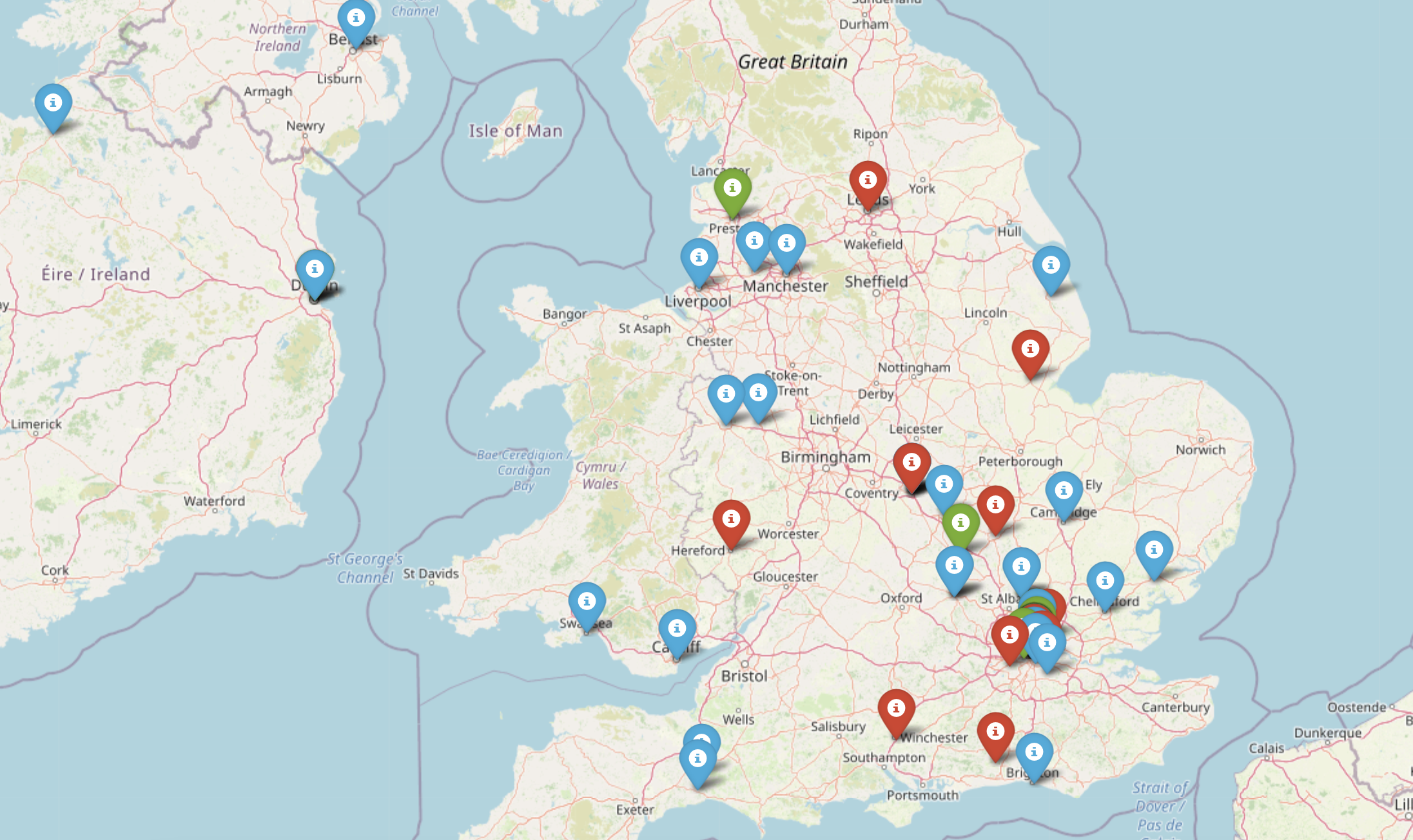
地理的に分散していることで、ファッションブランドは、顧客が製品やサービスに不満を持っている弱点分野に焦点を当てることができます。
まとめ
Twitterのデータセットで感情分析を行い、折れ線グラフ、ワードクラウド、デンドログラムを使って感情を可視化し、地理的な地図にプロットしました。このブログのパート1では、GridDBを使ってtwitterデータを取得する方法を説明しました。クラウド・トリガーを導入することで、感情分析を自動化し、感情に対する洞察を様々なファッション・ブランドにエクスポートして、より良いマーケティング活動に役立てることができます。
ソースコード Github
ブログの内容について疑問や質問がある場合は Q&A サイトである Stack Overflow に質問を投稿しましょう。 GridDB 開発者やエンジニアから速やかな回答が得られるようにするためにも "griddb" タグをつけることをお忘れなく。 https://stackoverflow.com/questions/ask?tags=griddb