
消費者行動を理解することは、マーケティング担当者が消費者の購買意欲を理解する上で重要です。消費者はそれぞれ独自の購買パターンを持っています。購買パターンを認識し、分析し、測定することで、企業はターゲットとする消費者をよりよく理解し、リーチを拡大できる可能性があるのです。
このブログで紹介しているソースコードのリポジトリはこちらです。 https://github.com/griddbnet/Blogs/tree/exploring_consumer_purchases
このブログの目的は、Google Merchandise Storeの顧客の購買行動をGridDBの力を使って分析することです。分析結果は、Googleアナリティクスデータの上にデータ分析を利用することを選択した企業にとって、より実行可能な業務改革やマーケティング予算の有効活用につながるかもしれません。
チュートリアルの概要は以下の通りです。
- データセット概要
- 必要なライブラリのインポート
- データセットの読み込み
- データのクリーニングと前処理
- データの可視化による分析
- まとめ
前提条件と環境設定
このチュートリアルは、Windows オペレーティングシステム上の Anaconda Navigator (Python バージョン – 3.8.3) で実行されます。チュートリアルを続ける前に、以下のパッケージがインストールされている必要があります。
- Pandas
- NumPy
- plotly
- Matplotlib
- Seaborn
- griddb_python
- scipy
- json
- squarify
- random
これらのパッケージは Conda の仮想環境に conda install package-name を使ってインストールすることができます。ターミナルやコマンドプロンプトから直接Pythonを使っている場合は、 pip install package-name でインストールできます。
GridDBのインストール
このチュートリアルでは、データセットをロードする際に、GridDB を使用する方法と、Pandas を使用する方法の 2 種類を取り上げます。Pythonを使用してGridDBにアクセスするためには、以下のパッケージも予めインストールしておく必要があります。
- GridDB Cクライアント
- SWIG (Simplified Wrapper and Interface Generator)
- GridDB Pythonクライアント
1. データセット概要
データセットにはGStore(Google swagオンラインストア)への訪問に関する情報が含まれており、各行は一意の訪問であり、各ユーザーは一意の「fullVisitorId」を持っています。
1) fullVisitorId– Google Merchandise Storeの各ユーザーに一意な識別子。
2) channelGrouping – ユーザーがストアにアクセスした経路。
3) date – ユーザーがストアにアクセスした日付。
4) device – ストアにアクセスするために使用されるデバイスの仕様です。
5) geoNetwork – ユーザーの地理に関する情報が記載されています。
6) socialEngagementType – エンゲージメントのタイプ、「ソーシャルに参加している」または「ソーシャルに参加していない」のどちらか。
7) totals – このセクションには、セッション全体の集計値が含まれます。
8) trafficSource – このセクションは、セッションの発信元であるトラフィックソースに関する情報を含んでいます。
9) visitId – このセッションの識別子。これは、通常_utmbクッキーとして保存される値の一部です。これは、ユーザーに対してのみ一意である。完全に一意なIDのためには、fullVisitorIdとvisitIdを組み合わせて使用する必要があります。
10) visitNumber – このユーザーのセッション番号です。これが最初のセッションである場合、これは1に設定されます。
11) visitStartTime – タイムスタンプ(POSIX時間として表現される)。
12) hits – この行とネストされたフィールドは、あらゆる種類のヒットについて入力されます。すべてのページ訪問の記録を提供します。
13) customDimensions – このセクションには、セッションに設定されたユーザ・レベルまたはセッション・レベルのカスタム・ディメンションが含まれま す。このフィールドは繰り返し使用され、設定された各ディメンジョンのエントリがあります。
14) totals – このカラムのセットには、主にハイレベルな集計データが含まれます。
https://www.kaggle.com/competitions/ga-customer-revenue-prediction/data?select=train.csv
2. 必要なライブラリのインポート
import griddb_python as griddb

import gc
import numpy as np
import pandas as pd
from pandas.io.json import json_normalize
from scipy.stats import norm
import json
import datetime
import random

import squarify
import seaborn as sns
import matplotlib.pyplot as plt
from plotly.offline import init_notebook_mode, iplot
import plotly.graph_objs as go
from plotly import tools

import warnings
warnings.filterwarnings('ignore')
%matplotlib inline
3. データセットの読み込み
続けて、データセットをノートブックにロードしてみましょう。
3.a GridDBを利用する
東芝GridDB™は、IoTやビッグデータに最適な高スケーラブルNoSQLデータベースです。GridDBの理念の根幹は、IoTに最適化された汎用性の高いデータストアの提供、高いスケーラビリティ、高性能なチューニング、高い信頼性の確保にあります。
大量のデータを保存する場合、CSVファイルでは面倒なことがあります。GridDBは、オープンソースでスケーラブルなデータベースとして、完璧な代替手段となっています。GridDBは、スケーラブルでインメモリなNo SQLデータベースで、大量のデータを簡単に保存することができます。GridDBを初めて使う場合は、GridDBへの読み書きのチュートリアルが役に立ちます。
すでにデータベースのセットアップが完了していると仮定して、今度はデータセットをロードするためのSQLクエリをpythonで書いてみましょう。
factory = griddb.StoreFactory.get_instance()

Initialize the GridDB container (enter your database credentials)
try:
    gridstore = factory.get_store(host=host_name, port=your_port,
            cluster_name=cluster_name, username=admin,
            password=admin)

    info = griddb.ContainerInfo("customer_data",
                    [["channelGrouping", griddb.Type.STRING],["geoNetwork", griddb.Type.STRING],["device", griddb.Type.STRING],
                     ["date", griddb.Type.TIMESTAMP],["sessionId", griddb.Type.STRING],["socialEngagementType", griddb.Type.STRING],
                     ["totals", griddb.Type.STRING],["trafficSource", griddb.Type.STRING],["visitStartTime", griddb.Type.TIMESTAMP],
                     ["fullVisitorId", griddb.Type.INTEGER],["visitNumber", griddb.Type.INTEGER],["visitId", griddb.Type.INTEGER],
                    griddb.ContainerType.COLLECTION, True)
    cont = gridstore.put_container(info)
    data = pd.read_csv("False.csv")
    #Add data
    for i in range(len(data)):
        ret = cont.put(data.iloc[i, :])
        print("Data added successfully")
Data added successfully
pandasライブラリが提供するread_sql_query関数は、取得したデータをpandasのデータフレームに変換し、ユーザーが作業しやすいようにします。
sql_statement = ('SELECT * FROM customer_data.csv')
df = pd.read_sql_query(sql_statement, cont)
変数 cont には、データが格納されているコンテナ情報が格納されていることに注意してください。credit_card_dataset をコンテナの名前に置き換えてください。詳細は、チュートリアルGridDBへの読み書きを参照してください。
IoTやビッグデータのユースケースに関して言えば、GridDBはリレーショナルやNoSQLの領域の他のデータベースの中で明らかに際立っています。全体として、GridDBは高可用性とデータ保持を必要とするミッションクリティカルなアプリケーションのために、複数の信頼性機能を提供しています。
3.b pandasのread_csvを使用する
また、Pandasの read_csv 関数を使用してデータを読み込むこともできます。どちらの方法を使っても、データはpandasのdataframeの形で読み込まれるので、上記のどちらの方法も同じ出力になります。
df = pd.read_csv("customer_data.csv")df.head()| channelGrouping | date | device | fullVisitorId | geoNetwork | sessionId | socialEngagementType | totals | trafficSource | visitId | visitNumber | visitStartTime | |
|---|---|---|---|---|---|---|---|---|---|---|---|---|
| 0 | Organic Search | 20160902 | {“browser”: “Chrome”, “browserVersion”: “not a… | 1131660440785968503 | {“continent”: “Asia”, “subContinent”: “Western… | 1131660440785968503_1472830385 | Not Socially Engaged | {“visits”: “1”, “hits”: “1”, “pageviews”: “1”,… | {“campaign”: “(not set)”, “source”: “google”, … | 1472830385 | 1 | 1472830385 |
| 1 | Organic Search | 20160902 | {“browser”: “Firefox”, “browserVersion”: “not … | 377306020877927890 | {“continent”: “Oceania”, “subContinent”: “Aust… | 377306020877927890_1472880147 | Not Socially Engaged | {“visits”: “1”, “hits”: “1”, “pageviews”: “1”,… | {“campaign”: “(not set)”, “source”: “google”, … | 1472880147 | 1 | 1472880147 |
| 2 | Organic Search | 20160902 | {“browser”: “Chrome”, “browserVersion”: “not a… | 3895546263509774583 | {“continent”: “Europe”, “subContinent”: “South… | 3895546263509774583_1472865386 | Not Socially Engaged | {“visits”: “1”, “hits”: “1”, “pageviews”: “1”,… | {“campaign”: “(not set)”, “source”: “google”, … | 1472865386 | 1 | 1472865386 |
| 3 | Organic Search | 20160902 | {“browser”: “UC Browser”, “browserVersion”: “n… | 4763447161404445595 | {“continent”: “Asia”, “subContinent”: “Southea… | 4763447161404445595_1472881213 | Not Socially Engaged | {“visits”: “1”, “hits”: “1”, “pageviews”: “1”,… | {“campaign”: “(not set)”, “source”: “google”, … | 1472881213 | 1 | 1472881213 |
| 4 | Organic Search | 20160902 | {“browser”: “Chrome”, “browserVersion”: “not a… | 27294437909732085 | {“continent”: “Europe”, “subContinent”: “North… | 27294437909732085_1472822600 | Not Socially Engaged | {“visits”: “1”, “hits”: “1”, “pageviews”: “1”,… | {“campaign”: “(not set)”, “source”: “google”, … | 1472822600 | 2 | 1472822600 |
4. データクリーニングと前処理
元のカラムは12個ですが、そのうち4個は変換可能なjsonオブジェクトを持っています。
device: 16個の新しいカラム、geoNetwork: 11個の新しいカラム、totals: 6個の新しいカラム、trafficSource: 14個の新しいカラム
def load_df(nrows=None):

    Columns = ['device', 'geoNetwork', 'totals', 'trafficSource']
    df = pd.read_csv('customer_data.csv',
                     converters={column: json.loads for column in Columns},
                     dtype={'fullVisitorId': 'str'}, nrows=nrows)

    for column in Columns:
        column_as_df = json_normalize(df[column])
        column_as_df.columns = [f"{column}_{subcolumn}" for subcolumn in column_as_df.columns]
        df = df.drop(column, axis=1).merge(column_as_df, right_index=True, left_index=True)
    return df
2つのデータセットを1つにまとめ、テキストとタイトルを1つのカラムに追加します。
df = load_df()
df.head()| channelGrouping | date | fullVisitorId | sessionId | socialEngagementType | visitId | visitNumber | visitStartTime | device_browser | device_browserVersion | … | trafficSource_adwordsClickInfo.criteriaParameters | trafficSource_isTrueDirect | trafficSource_referralPath | trafficSource_adwordsClickInfo.page | trafficSource_adwordsClickInfo.slot | trafficSource_adwordsClickInfo.gclId | trafficSource_adwordsClickInfo.adNetworkType | trafficSource_adwordsClickInfo.isVideoAd | trafficSource_adContent | trafficSource_campaignCode | |
|---|---|---|---|---|---|---|---|---|---|---|---|---|---|---|---|---|---|---|---|---|---|
| 0 | Organic Search | 20160902 | 1131660440785968503 | 1131660440785968503_1472830385 | Not Socially Engaged | 1472830385 | 1 | 1472830385 | Chrome | not available in demo dataset | … | not available in demo dataset | NaN | NaN | NaN | NaN | NaN | NaN | NaN | NaN | NaN |
| 1 | Organic Search | 20160902 | 377306020877927890 | 377306020877927890_1472880147 | Not Socially Engaged | 1472880147 | 1 | 1472880147 | Firefox | not available in demo dataset | … | not available in demo dataset | NaN | NaN | NaN | NaN | NaN | NaN | NaN | NaN | NaN |
| 2 | Organic Search | 20160902 | 3895546263509774583 | 3895546263509774583_1472865386 | Not Socially Engaged | 1472865386 | 1 | 1472865386 | Chrome | not available in demo dataset | … | not available in demo dataset | NaN | NaN | NaN | NaN | NaN | NaN | NaN | NaN | NaN |
| 3 | Organic Search | 20160902 | 4763447161404445595 | 4763447161404445595_1472881213 | Not Socially Engaged | 1472881213 | 1 | 1472881213 | UC Browser | not available in demo dataset | … | not available in demo dataset | NaN | NaN | NaN | NaN | NaN | NaN | NaN | NaN | NaN |
| 4 | Organic Search | 20160902 | 27294437909732085 | 27294437909732085_1472822600 | Not Socially Engaged | 1472822600 | 2 | 1472822600 | Chrome | not available in demo dataset | … | not available in demo dataset | True | NaN | NaN | NaN | NaN | NaN | NaN | NaN | NaN |
5 rows × 55 columns
# converting date column into a proper format
def convert_to_datetime(frame):
    frame['date'] = frame['date'].astype(str)
    frame['date'] = frame['date'].apply(lambda x : x[:4] + "-" + x[4:6] + "-" + x[6:])
    frame['date'] = pd.to_datetime(frame['date'])
    return frame

df = convert_to_datetime(df)
#converting totals_transactionRevenue into int64 datatype and filling missing values as 0
df['totals_transactionRevenue'] = df['totals_transactionRevenue'].fillna(0).astype('int64')5. データを可視化して分析する
データを分析するために、plotly, matplotlib, seabornなどの複数のライブラリを用いて、既存の属性をすべて使って様々なプロットを行います。
#Analysing missing data
def missing_plot(frame, set_name, palette):
    nan_ratio = frame.isna().sum()/len(frame)
    nan_ratio = nan_ratio.to_frame().reset_index().rename({'index': 'column', 0: 'Percentage'},axis=1)
    nan_ratio.sort_values(by=['Percentage'], ascending=False, inplace=True)
    plt.figure(figsize=(8,6))
    plt.title("% Columns Missing Values")
    ax = sns.barplot(x='Percentage', y='column', orient='h',
                     data=nan_ratio[nan_ratio['Percentage'] > 0],
                     palette= palette)

missing_plot(df, 'df', 'Greens_d')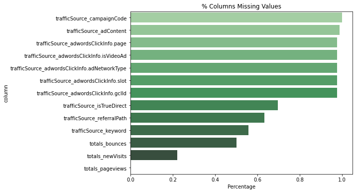
ほとんどの欠損値はtrafficSourceにあります。
# This plot shows the number of visits for each channel
def barplot_percentage(count_feat, color1= 'rgb(55, 83, 109)',
                       color2= 'rgb(26, 118, 255)',num_bars= None):

    df_channel = 100*df[count_feat].value_counts()/len(df)
    df_channel = df_channel.to_frame().reset_index()
    if num_bars:
        df_channel = df_channel.head(num_bars)

    trace0 = go.Bar(
        x=df_channel['index'],
        y=df_channel[count_feat],
        name='df set',
        marker=dict(color=color1)
    )

    layout = go.Layout(
        title='{} grouping'.format(count_feat),
        xaxis=dict(
            tickfont=dict(size=14, color='rgb(107, 107, 107)')
        ),
        yaxis=dict(
            title='Percentage of visits',
            titlefont=dict(size=16, color='rgb(107, 107, 107)'),
            tickfont=dict(size=14, color='rgb(107, 107, 107)')
        ),
        legend=dict(
            x=1.0,
            y=1.0,
            bgcolor='rgba(255, 255, 255, 0)',
            bordercolor='rgba(255, 255, 255, 0)'
        ),
        barmode='group',
        bargap=0.15,
        bargroupgap=0.1
    )

    fig = go.Figure(data=[trace0], layout=layout)
    iplot(fig)

barplot_percentage('channelGrouping')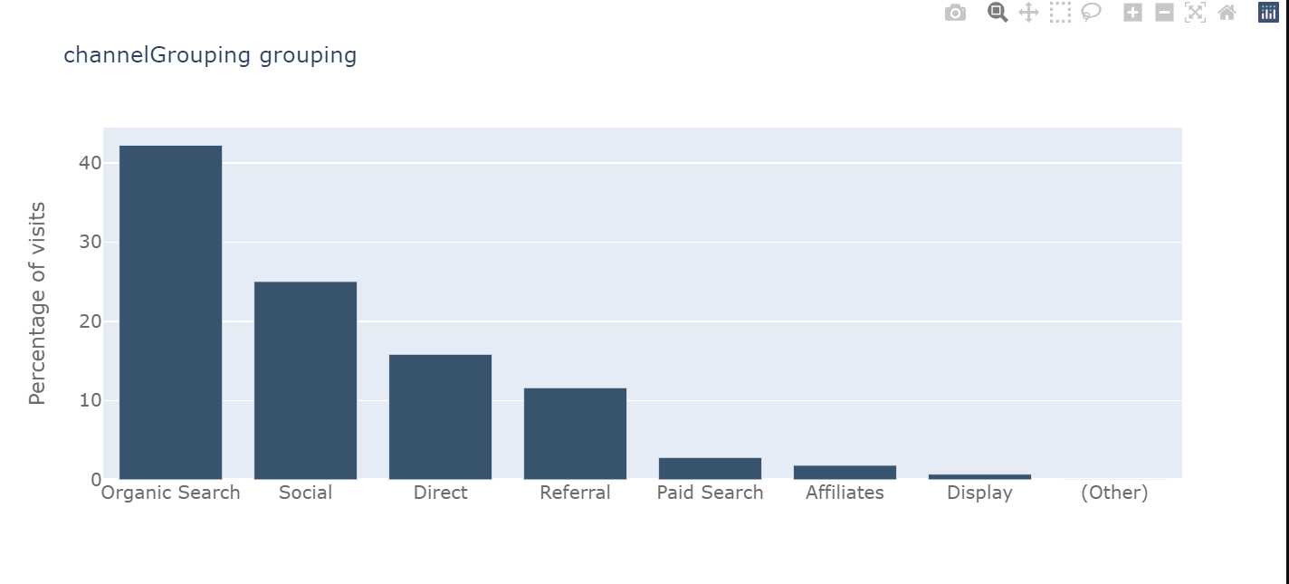
# Now we will analyse the time series data
tmp_df = df['date'].value_counts().to_frame().reset_index().sort_values('index')
tmp_df = tmp_df.rename(columns = {"date" : "visits"}).rename(columns = {"index" : "date"})
# Plot visits
trace1 = go.Scatter(x=tmp_df.date.astype(str), y=tmp_df.visits,
opacity = 0.8, line = dict(color = '#ff751a'), name= 'df')
traces = [trace1]
layout = dict(
title= "Visits by date",
xaxis=dict(
rangeselector=dict(
buttons=list([
dict(count=1, label='1m', step='month', stepmode='backward'),
dict(count=3, label='3m', step='month', stepmode='backward'),
dict(count=6, label='6m', step='month', stepmode='backward'),
dict(step='all')
])
),
rangeslider=dict(visible = True),
type='date'
)
)
fig = dict(data= traces, layout=layout)
iplot(fig)
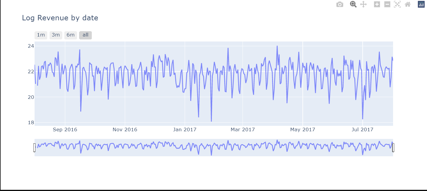
# Revenue by time
df_date_sum = df.groupby('date')['totals_transactionRevenue'].sum().to_frame().reset_index()
# Plot
trace_date = go.Scatter(x=df_date_sum.date.astype(str),
y=df_date_sum['totals_transactionRevenue'].apply(lambda x: np.log(x)), opacity = 0.8)
layout = dict(
title= "Log Revenue by date",
xaxis=dict(
rangeselector=dict(
buttons=list([
dict(count=1, label='1m', step='month', stepmode='backward'),
dict(count=3, label='3m', step='month', stepmode='backward'),
dict(count=6, label='6m', step='month', stepmode='backward'),
dict(step='all')
])
),
rangeslider=dict(visible = True),
type='date'
)
)
fig = dict(data= [trace_date], layout=layout)
iplot(fig)
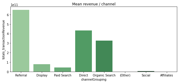
収益の分析
# Flag visits with revenue
df['has_revenue'] = df['totals_transactionRevenue'].apply(lambda x: 1 if x > 0 else 0)
channel_order = ['Referral', 'Display', 'Paid Search', 'Direct', 'Organic Search', '(Other)', 'Social', 'Affiliates']
plt.figure(figsize=(10,4))
plt.title("% visits with revenue / channel")
sns.barplot(x='channelGrouping', y='has_revenue', data=df, order=channel_order, palette='Greens_d')
revenue_channel = df.groupby('channelGrouping')['totals_transactionRevenue'].sum()
revenue_channel = revenue_channel.to_frame().reset_index()
plt.figure(figsize=(10,4))
plt.title("Mean revenue / channel")
ax = sns.barplot(x='channelGrouping', y='totals_transactionRevenue', data=revenue_channel, order=channel_order, palette='Greens_d')[
df['revenue_status']=df.totals_transactionRevenue.apply(lambda x: 0 if x==0 else 1)
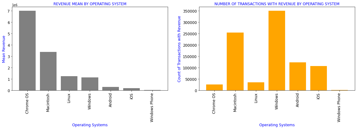
#Revenue generated by different Operating systems
df_OS=df[['device_operatingSystem','totals_transactionRevenue','revenue_status']].groupby(df.device_operatingSystem).aggregate({'totals_transactionRevenue':['mean'],
'revenue_status':['count']}).reset_index()
df_OS.columns=['device_operatingSystem','totals_transactionRevenue_mean','revenue_status_count']
df1=df_OS.sort_values(by='totals_transactionRevenue_mean',ascending=False)[df_OS.totals_transactionRevenue_mean>0]
display(df1.style.format(formatter))
plt.subplots(figsize=(20,5))
plt.subplot(1,2,1)
plt.title('REVENUE MEAN BY OPERATING SYSTEM',color='b',fontsize=12)
plt.xlabel('Operating Systems',color='b',fontsize=12)
plt.ylabel('Mean Revenue',color='b',fontsize=12)
plt.bar(range(len(df1)),df1.totals_transactionRevenue_mean,color='grey')
plt.xticks(range(len(df1)),df1.device_operatingSystem,rotation=90,fontsize=12)
plt.yticks(fontsize=12)
plt.subplot(1,2,2)
plt.title('NUMBER OF TRANSACTIONS WITH REVENUE BY OPERATING SYSTEM',color='b',fontsize=12)
plt.xlabel('Operating Systems',color='b',fontsize=12)
plt.ylabel('Count of Transactions with Revenue',color='b',fontsize=12)
plt.bar(range(len(df1)),df1.revenue_status_count,color='orange')
plt.yticks(fontsize=12)
plt.xticks(range(len(df1)),df1.device_operatingSystem,rotation=90,fontsize=12)
plt.show()
| device_operatingSystem | totals_transactionRevenue_mean | revenue_status_count | |
|---|---|---|---|
| 3 | Chrome OS | 6984005.39 | 26337 |
| 7 | Macintosh | 3372381.41 | 253938 |
| 6 | Linux | 1253365.30 | 35034 |
| 16 | Windows | 1134945.73 | 350072 |
| 1 | Android | 293330.32 | 123892 |
| 19 | iOS | 205887.71 | 107665 |
| 17 | Windows Phone | 21710.53 | 1216 |
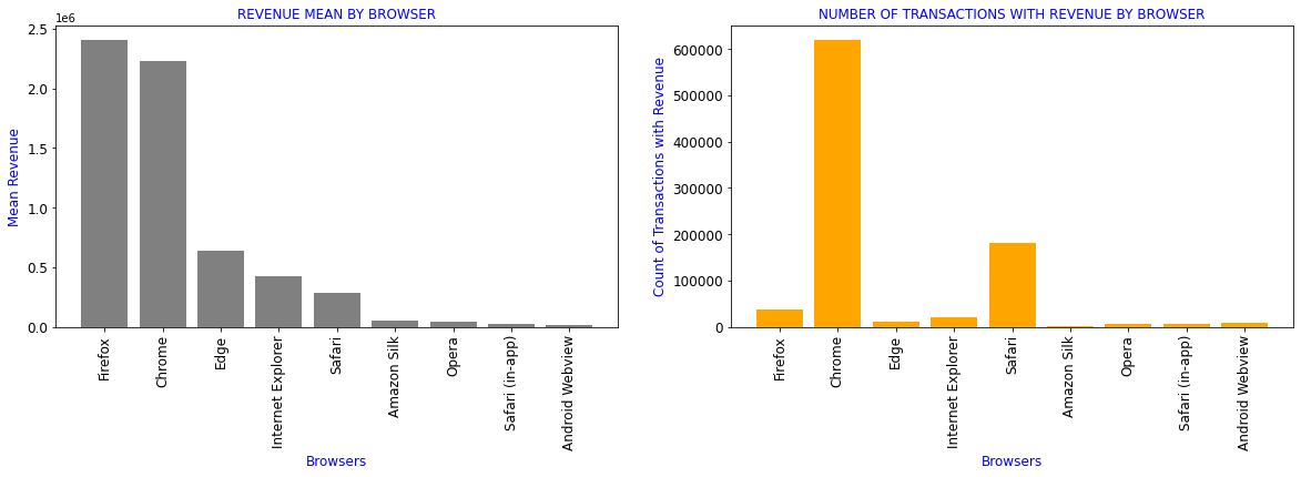
ブラウザー別の売上高
df_browser=df[['device_browser','totals_transactionRevenue','revenue_status']].groupby(df.device_browser).aggregate({'totals_transactionRevenue':['mean'],
                                                                                                              'revenue_status':['count']}).reset_index()
df_browser.columns=['device_browser','totals_transactionRevenue_mean','revenue_status_count']
df1=df_browser.sort_values(by='totals_transactionRevenue_mean',ascending=False)[df_browser.totals_transactionRevenue_mean>0]
formatter = {'totals_transactionRevenue_mean':'{:4.2f}'}
display(df1.style.format(formatter))

plt.subplots(figsize=(20,5))
plt.subplot(1,2,1)
plt.title('REVENUE MEAN BY BROWSER',color='b',fontsize=12)
plt.xlabel('Browsers',color='b',fontsize=12)
plt.ylabel('Mean Revenue',color='b',fontsize=12)
plt.bar(range(len(df1)),df1.totals_transactionRevenue_mean,color='grey')
plt.xticks(range(len(df1)),df1.device_browser,rotation=90,fontsize=12)
plt.yticks(fontsize=12)


plt.subplot(1,2,2)
plt.title('NUMBER OF TRANSACTIONS WITH REVENUE BY BROWSER',color='b',fontsize=12)
plt.xlabel('Browsers',color='b',fontsize=12)
plt.ylabel('Count of Transactions with Revenue',color='b',fontsize=12)
plt.bar(range(len(df1)),df1.revenue_status_count,color='orange')
plt.xticks(range(len(df1)),df1.device_browser,rotation=90,fontsize=12)
plt.yticks(fontsize=12)
plt.show()
| device_browser | totals_transactionRevenue_mean | revenue_status_count | |
|---|---|---|---|
| 16 | Firefox | 2409461.27 | 37069 |
| 11 | Chrome | 2229505.52 | 620364 |
| 15 | Edge | 635273.89 | 10205 |
| 20 | Internet Explorer | 426092.90 | 19375 |
| 40 | Safari | 287511.21 | 182245 |
| 3 | Amazon Silk | 53458.11 | 561 |
| 36 | Opera | 38162.33 | 5643 |
| 41 | Safari (in-app) | 22448.18 | 6850 |
| 6 | Android Webview | 14602.67 | 7865 |
異なる場所での複数属性の分析
def plotmap(frame, z_var, countries_col, title, colorscale, rcolor=True):
data = [ dict(
type = 'choropleth',
autocolorscale = False,
colorscale = colorscale,
showscale = True,
reversescale = rcolor,
locations = frame[countries_col],
z = frame[z_var],
locationmode = 'country names',
text = frame[countries_col],
marker = dict(line = dict(color = '#fff', width = 2))
)
]
layout = dict(
height=680,
#width=1200,
title = title,
geo = dict(
showframe = False,
showcoastlines = False,
projection = dict(type = 'mercator'),
),
)
fig = dict(data=data, layout=layout)
iplot(fig)
colorscale = [[0, 'rgb(102,194,165)'], [0.005, 'rgb(102,194,165)'],
[0.01, 'rgb(171,221,164)'], [0.02, 'rgb(230,245,152)'],
[0.04, 'rgb(255,255,191)'], [0.05, 'rgb(254,224,139)'],
[0.10, 'rgb(253,174,97)'], [0.25, 'rgb(213,62,79)'], [1.0, 'rgb(158,1,66)']]
# Plot world map - total visits
tmp = df["geoNetwork_country"].value_counts().to_frame().reset_index()
plotmap(tmp, 'geoNetwork_country', 'index', 'Total visits by Country', colorscale, False)
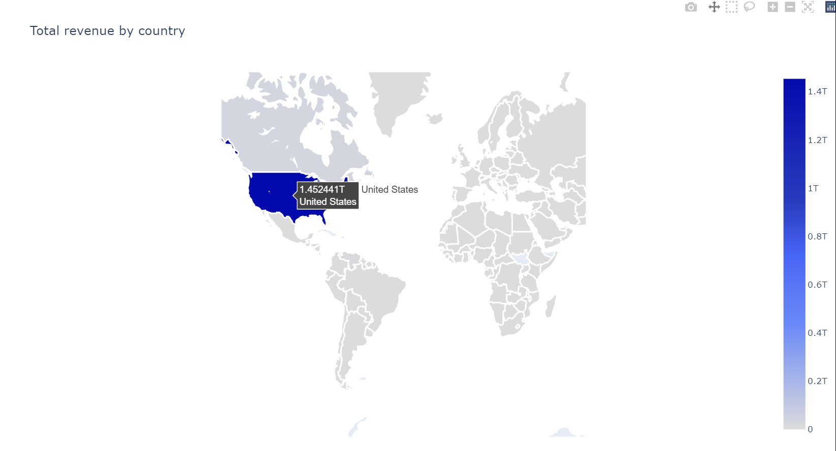
colorscale = [[0,"rgb(5, 10, 172)"],[0.35,"rgb(40, 60, 190)"],[0.5,"rgb(70, 100, 245)"],\
[0.6,"rgb(90, 120, 245)"],[0.7,"rgb(106, 137, 247)"],[1,"rgb(220, 220, 220)"]]
# Plot world map - total revenue
tmp = df.groupby("geoNetwork_country").agg({"totals_transactionRevenue" : "sum"}).reset_index()
plotmap(tmp, 'totals_transactionRevenue','geoNetwork_country', 'Total revenue by country', colorscale)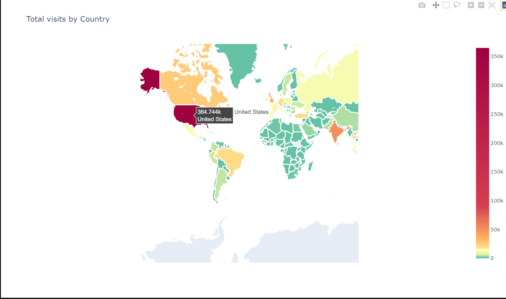
# Using squarify to plot an interesting distribution
df.loc[df["geoNetwork_city"] == "not available in demo dataset", 'geoNetwork_city'] = np.nan
number_of_colors = 20
color = ["#"+''.join([random.choice('0123456789ABCDEF') for j in range(6)])
             for i in range(number_of_colors)]

city_tree = df["geoNetwork_city"].value_counts() #counting

print("Description most frequent Citys: " )
print(city_tree[:15])

city_tree = round((city_tree[:30] / len(df['geoNetwork_city']) * 100),2)

plt.figure(figsize=(14,5))
g = squarify.plot(sizes=city_tree.values, label=city_tree.index,
                  value=city_tree.values,
                  alpha=.4, color=color)
g.set_title("'TOP 30 Citys - % size of total",fontsize=20)
g.set_axis_off()
plt.show()
Description most frequent Cities:
Mountain View 40884
(not set) 34262
New York 26371
San Francisco 20329
Sunnyvale 13086
London 12607
San Jose 10295
Los Angeles 8670
Bangkok 7709
Chicago 7444
Ho Chi Minh City 7342
Istanbul 6330
Bengaluru 5468
Toronto 5223
Hanoi 5032
Name: geoNetwork_city, dtype: int64
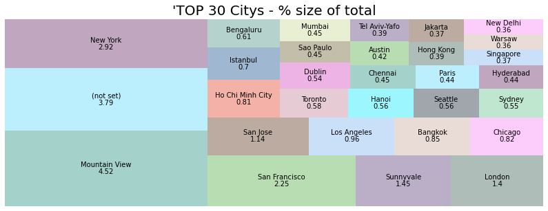
店舗にアクセスした顧客数はきれいに分散しています。上位5都市は以下の通りです。
マウンテンビュー、ニューヨーク、サンフランシスコ、サニーベール、ロンドン
barplot_percentage('geoNetwork_networkDomain', num_bars= 10,
                   color1='rgb(38, 115, 77)', color2='rgb(102, 204, 153)')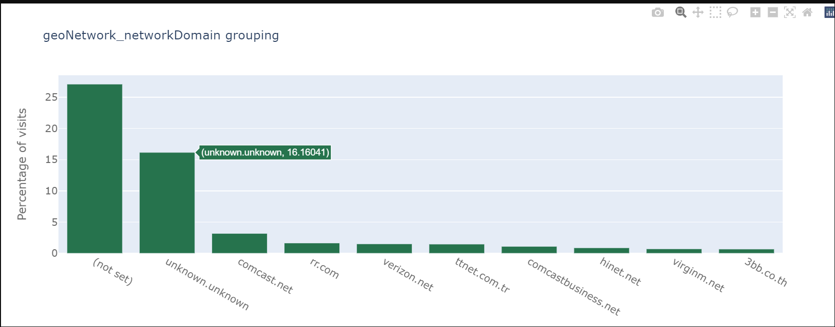
デバイスカテゴリーを分析してみましょう。
plt.figure(figsize=(14,5))

plt.subplot(1,2,1)
sns.countplot(df["device_deviceCategory"], palette="hls")
plt.title("Device Category Count", fontsize=10)
plt.xlabel("Category", fontsize=12)
plt.ylabel("Count", fontsize=12)
plt.xticks(fontsize=10)

plt.subplot(1,2,2)
sns.boxenplot(x="device_deviceCategory", y = 'totals_transactionRevenue',
              data=df[df['totals_transactionRevenue'] > 0], palette="hls")
plt.title("Device Category Revenue Distribuition", fontsize=10)
plt.xlabel("Category", fontsize=12)
plt.ylabel("Revenue(Log)", fontsize=12)
plt.xticks(fontsize=10)

plt.subplots_adjust(hspace = 0.9, wspace = 0.5)

plt.show() 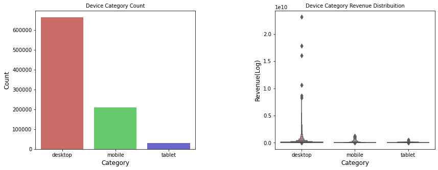
デスクトップが73.5%、モバイルが23.12%、タブレットが3.38%です。
6. 結論
このチュートリアルでは、PythonとGridDBを使用して顧客の購買データを分析・調査しました。データをインポートする方法として、(1) GridDB と (2) Pandas の2つの方法を検討しました。GridDBは、オープンソースで拡張性が高いため、大きなデータセットの場合、ノートブックにデータをインポートするための優れた代替手段を提供します。
ブログの内容について疑問や質問がある場合は Q&A サイトである Stack Overflow に質問を投稿しましょう。 GridDB 開発者やエンジニアから速やかな回答が得られるようにするためにも "griddb" タグをつけることをお忘れなく。 https://stackoverflow.com/questions/ask?tags=griddb