Introduction
In this age of technology, the amount of data being generated and gathered is growing in multitudes. However, this data does not hold any value until it is transformed from data to information through proper analysis. But the story does not end here, because the insights gained from analysis are further required to be communicated to the decision makers. Therefore, good visualizations are an integral part of data analysis as they help comprehend vast amounts of data in a glance and consequently help make effective decisions for the future. So the aim of this blog is to show you how to make high quality visualizations in Plotly after accessing data stored in the GridDB.
Connecting with GridDB using Python
GridDB is a highly scalable and highly reliable NoSQL database built within Toshiba. It can be downloaded from free from here. Once downloaded, use griddb_python package to interact with it using Python. Full python code to insert and read data from GridDB for this particular blog can be found here.
Overview of the dataset
The original source of dataset (ted_main.csv) can be found here. There are a total of 17 columns in the dataset but in this blog we are only going to focus only on the following six features:
- Duration – the duration of the talk in seconds
- Event – the TED/TEDx event where the talk took place
- Views – total number of times a talk is viewed
- Comments – the number of first level comments made on the talk
- Num_speaker – the number of speakers in the talk
- Published_date – UNIX timestamp for publication of the talk
A snapshot of few sample rows from this dataset is given below:

First let us perform a qualitative check on the dataset for the missing values. From the figure below, we observe that there are not any missing/NULL values in our dataset.

Before moving on to the visualization stage, some preprocessing is required to done for the following columns:
Converting Duration column values from seconds to minutes
data_relevant['duration_minutes'] = data_relevant['duration']/60From screen shot below, we observe that shortest speech was only 2.25 minutes long whereas longest speech was 87 minutes long. Mean speech time is 13.77 minutes.

Extracting Year values from Published_date column
Published_date column is given in the Unix timestamp format so first we convert it to pandas day-month-year format and then extract only the year value, saving it into a new column called year_released.
    data_relevant['date_normal'] =
    data_relevant['published_date'].apply(lambda x:
    datetime.datetime.fromtimestamp(int(x)).strftime('%d-%m-%Y'))
Now lets get started with creating beautiful visualizations in plotly.
What is Plotly?
Plotly for python is an open source, free data visualization library. It is used to build a broad variety of interactive charts ranging from basic charts to statistical charts to financial charts to Geographical map charts with minimal lines of code.
We can call plotly package using any of the following two interfaces: * Plotly Express: a high level API to build powerful graphs using very few lines of code (released in 2019) * Plotly Graph Object: a low level API for more graph customizations. Plotly express is actually a high level wrapper for Plotly Graph Objects library
We can import these in our python code as px and go like this:
    import plotly.express as px
    import plotly.graph_objects as go
One core concept when using Plotly is the figure object which stores all the parameters that dictate how our chart will come together.
Analysis of the dataset using Visualizations in Plotly
Basic Charts
Suppose we want to find out if the number of Ted talks events held each year are increasing or decreasing with time. How do we do that?
We can call px.line() function to draw a line chart with year on x-axis and total number of events held on y-axis. The item returned by this function is a Figure object. Next we are adding a custom title for this chart and center-aligning it by calling update_layout() on this Figure object. We can also choose a template here e.g. plotly_dark to change the background color.
Last step is to display this chart on screen by calling show() on the Figure object and here is the result. We can hover over our cursor at a specific point on this line to get exact x and y axis details.
    line_plot = px.line(year_events, x='year_released', y='event', labels=dict(year_released="Year", event="Events Held"))
    line_plot.update_layout(title_text='TED Events held per year (2006 - 2017)', title_x=0.5, template='plotly_dark')
    line_plot.update_traces(mode='lines+markers')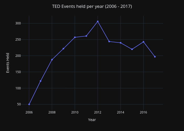
So coming back towards the answer to the question posed above, we are able to depict that the number of events held had an increasing trend from 2006 to 2012 and a decreasing trend after 2012 till 2017 with just 3 lines of code.
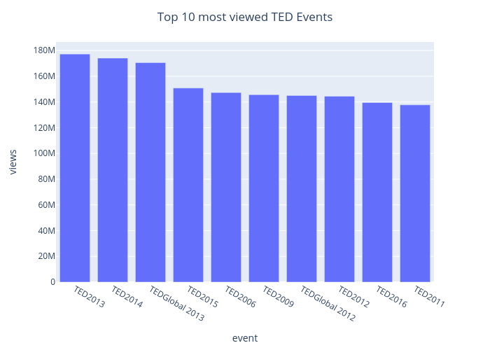
Next let’s find out what are the top 10 most viewed TED events. The bar chart below depicts this information in a neat and concise manner. TED2013 stands out as the most popular event with 177.3 Million views.
The same information can also be displayed in the form of horizontal bar chart if you prefer.
Instead of looking at data for all the years, lets drill down into data for one year (lets say 2012) and find out the names and percentages of top 5 most viewed events in the form of a donut chart below.
Statistical Charts
Now that we have fundamental understanding of essential charts in plotly, lets visualize our data through the lens of statistical charts too.
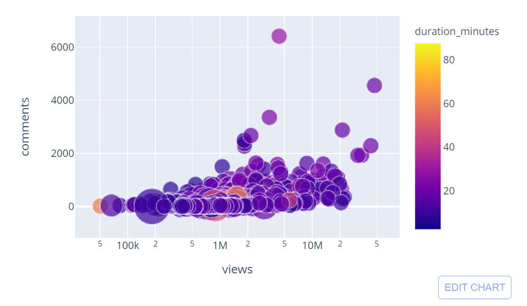
First lets find out if there is a relationship between our numerical valued columns views and comments. We will be using the entire dataset here.
We can plot a trendline to get an idea about the general direction. Trendline sketched above has a positive slope so in general, most viewed talks are the ones that got the most comments.
A third dimension i.e. duration_minutes can also be added to display the length of each talk on the same scatter plot in color coded fashion.
Furthermore you can quickly convert this scatter plot into a bubble plot by adding the size parameter. Now, the size of the bubble is proportional to number of speakers in that particular talk.
Another very common type of statistical chart is histogram that depicts the distributions of values for a feature in the dataset.
Yet another very useful statistical chart is a box plot that depicts minimum, maximum, median and quartile values as shown below.
Animation
Plotly also supports animated figures through animation_frame argument as shown below.
3D plot
Using a single line of code, we can create this 3 dimensional scatter plot figure which you can move and drag around with the help of your cursor.
Conclusion
Voila! Now you know how incredibly easy it is to create interactive plots and animations in no time with plotly. Do bear in mind though that we have only shown you only a handful of customizations available in plotly package. With loads of other options available, you can play around to your heart’s content and create stunning visualizations for effectively communicating key insights with your audience.