
Introduction
Stock markets are fickle and often changing. Humans have tried to tame the bull throughout history but have never been successful. Stock market prediction is difficult because there are too many factors at play, and creating models to consider such variances is almost impossible. However, recent advances in machine learning and computing have allowed machines to process large amounts of data. This will enable us to use past stock exchange data and analyze trends. This post will leverage python and GridDB to analyze stock data for Google for the past year.
Stock prices are stored daily. Thus, daily stock data can grow very large. We will use GridDB as the database to store our data as it has been known to handle large datasets well. GridDB ensures high performance while being scalable and reliable at the same time. GridDB is easy to use and works with most modern programming languages. In this post, we will run some fundamental stock price analysis using python and visualize our results.
Setup
GridDB setup
Setup for the GridDB python client can be found in this video. Before we begin, we should have the following endpoints correctly defined.
export LIBRARY_PATH=$LIBRARY_PATH:/usr/share/doc/griddb-c-client [insert path to c_client]
export PYTHONPATH=$PYTHONPATH:[insert path to python_client]
export LIBRARY_PATH=$LD_LIBRARY_PATH:[insert path to c_client/bin]
Python Libraries
We will use python 3.6 for this analysis. To install libraries we will use pip.
pip install pandas
pip install plotly
Data Collection
GridDB provides an excellent interface to access data. The GridDB python client blog goes into great detail on linking a GridDB database and pushing all the data to a pandas data frame. We will use yahoo finance to get data for Google stock. The data can be found at : Yahoo! Finance We save the data for one year at GOOG.csv.
We can insert and retrive this data into GridDB with SQL queries.
To insert:
import griddb_python as griddb
import pandas as pd

# Initialize container
gridstore = factory.get_store(host= host, port=port,
            cluster_name=cluster_name, username=uname,
            password=pwd)

conInfo = griddb.ContainerInfo("GOOGL",
                    [["Date", griddb.Type.TIMESTAMP],
                    ["Open",griddb.Type.LONG],
                    ["High", griddb.Type.LONG],
                    ["Low",griddb.Type.LONG]
                    ["Close", griddb.Type.LONG]
                    ["Adj. Close", griddb.Type.LONG]
                    ["Volume", griddb.Type.LONG]],
                    griddb.ContainerType.COLLECTION, True)

cont = gridstore.put_container(conInfo)
cont.create_index("Date", griddb.IndexType.DEFAULT)
data = pd.read.csv("GOOG.csv")
#Add data
for i in range(len(data)):
    ret = cont.put(data.iloc[i, :])
Note that this process can be automa,ted to query regualrly from Yahoo! Finacne as well.
We can retrive data from GridDB using the following SQL query:
query = cont.query("select * where Date > TIMESTAMPADD(YEAR, NOW(), -1)")
Data Analysis
We can load the data using pandas
Import pandas as pd
googf = pd.read_csv("GOOG.csv")
This is what stock data looks like:
The columns are interpreted as:
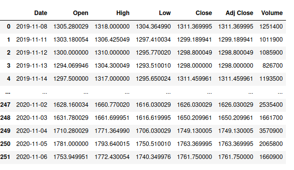
- Date: The date of the trading day.
- Open: The first trade price on Date.
- High: The highest price at which the stock is traded on Date.
- Low: The lowest price at which the stock is traded on Date.
- Close: The last trade price on Date
- Adj Close: This is defined as the closing price after all dividends are split.
- Volume: The number of shares traded on Date.
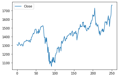
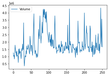
First, we visualize that data on line plots. We use the plot functionality in pandas to plot the close price and the traded volume.
googf[["Close"]].plot()
googf[["Volume"]].plot()
We see that volume traded and closing price have an inverse relationship. This relationship is a common practice in finance. If the closing price of a stock decreases, people are more likely to trade a particular stock. However, we see that the data is very spiky. This spikiness is because there are subtle market forces that guide the price fluctuations.
Next, we can use an OHLC chart to visualize the data. The OLHC (open, high, low and close) chart is a financial chart describing open, high, low and close values for a given date.
The horizontal segments represent open and close values, and the tip of the lines represents the low and high values. Points, where the close value is higher than open are called increasing (in green) and decreasing close value is lower than open( in red).
We will use plotly to plot this.
import plotly.graph_objects as go

fig = go.Figure(data=go.Ohlc(x=googf['Date'],
        open=googf['Open'],
        high=googf['High'],
        low=googf['Low'],
        close=googf['Close']))
fig.show()
We see that there was a dip in google stock in March. Moreover, the red lines are more prominent in the earlier half of the year than the latter. This could be due to multiple factors like the COVID epidemic, for instance. In a later post, we will try to analyze stock trends with Covid spread data.
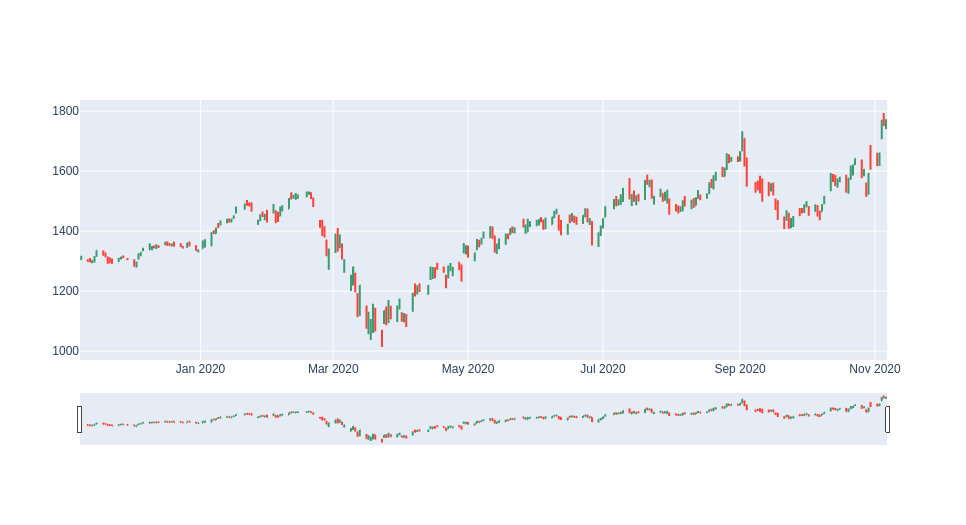
Next, we use the range slider to zoom in in March.
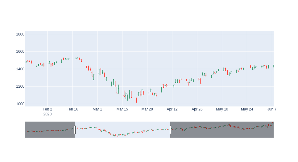
We see that the vertical bars are longer, indicating a massive difference between opening and closing. This shows that there was large volatility in the market at the time.
These charts are much more intuitive than regular line plots.
Market Trends Analysis
Moving averages
Next, we compute moving averages. The moving average of a stock is creating a continually updated average price. Moving averages are used to confirm trend changes and are not used for future prediction.
We can calculate moving averages for short, intermediate, and longer terms to analyze market trends.
- Short-term: The time frames are between 5–20 days and are used to identify trends that can last
a few days to a few weeks. - Intermediate: The time frames are between 20–65 days and are used to identify trends that can
last a few months. - Long: The time frames are between 65–200 days and are used to identify trends that can last
years.
As we have only one year of data, we will look at short trends. We will calculate moving averages for 5, 20 and 50 days and use them to analyze trends.
To calculate the moving average in python, we use the rolling function.
Simple Moving Average
A simple moving average of N days can be defined as the mean of the closing price for N days. We shift the period by one day and keep calculating his average for every N range. Here is the code:
googf['SMA5'] = googf.Close.rolling(5).mean()
googf['SMA20'] = googf.Close.rolling(20).mean()
googf['SMA50'] = googf.Close.rolling(50).mean()

fig = go.Figure(data=[go.Ohlc(x=googf['Date'],
            open=googf['Open'],
            high=googf['High'],
            low=googf['Low'],
            close=googf['Close'], name = "OHLC"),
            go.Scatter(x=googf.Date, y=googf.SMA5, line=dict(color='orange', width=1), name="SMA5"),
            go.Scatter(x=googf.Date, y=googf.SMA20, line=dict(color='green', width=1), name="SMA20"),
            go.Scatter(x=googf.Date, y=googf.SMA50, line=dict(color='blue', width=1), name="SMA50")])
fig.show()
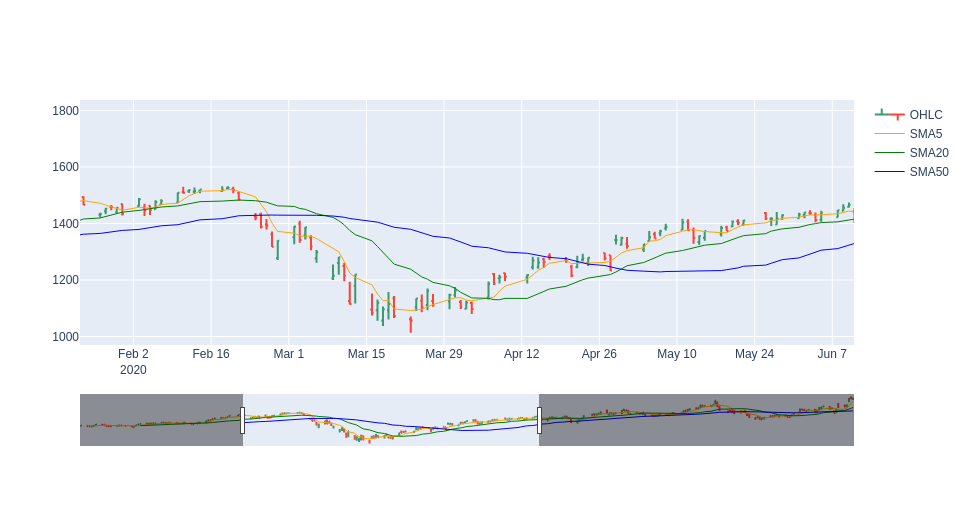
The yellow line shoes moving average for five days, green one shows a trend for 20 days and blue shows the trend for 50 days. We zoom in in March again. We can see a crossover at the start and end of March, i.e., the blue line goes above the green, and at the end of March, it goes down again. This indicates that the market is bearish at the start of March and then picks up again.
Simple moving averages can be slow to respond to large price swings. To gauge this effect, investors use exponential moving averages.
Exponential Moving Average
The exponential moving average calculates the average again but gives more weight to more recent points of data.
We use the ewm function and get the exponential moving average for five days, 20 days and 50 days. Here is the code:
googf['EMA5'] = googf.Close.ewm(span=5, adjust=False).mean()

googf['EMA20'] = googf.Close.ewm(span=20, adjust=False).mean()

fig = go.Figure(data=[go.Ohlc(x=googf['Date'],
        open=googf['Open'],
        high=googf['High'],
        low=googf['Low'],
        close=googf['Close'], name = "OHLC"),
        go.Scatter(x=googf.Date, y=googf.EMA5, line=dict(color='orange', width=1), name="EMA5"),
        go.Scatter(x=googf.Date, y=googf.EMA20, line=dict(color='green', width=1), name="EMA20")])
fig.show()
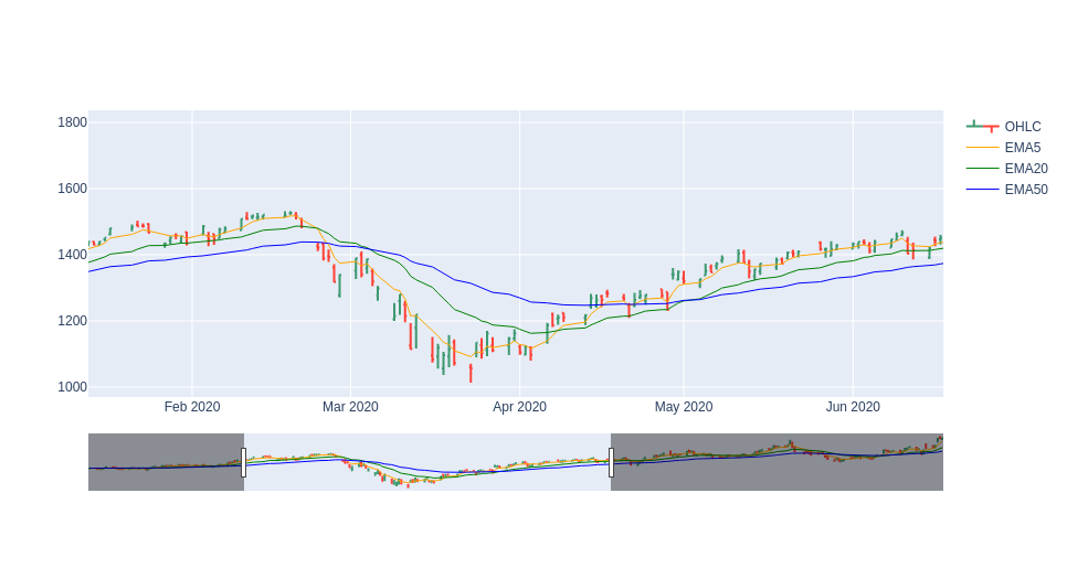
Here we again see a similar double crossover at the beginning of March and at the end. However, the gap is less significant. This implies that the market trend is more stable than we thought.
Moving averages are easy to calculate but are limited because they’re based on previous data. They will not be of much use for extremely volatile stocks.
Conclusion
In this post we first learned how to do market trend analysis with GridDB and python. We learned how to plot OHLP plots and do some moving average analysis.
You can read more about moving averages here.