Introduction and Purpose
The Use Case
Imagine that you are the owner of a building complex. You have installed smart meters all over the place to monitor power usage. Each of the devices creates a timestamp two times in a minute. It saves power usage data in kW and timestamps in the form of epoch seconds. The IoT provider sends you a .CSV file every month.
Objectives
You want to propose an energy-saving plan. To start, you'd like to identify patterns in power usage: how the power is consumed, when less of it is consumed, and when power usage is particularly extensive. For this purpose, you will build different data visualizations that help to catch patterns in time series data without applying such advanced methods as regression analysis.
Methods
The article will explain how to save the extracted raw data into GridDB, and then visualize it in Jupyter Notebook. The latter is very convenient for exploring trends and patterns in the data and for writing reports. In Jupyter, you have cells for code chunks, and you have cells for simple text where you can write down your thoughts, notes, etc. Jupyter Notebook is a powerful tool for data scientists since it allows loading huge amounts of data into it and analyzing them easily.
Jupyter Notebook works with all Python packages.
Prerequisites
The present tutorial is based upon a previous GridDB blog post that shows how to install Jupyter and access GridDB from it.
To start with the tutorial, you need to finish both aforementioned installations first.
Saving Data Into the Database
We will build the database from a publicly available IoT dataset. It contains smart metering data on power usage in a university campus. A one-month data with a total of 86192 is sufficient to illustrate the tutorial steps.
Let's get our hands dirty.
Access the Database
First of all, we access this database using JayDeBeApi Python package.
import jaydebeapi

conn = jaydebeapi.connect("com.toshiba.mwcloud.gs.sql.Driver",
                           "jdbc:gs://griddb:20001/defaultCluster/public?notificationMember:127.0.0.1:20001",
                           ["admin", "admin"],
                          "/usr/share/java/gridstore-jdbc-4.5.0.jar",)
curs = conn.cursor()
Create a Table
We have established a connection to the database and can insert the data. The queries can be written in SQL. We send them to the database using curs.execute(). The first query to start is the one that creates the data table.
curs.execute('CREATE TABLE power2(timestamp INTEGER, power FLOAT)')
Inserting the Data
We load the data from the .CSV into the database. We can do it directly via Jupyter, by saving the data into a data frame, and then sending it to GriDB. If you get new data regularly, you can repeat this step to add new data to the database, or automate its execution.
Making short checks by calling the info() or head() function is a good habit and helps to spare a lot of headaches. If the data has gaps or looks weird, you notice it in the very beginning.
import pandas as pd

power = pd.read_csv('Power.csv', names = ['timestamp', 'power'])
power.info()
<class 'pandas.core.frame.DataFrame'>
RangeIndex: 86192 entries, 0 to 86191
Data columns (total 2 columns):
 #   Column     Non-Null Count  Dtype
---  ------     --------------  -----
 0   timestamp  86192 non-null  float64
 1   power      86192 non-null  float64
dtypes: float64(2)
memory usage: 1.3 MB
pd.options.display.float_format = '{:.2f}'.format
power.head()
| timestamp | power | |
|---|---|---|
| 0 | 1401595223 | 0.00 |
| 1 | 1401595253 | 0.00 |
| 2 | 1401595283 | 0.00 |
| 3 | 1401595313 | 0.00 |
| 4 | 1401595343 | 0.00 |
The timestamp column does not make sense so far. It has three zeros at the end: maybe, it was supposed to track milliseconds in addition to seconds, but the smart meter failed to. The timestamp is too long to be written to the database now. Besides, as a float number, it has little sense: epoch seconds can only be integers.
We will get rid of the first two problems.
If you will try this tutorial on a different dataset and won't meet the same problem, just skip this step. The point is, you need the timestamps to be in the integer format before writing it to the database.
power['timestamp'] = (power['timestamp']/1000).astype(int)
power.info()
<class 'pandas.core.frame.DataFrame'>
RangeIndex: 86192 entries, 0 to 86191
Data columns (total 2 columns):
 #   Column     Non-Null Count  Dtype
---  ------     --------------  -----
 0   timestamp  86192 non-null  int64
 1   power      86192 non-null  float64
dtypes: float64(1), int64(1)
memory usage: 1.3 MB
The data looks good, and both types coincide with the data types in the columns that we created in our table. We are
ready to feed the data from the data frame into the database.
for row in power.itertuples():
    curs.execute('''
                INSERT INTO power2 (timestamp, power)
                VALUES (?,?)
                ''',
                (row.timestamp,
                row.power)
                )
conn.commit()
After we have waited patiently for the data to be inserted, we can perform another small check and look at what we get back from the database.
Starting from now, we communicate with the database table using read_sql_query() function from the pandas package. This function fetches the data and converts it into a pandas data frame.
Check the Success
sql = ('SELECT power, timestamp FROM power2 LiMIT 1')
sql_query = pd.read_sql_query(sql, conn)
sql_query
| power | timestamp | |
|---|---|---|
| 0 | 0.00 | 1401595223 |
The data looks like expected, so we proceed to load all rows.
sql = ('SELECT power, timestamp FROM power2')
sql_query = pd.read_sql_query(sql, conn)
sql_query.info()
<class 'pandas.core.frame.DataFrame'>
RangeIndex: 86192 entries, 0 to 86191
Data columns (total 2 columns):
 #   Column     Non-Null Count  Dtype
---  ------     --------------  -----
 0   power      86192 non-null  float64
 1   timestamp  86192 non-null  int64
dtypes: float64(1), int64(1)
memory usage: 1.3 MB
Both columns have data in float format. We will create three different data frames out of that one to catch patterns in power usage. Next stop – data preparation!
Getting First Insights
We will begin with the simplest data visualization possible: a line chart. Before making anything complicated, it isuseful to have a broader look over the data. This will guide us to choosing the further steps, for instance, if we want to zoom into the data, or focus on some specific dimension (although we have none so far), or we are going to search for some patterns.
Small Preparations
To be able to plot the data, we have to convert the epoch seconds into a datetime format. We make a string out of it and then apply the to_datetime() function.
sql_query['timestamp2'] = sql_query['timestamp'].apply(str)
sql_query.head()
| power | timestamp | timestamp2 | |
|---|---|---|---|
| 0 | 0.00 | 1401595223 | 1401595223 |
| 1 | 0.00 | 1401595253 | 1401595253 |
| 2 | 0.00 | 1401595283 | 1401595283 |
| 3 | 0.00 | 1401595313 | 1401595313 |
| 4 | 0.00 | 1401595343 | 1401595343 |
sql_query['datetime'] = sql_query['timestamp2'].apply(lambda x: pd.to_datetime(x, unit='s'))
sql_query.head()
| power | timestamp | timestamp2 | datetime | |
|---|---|---|---|---|
| 0 | 0.00 | 1401595223 | 1401595223 | 2014-06-01 04:00:23 |
| 1 | 0.00 | 1401595253 | 1401595253 | 2014-06-01 04:00:53 |
| 2 | 0.00 | 1401595283 | 1401595283 | 2014-06-01 04:01:23 |
| 3 | 0.00 | 1401595313 | 1401595313 | 2014-06-01 04:01:53 |
| 4 | 0.00 | 1401595343 | 1401595343 | 2014-06-01 04:02:23 |
Now we are set up to produce the first chart.
Line Chart and First Conclusions
%matplotlib inline

import matplotlib.pyplot as plt

plt.rcParams['figure.figsize'] = (20,8) # Change the plot size

sql_query.plot(y = 'power', x = 'datetime', grid=True)
<AxesSubplot:xlabel='datetime'>
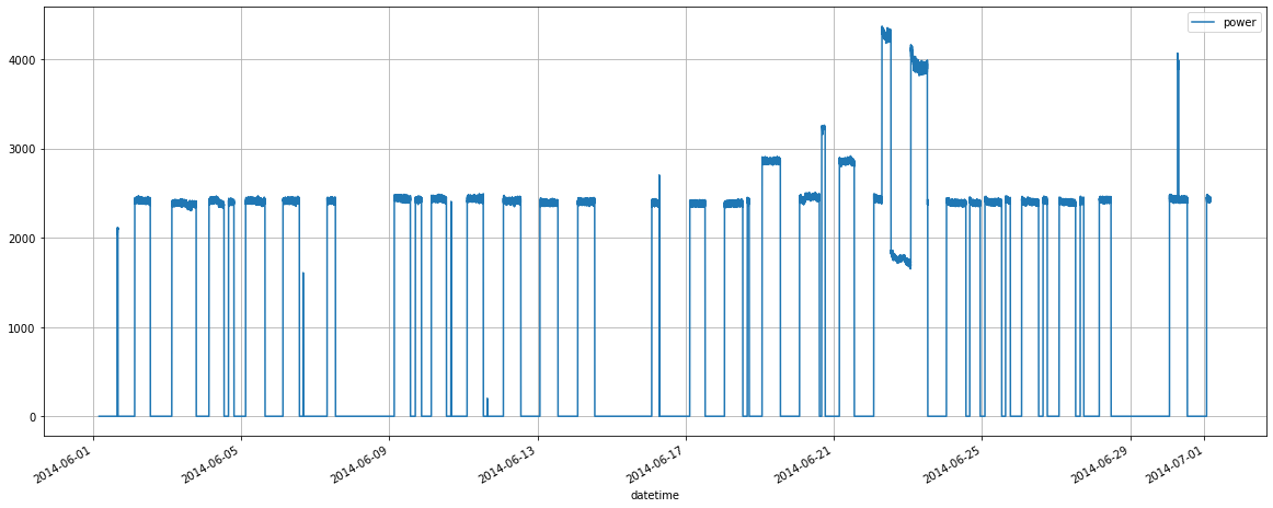
If we look at this chart … we will be able to recognize quite a little. This is an outburst in energy consumption on a couple of days, but besides that, the power usage seems to have a flat trend. It demonstrates the same amount each day, with nightly drops and two-days gaps that are weekends.
We cannot identify any differences between single days and nights. We do see that during the day hours, there is a curve, not a line. Moreover, our intuition says that during the night time, power usage cannot be zero all the time. You have heating and air conditioning systems. Their usage strongly depends on the temperature outside, which cannot be the same every day.
Still, any chance of finding a pattern here? Sure, but we have to do more than a simple line chart.
Finding Patterns
Rolling Mean
The nightly gaps make daily consumption during the peaks look "flat." We want to find a trend to recognize differences in day-to-day numbers. For this, we will flatten the line even more by adding a rolling mean. We take the average data consumption for every 24 hours and assign it to any single time point within one day.
Since the timestamps were made each 30 seconds, we calculate the mean alongside 30 60 24 = 2880 data rows.
We also have to set and then reset index since the rolling window will destroy other columns, including the datetime column that we still need to build the chart.
timeseriesdf = sql_query.drop(columns = ['timestamp', 'timestamp2' ])
timeseriesdf = timeseriesdf.set_index('datetime')
timeseriesdf = timeseriesdf.rolling(2880).mean()
timeseriesdf.reset_index(inplace=True)
timeseriesdf.tail()
| datetime | power | |
|---|---|---|
| 86187 | 2014-07-01 03:57:47 | 1210.53 |
| 86188 | 2014-07-01 03:58:17 | 1210.52 |
| 86189 | 2014-07-01 03:58:47 | 1210.54 |
| 86190 | 2014-07-01 03:59:17 | 1210.53 |
| 86191 | 2014-07-01 03:59:47 | 1210.53 |
After the second data frame is ready, we can plot the average data and lay it above the raw data.
ax = sql_query.plot(y = 'power', ylabel = 'power', x = 'datetime', grid=True, label = "raw power data")
timeseriesdf.plot(ax = ax, y = 'power', x = 'datetime', label = "rolling mean")
<AxesSubplot:xlabel='datetime', ylabel='power'>
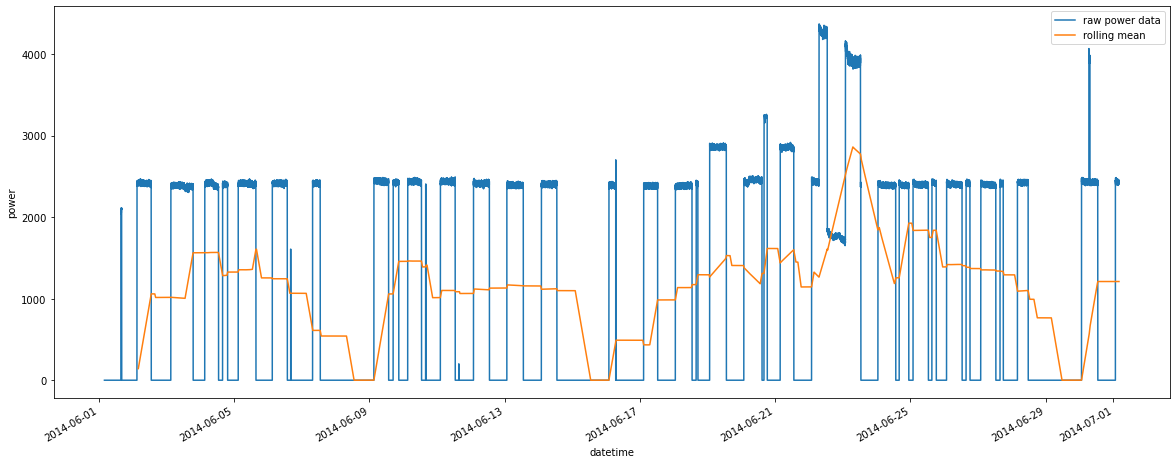
Now we can see that the daily usage is not the same for each day. We see the weekend gaps, as usual, then the usage grows a bit and has its peaks on Tuesdays. And there is one week when we have no Tuesday peak, but then a power usage outburst on the weekend.
Heat Map
Since we have identified a vague pattern in power consumption depending on the hour and weekday, we can now take a deep dive following this direction.
There is nothing left that we can get from a line plot, so we switch to aggregating data and using heat maps. Fits well with the type of data source: power usage! Let's have a look at how much energy is being burnt in this building.
Preparing the Aggregation Dimensions
We need to create two dimensions to aggregate the data:
- hour
- day of week
It is possible to extract the hour directly from the datetime column. We will add "0" to the hours that are less than 10 to be able to sort this column later in a meaningful manner.
To get weekdays, we need to do some preparation: convert datetime into date and then extract the weekday. We will also give readable names to the weekdays. For the last part, we will create a small data frame and then merge it with the main one.
Hour of the day
sql_query['hour'] = sql_query['datetime'].apply(lambda x: "0" + str(x.hour) if x.hour < 10 else str(x.hour))
sql_query.head()
| power | timestamp | timestamp2 | datetime | hour | |
|---|---|---|---|---|---|
| 0 | 0.00 | 1401595223 | 1401595223 | 2014-06-01 04:00:23 | 04 |
| 1 | 0.00 | 1401595253 | 1401595253 | 2014-06-01 04:00:53 | 04 |
| 2 | 0.00 | 1401595283 | 1401595283 | 2014-06-01 04:01:23 | 04 |
| 3 | 0.00 | 1401595313 | 1401595313 | 2014-06-01 04:01:53 | 04 |
| 4 | 0.00 | 1401595343 | 1401595343 | 2014-06-01 04:02:23 | 04 |
Day of week
import datetime
sql_query['date'] = sql_query['datetime'].apply(lambda x: datetime.datetime.date(x))
sql_query['weekday'] = sql_query['date'].apply(lambda x: str(datetime.datetime.weekday(x)))
weekdaydf = pd.DataFrame({'day_of_week': ["Mon", "Tue", "Wed", "Thu", "Fr", "Sat", "Sun"], 'weekday':["0", "1", "2", "3", "4", "5", "6"]})
power = pd.merge(sql_query, weekdaydf, on='weekday')
power = power.drop(columns=['timestamp', 'timestamp2', 'datetime', 'date', 'weekday'])
Group and Aggregate
We need two steps to create an aggregation that can be used to build a heat map:
- group the dataframe with groupby() and sum() functions
- create a pivot table out of it
Apart from this, we need to sort weekdays to set them in the right order as we know it.
powergrouped = power.groupby(['day_of_week', 'hour'], as_index=False).sum()
powerpivot = powergrouped.pivot('day_of_week','hour', 'power')
new_order= ["Sun", "Sat", "Fr", "Thu", "Wed", "Tue", "Mon"]
powerpivot.sort_index(axis=1, ascending=True, inplace=True) #x-axis
powerpivot = powerpivot.reindex(new_order, axis=0)
powergrouped
| day_of_week | hour | power | |
|---|---|---|---|
| 0 | Fr | 00 | 0.00 |
| 1 | Fr | 01 | 224969.23 |
| 2 | Fr | 02 | 864557.15 |
| 3 | Fr | 03 | 1119128.11 |
| 4 | Fr | 04 | 1150885.10 |
| … | … | … | … |
| 163 | Wed | 19 | 105530.85 |
| 164 | Wed | 20 | 0.00 |
| 165 | Wed | 21 | 0.00 |
| 166 | Wed | 22 | 0.00 |
| 167 | Wed | 23 | 0.00 |
168 rows × 3 columns
powerpivot
| hour | 00 | 01 | 02 | 03 | 04 | 05 | 06 | 07 | 08 | 09 | … | 14 | 15 | 16 | 17 | 18 | 19 | 20 | 21 | 22 | 23 |
|---|---|---|---|---|---|---|---|---|---|---|---|---|---|---|---|---|---|---|---|---|---|
| day_of_week | |||||||||||||||||||||
| Sun | 0.00 | 51497.60 | 291117.90 | 292769.57 | 291190.81 | 291278.86 | 290997.18 | 491656.62 | 513788.41 | 510171.87 | … | 213315.17 | 288440.83 | 263605.47 | 208461.53 | 211521.67 | 211974.35 | 212378.75 | 210879.87 | 209623.45 | 206585.15 |
| Sat | 0.00 | 0.00 | 269834.76 | 458969.12 | 915983.93 | 918758.96 | 921725.76 | 999486.05 | 1206349.12 | 1210010.29 | … | 0.00 | 0.00 | 0.00 | 0.00 | 0.00 | 0.00 | 0.00 | 0.00 | 0.00 | 0.00 |
| Fr | 0.00 | 224969.23 | 864557.15 | 1119128.11 | 1150885.10 | 1157386.84 | 1156024.29 | 1153747.56 | 1158855.92 | 1158471.02 | … | 181962.75 | 120546.90 | 650737.81 | 633932.26 | 132555.43 | 0.00 | 0.00 | 0.00 | 0.00 | 0.00 |
| Thu | 0.00 | 309328.00 | 932204.37 | 1205611.23 | 1207128.36 | 1204462.24 | 1206721.36 | 1208640.58 | 1204511.73 | 1199805.57 | … | 287940.39 | 287652.30 | 290639.87 | 287504.60 | 65143.31 | 0.00 | 0.00 | 0.00 | 0.00 | 0.00 |
| Wed | 0.00 | 281027.87 | 749927.37 | 1100732.95 | 1153720.09 | 1151129.83 | 1153740.49 | 1156341.91 | 1153000.58 | 1147049.35 | … | 0.00 | 296933.91 | 861515.44 | 618844.71 | 372767.37 | 105530.85 | 0.00 | 0.00 | 0.00 | 0.00 |
| Tue | 26562.56 | 445447.54 | 683084.53 | 1342209.28 | 1151558.18 | 1147726.28 | 1149619.97 | 1150122.07 | 1152870.25 | 1148160.37 | … | 282747.19 | 298448.77 | 612924.25 | 572219.97 | 545555.71 | 284165.57 | 286591.83 | 286551.77 | 219794.28 | 0.00 |
| Mon | 206121.08 | 419298.17 | 1068524.79 | 1550715.82 | 1630477.85 | 1630106.16 | 1680749.36 | 1412979.20 | 1332721.77 | 1338198.34 | … | 0.00 | 0.00 | 33988.80 | 290805.45 | 291424.27 | 291727.70 | 242969.68 | 0.00 | 0.00 | 0.00 |
7 rows × 24 columns
Analyzing the Pattern
import seaborn as sns
ax = sns.heatmap(powerpivot)
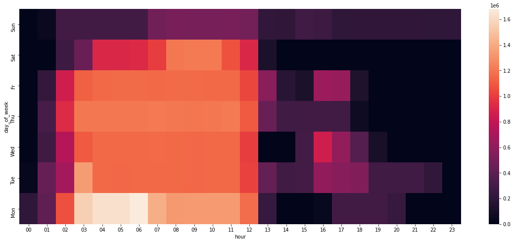
Since we have smart metering data from a university campus, it seems natural that the usage drops starting from noon. The classes take place in the mornings.
The weekly peak is Wednesday: Our prophecy from before was almost correct. Although it is not quite clear. On Tuesdays, more hours are marked with purple, but the red one lies on Wednesday.
And why the hottest spots are between 3 and 7 a.m.? Who needs so much power in the dawn?
Bonus: Grouped Line Charts
We could have built a simple multiple line chart like the one below:
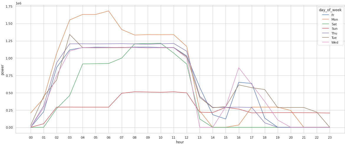
sns.lineplot(data=powergrouped, x="hour", y="power", hue="day_of_week")
<AxesSubplot:xlabel='hour', ylabel='power'>
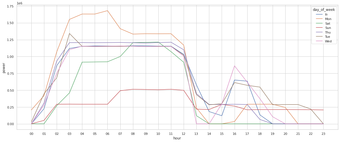
The problem is that you have to consult with the legend each time you've noticed something interesting since it is difficult to keep in mind which line is which.
A better supplement to the heat map is a grid with small multiple time series charts. They separate each weekday's trend and help to focus on peaks and gaps.
powergrouped['day_of_week'] = pd.Categorical(powergrouped['day_of_week'], new_order[::-1])
powergrouped = powergrouped.sort_values(by = 'day_of_week')

g = sns.relplot(
    data=powergrouped,
    x="hour", y="power", col="day_of_week", hue="day_of_week",
    kind="line", palette="crest", linewidth=4, zorder=5,
    col_wrap=3, height=2, aspect=1.5, legend=False,
)

for day_of_week, ax in g.axes_dict.items():


    ax.text(.8, .85, day_of_week, transform=ax.transAxes, fontweight="bold")


    sns.lineplot(
        data=powergrouped, x="hour", y="power", units="day_of_week",
        estimator=None, color=".7", linewidth=1, ax=ax,
    )

ax.set_xticks(ax.get_xticks()[::4])


g.set_titles("")
g.set_axis_labels("", "power")
<seaborn.axisgrid.FacetGrid at 0x7f105ecbf8b0>
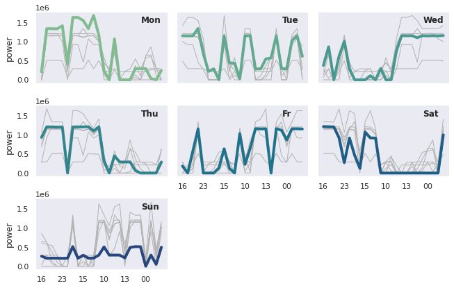
These last visualizations emphasize the fact that power usage is highly dependent on both day of week and hour of the day.
Conclusion: Energy Saving Potential
Going back to the aim of our analysis, we can propose a few directions for closer investigation:
- power usage on Monday mornings: reduce by heating a bit more on Sundays
- check for activities on Wednesday, Tuesday, and Friday noons: are there classes?
The best strategy is to flatten power usage since each drop is always followed by a strong increase. If you let the heating on a low level for the weekend, you do not need to heat like crazy on Mondays.
A Short Afterward
You can use different methods to catch patterns in your time series data, like rolling windows and aggregations. Heat maps and multiple line charts will help to uncover trends and localize data outliers.
Saving data to a database instead of storing it in .CSV files permanently has a lot of advantages:
- You do not have to create numerous folders and flood your file system.
- You have enough free space on your hard drive.
-
Your data is safer in a database than if it is saved locally.
Happy plotting!