Take a look at this half-tongue-in-cheek, half-heartbreaking website: http://www.iscaliforniaonfire.com/. Though I suspect it started out as a joke, the web page helps to illustrate — by sheer power of existence — the constant, existential threat faced by the Golden State; the state-wide wildfires can wreak havoc in countless ways, but today we want to focus on air quality. Specifically we want to look at whether carbon monoxide (CO) and/or Nitrogen dioxide (NO2) emissions rise when California is on fire, and by how much.
The full source code for this project can be found at the bottom of this page: FULL SOURCE CODE
Dataset
To begin, let’s take a look at the dataset retrieved from the EPA’s air quality system API. I was specifically hoping to look at the data during the record-breaking fires in my home state that stretched from Aug – Sept 2020. Unfortunately, that data has not yet been processed and shared, so we will make due with a dataset for the year of 2019. I also realized half way through this blog that simply looking at the Carbon Monoxide data was not enough; I ended deciding to grab all NO2 data for 2019 as well.
Once I registered my email address and received my API key, I made the following query using their services:
https://aqs.epa.gov/data/api/sampleData/byCounty?email=yourEmailAddress&key=yourAPIKey¶m=42101&bdate=20190101&edate=202190131&state=06&county=037
The above request is submitting a query for my specific location, a specific range of time, and a specific data parameter (CO). Because the data returned by these API calls are rather hefty, the time range is limited to about six weeks of data or so (~25 MB JSON file). This unfortunately meant that I couldn’t simply ingest all relevant data into GridDB in one go; I needed to work in chunks to get all data inserted properly.
Inserting Data Into GridDB
Of course, we assume you already have GridDB installed and running. If you do not, please follow along with our Quick Start guide: https://docs.griddb.net/gettingstarted/introduction/. For simplicity’s sake, we will be using Python for this blog. The JSON returned by their API looked like this:
{
      "state_code": "06",
      "county_code": "037",
      "site_number": "1602",
      "parameter_code": "42101",
      "poc": 1,
      "latitude": 34.01029,
      "longitude": -118.0685,
      "datum": "NAD83",
      "parameter": "Carbon monoxide",
      "date_local": "2020-06-21",
      "time_local": "00:00",
      "date_gmt": "2020-06-21",
      "time_gmt": "08:00",
      "sample_measurement": 0.2,
      "units_of_measure": "Parts per million",
      "units_of_measure_code": "007",
      "sample_duration": "1 HOUR",
      "sample_duration_code": "1",
      "sample_frequency": "HOURLY",
      "detection_limit": 0.5,
      "uncertainty": null,
      "qualifier": null,
      "method_type": "FRM",
      "method": "INSTRUMENTAL - NONDISPERSIVE INFRARED PHOTOMETRY",
      "method_code": "158",
      "state": "California",
      "county": "Los Angeles",
      "date_of_last_change": "2020-09-22",
      "cbsa_code": "31080"
}
Most of this data is superfluous for our specific purposes; I simply made a Time Series Container which takes the sample measurement and the time.
conInfo = griddb.ContainerInfo("LosAngelesCO",
                        [["timestamp", griddb.Type.TIMESTAMP],
                        ["CO", griddb.Type.DOUBLE]],
                        griddb.ContainerType.TIME_SERIES, True)
conInfo = griddb.ContainerInfo("LosAngelesNO2",
[["timestamp", griddb.Type.TIMESTAMP],
["NOtwo", griddb.Type.DOUBLE]],
griddb.ContainerType.TIME_SERIES, True)Inserting these specific data points into our DB is very simple with Python. First, I used a the JSON library to fulfill an HTTP request and grab the relevant info:
def getJSON(bdate, edate):

    url = "https://aqs.epa.gov/data/api/sampleData/byCounty?email=EMAILADDRESS&key=APIKEY¶m=42602&bdate="+bdate+"&edate="+edate+"&state=06&county=037"

    payload={}
    headers = {}

    response = requests.request("GET", url, headers=headers, data=payload)

    return (response.text)
From there, it was a matter of actually inserting into my database. And please note, I manually and painstakingly went in and changed the beginning and end dates to insert all relevant data from 2019, month by month. I could have figured out a for-loop to range over each month without any going into any overlap, but it was late and I was tired and this tedious labor seemed easier at the time. Do not judge me.
def writeContainer():

    factory = griddb.StoreFactory.get_instance()
    gridstore = factory.get_store(host='239.0.0.1', port=31999, cluster_name='defaultCluster', username='admin', password='admin')

    #Create Collection
    conInfo = griddb.ContainerInfo("LosAngelesNO2",
                        [["timestamp", griddb.Type.TIMESTAMP],
                        ["notwo", griddb.Type.DOUBLE]],
                        griddb.ContainerType.TIME_SERIES, True)

    rows = []
    data = getJSON('20191201', '20191231')
    data = json.loads(data)
    for p in data['Data']:
        date_time_str = p['date_local'] + ' '+  p['time_local']
        date_time_obj = datetime.datetime.strptime(date_time_str, '%Y-%m-%d %H:%M')
        row = [None, None]
        row[0] = date_time_obj.timestamp()
        row[1] = p['sample_measurement']
        rows.append(row)

    con = gridstore.put_container(conInfo);
    con.set_auto_commit(False)
    con.multi_put(rows)
    length = str(len(rows))
    con.commit()
    print("Wrote "+ length + " records")
Okay, great, so now we’ve got hourly data of both CO and NO2 in Los Angeles County. Now here comes the fun part: visualizing with Tableau!
Tableau
Installation and Basic Usage
To install Tableau along with the GridDB Connector, please take a look at our previous blog here: Getting Started with the GridDB JDBC Tableau Connector Plugin. In that blog you will learn the absolute basics of getting your precious data loaded into Tableau.
Visualizing Data
Monthly CO
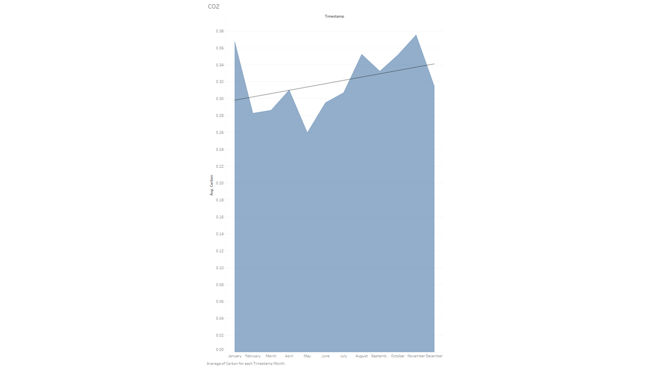
The first data set I looked into via Tableau was the Los Angeles Carbon Monoxide levels on a monthly level. Fire season is typically August and beyond so I expected to see a huge uptick during this time span. So I entered those two metrics (Avg CO and Time) into the top portion of the view page:
And this is what the chart that was produced looked like:
While the data does indeed show that co emissions go up above average during these months, I was a bit surprised it wasn’t that much higher. I would also like to point out that I included here what is called a linear trend line (the big line intersecting horizontally). It helps show the general direction of the data as the year progresses.
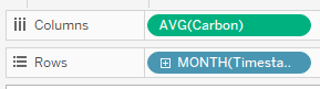
Monthly NO2
While gathering the data for this blog initially, I had learned that while wildfires do indeed emit carbon monoxide, the really damaging gas was NO2 (Nitrogen Dioxide). So let’s take a look at that graph:
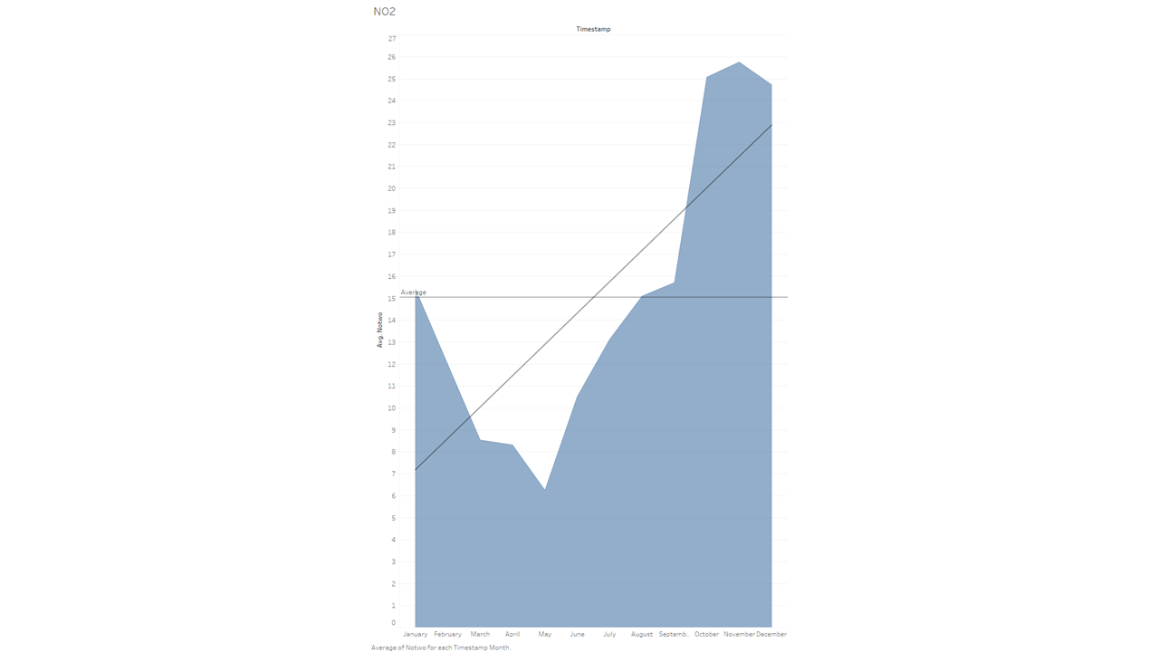
Wow! Talk about a dramatic increase! While I did expect a large difference between the spring months and “fire season”, it is still staggering — and quite frankly a bit scary — to see the data so nakedly laid out.
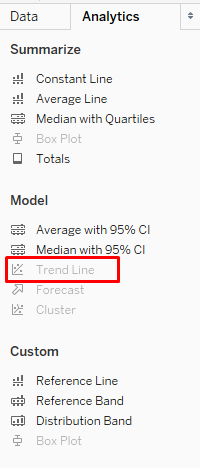
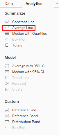
Another quick tidbit I’d like to add here: this chart also contains an “average” line throughout the chart. I think it helps to show how much higher the latter months go over the norm. You can find that setting in a similar spot to the trend line:
Misc Carbon Monoxide Data
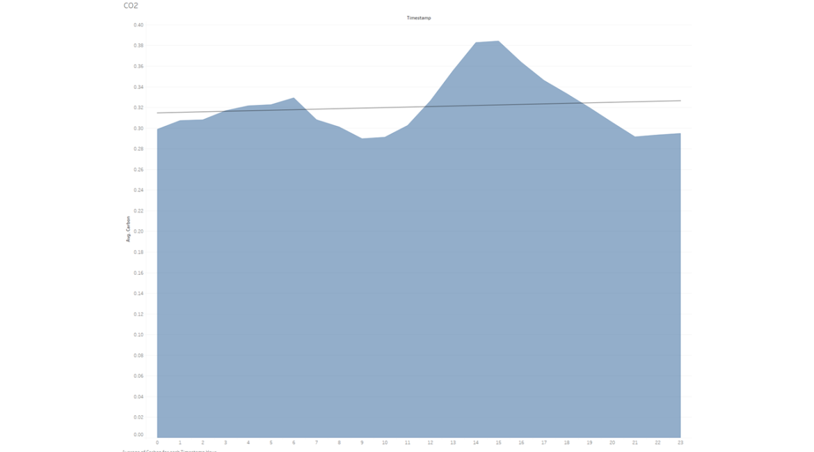
After taking a look at the hourly Average CO and NO2 data per distilled into a monthly basis, I decided maybe looking at the hourly data could be fun as well. Specifically, I knew that vehicles are a big omitter of CO emissions, so let’s take a look at that.

And here’s that same dataset, but visualized in a different way:
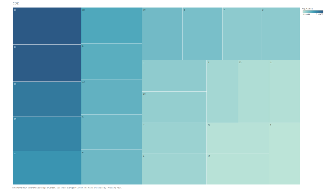
What this dataset is showing us that, if you take ALL data points from the entire year of 2019, on average, hour 14 and hour 15 (2pm and 3pm) have the highest/worst emissions of carbon. This totally matches our preconceived notions of what what we consider normal “traffic hours”, but it does skew a tad earlier than I had expected. Though that could be explained by remembering that the dataset includes weekends and those data could skew the normal “traffic bump” a bit.
When the GridDB connector is able to add JOINs, I think it would be very interesting to compare a carbon emissions from April-July 2020 vs 2019. I’d imagine the difference is a bit mind-melting.
Conclusion
Well, that concludes our look at the Nitrogen Dioxide and Carbon Monoxide data that is so generously gathered and offered for analysis by the EPA. If you would have liked to see some other data analyzed, please do not hesitate to contact us and let us know.