About the Dataset
BRFSS stands for Behavioural Risk Factor Surveillance system. The objective of the BRFSS is to assess behavioural risk factors for non-institutionalized adults (age>=18) residing in the United States. To collect these health instances, a total number of 50 states within the US orchestrates telephone-based surveys which selects a random adult from the household.
Based on this information, we could say that Random Sampling is followed. Therefore, the conclusion obtained from this sample could be generalized to a larger and relevant population.
However, since we’re conducting surveys, which means it would also depend on the adult whether or not to volunteer, we can not say with certainty that the assignment is completely random. Establishing a causal relation between two parameters based on this data, thus, would not be appropriate.
There are a total of 330 parameters in the dataset. These parameters are responsible for noting down the age, physical health, mental health, medication, etc. The total number of instances present in the dataset are 4,91,775.
We would be using this public dataset for the year 2013 which can be downloaded here from Kaggle. The website has also provided more recent versions of this dataset from 2015 both in CSV and JSON formats, nevertheless, this tutorial would be extensible to any dataset.
Environment Setup
The following tutorial is carried out in RStudio (R version 4.0.2) on Windows 10. However, the syntax would remain the same irrespective of the Operating System used.
Install and Load the necessary packages
install.packages("dplyr")
install.packages("ggplot2")
library(dplyr)
library(ggplot2)
Load the Dataset
The dataset needs to be in the same directory as your R Working directory, otherwise, the below-mentioned command would output an error message.
load("brfss2013.RData")
.RData is an extension of datasets particularly belonging to R.
Troubleshooting
Get your working directory using:
getwd()
In case your working directory is different from the location of your dataset, set your working directory using the following command. Alternatively, move the dataset to the above output location.
setwd(dir)
Where dir is a character string specifying your desired path. For more information on how to set your path, see here.
An easy alternative – GridDB
The above-mentioned dataset is nearly 600 MB. While this may not seem a big deal, uploading such an enormous amount of data on RCloud does not result in a fruitful outcome. Instead, the server takes a lot of time uploading this dataset due to which it eventually times out. This chunk of information is important because the tutorial we have carried out needs to be done using your local system. This does not leave room for scalability, especially if you’re working in an organization which more often than not involves collaborating with multiple people.
To solve this problem, we have a highly scalable and just the right solution for your data – GridDB. GridDB is a highly scalable, reliable and relatively faster tool for your data storage. It also supports a number of programming languages including Java, C, Python, etc.
Check out our quick tutorial on setting up Python-GridDB client here. Alternatively, you can manually download this open-source database especially optimized for IoT and Big Data.
Filtering and Visualization
Our foremost research focus for this tutorial is to visualize the distribution of a person’s general health and whether or not it varies with a person’s marital status. This research question would focus on two parameters from this dataset: General Health parameter (denoted by genhlth in the dataset) and the marital status (denoted by marital in the dataset).
General Health of a person is subdivided into 5 main categories – Excellent, Very Good, Good, Fair, Poor and for some of the entries, this information might not be available (<NA>).
Similarly, the possible values for the marital status are: Married, Divorced, Widowed, Separated, Never Married, or a member of an unmarried couple. Again, some of the participants might not have responded and those entries would have been filled with <NA>.
Let us first review what is the distribution of people under the general health category.
brfss2013 %>%
    group_by(genhlth) %>%
    summarise(count = n())
Gives the following output:
## # A tibble: 6 x 2 ## genhlth count #### 1 Excellent 85482 ## 2 Very good 159076 ## 3 Good 150555 ## 4 Fair 66726 ## 5 Poor 27951 ## 6 1985
We can see that 1985 people have not responded to the question at hand. Hence, we will be filtering out such entries.
brfss2013 %>%
  filter(genhlth != "NA") %>%
  group_by(genhlth) %>%
  summarise(count = n())
The output should look something like this now.
## # A tibble: 5 x 2 ## genhlth count #### 1 Excellent 85482 ## 2 Very good 159076 ## 3 Good 150555 ## 4 Fair 66726 ## 5 Poor 27951
We shall now have a look at the other parameter of interest: Marital Status. Again, we will be filtering out any missing entries.
brfss2013 %>%
  filter(marital!="NA") %>%
  group_by(marital) %>%
  summarise(count = n())
## # A tibble: 6 x 2 ## marital count #### 1 Married 253329 ## 2 Divorced 70376 ## 3 Widowed 65745 ## 4 Separated 10662 ## 5 Never married 75070 ## 6 A member of an unmarried couple 13173
Now, for visualizing every possible combination, we would need to aggregate this data based on these two parameters somehow. For this purpose, the dplyr library offers a function count which will be used to count people with excellent health and compare their marital status.
agg = count(brfss2013, genhlth, marital) %>%
  filter(genhlth!="NA", marital!="NA")
Let’s see what agg has stored.
head(agg)
-->
##     genhlth                         marital     n
## 1 Excellent                         Married 49682
## 2 Excellent                        Divorced 10049
## 3 Excellent                         Widowed  7007
## 4 Excellent                       Separated  1221
## 5 Excellent                   Never married 14419
## 6 Excellent A member of an unmarried couple  2364
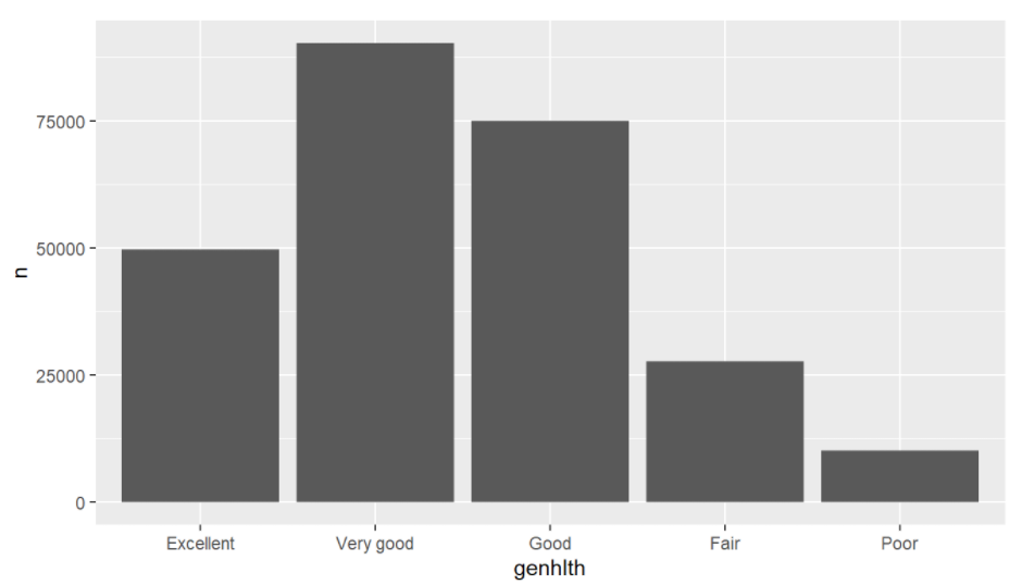
Now that we have the count, let’s see the proportion of married men/women to their health.
ggplot(agg %>%
         filter(marital=="Married")) + geom_bar(aes(x = genhlth, y = n), stat = "identity")
The above command gives the following output:
Similarly, you could visualize this proportion for people with marital status other than married. Go ahead, plot some fancy plots with this simple code!
Conclusion
In this tutorial, we analyzed the public BRFSS dataset using the R programming language. We discussed some limitations of using a huge dataset on your local system and an easy, much faster alternative.
Following our discussion, we also saw how to filter out the missing information in R after which we plotted a Bar plot based upon two parameters using the ‘ggplot’ library.
If you have any questions about the blog, please create a Stack Overflow post here https://stackoverflow.com/questions/ask?tags=griddb .
Make sure that you use the “griddb” tag so our engineers can quickly reply to your questions.