Introduction
Data Analysis is the process of gaining meaningful data from raw data. Without proper analytics, any data set will be simply a bunch of information. In this article, we will learn how to transform structured data into meaningful data using data visualization methods.
In the previous article, we learned how to store data inside a database in a structured manner and also how to retrieve data from the database. This article will focus on what we can achieve through data visualization and how to obtain data from the database to match our analytics needs.
Prerequisites
We will use Python as the programming language and utilize pandas, matplotlib, and folium libraries for data analysis and visualization for the purpose of this tutorial. The GridDB Python connector will be used to interact with the database.
Additionally, we need to have a GridDB instance configured, and all the required collections created from the Formula 1 World Championship (1950 – 2020) data set obtained from Kaggle.
Data Structure
Following are the collections within the GridDB instance, which we will be using for data visualization.
| Field Name | Data Type (GridDB) | Notes |
|---|---|---|
| CircuitID | INTEGER | Curcuit Identifier |
| CircuitRef | STRING | |
| name | STRING | |
| location | STRING | City where the circuit is located |
| country | STRING | |
| lat | FLOAT | |
| lng | FLOAT | |
| url | String | URL for Wiki Article |
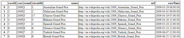
Races collection
| Field Name | Data Type (GridDB) | Notes |
|---|---|---|
| raceid | INTEGER | Race Identifier |
| year | STRING | |
| round | STRING | |
| circuitid | INTEGER | City where the circuit is located |
| name | STRING | |
| raceTime | TIMESTAMP | |
| url | STRING | URL for Wiki Article |
Basic Data Presentation
Before trying to analyze or visualize data, first, we need to retrieve them from the database. So let’s have a small refresher on how to retrieve data. GridDB provides the TQL query language to perform database queries.
For data retrieval, we need to create the connection, get the collection, and perform the queries on the collection objects. The following code block demonstrates how to obtain the containers within the database.
$ sudo yum -y install griddb_nosql griddb-c-clientfactory = griddb.StoreFactory.get_instance()
try:
# Create gridstore object
gridstore = factory.get_store(
host='239.0.0.1',
port=31999,
cluster_name='defaultCluster',
username='admin',
password='admin'
)
# Define the container names
circuits_container = "circuits"
races_container = "races"
# Get the containers
circuits_data = gridstore.get_container(circuits_container)
races_data = gridstore.get_container(races_container)
except griddb.GSException as e:
for i in range(e.get_error_stack_size()):
print("[", i, "]")
print(e.get_error_code(i))
print(e.get_location(i))
print(e.get_message(i))Now we have data in two different objects. We need to convert these data into a proper format so that they can be easily analyzed. This is where the “Pandas” library comes in, and we will convert the data into Pandas DataFrames.
For that, we need to write a query to select all the data within the two containers, create a list from those data and then convert that list into a DataFrame. Following is a simple TQL query to achieve that.
# Select all rows from circuits_container
    query = circuits_data.query("select *")
    rs = query.fetch(False)

    # Create a list
    retrieved_data= []
    while rs.has_next():
        data = rs.next()
        retrieved_data.append(data)

    # Convert the list to a pandas data frame
    circuits_dataframe = pd.DataFrame(retrieved_data, columns=['circuitId', 'circuitRef', 'name', 'location', 'country', 'lat', 'lng', 'url'])

    # Select all rows from races_container
    query = races_data.query("select *")
    rs = query.fetch()

    # Create a list
    retrieved_data= []
    while rs.has_next():
        data = rs.next()
        retrieved_data.append(data)

    # Convert the list to a pandas data frame
    races_dataframe = pd.DataFrame(retrieved_data, columns=['raceID', 'year', 'round', 'circuitId', 'name', 'url', 'raceTime'])
Creating an HTML Table
One of the simplest ways to represent data is through a table. The panda’s library provides the “to_html†function to convert a data frame into an HTML table.
races_dataframe.to_html('races_data.html')The above function will create a simple HTML table. However, we need to present the data inside the table in a pleasing manner. To accomplish this, let’s add some formatting to the data frame and embed the created HTML table within a proper HTML page with an attached style sheet.
# Create the HTML Page Structure
# Include the Style Sheet
html_string = '''
<html>

    <link rel="stylesheet" type="text/css" href="style.css"/>
    <body>
    <h1>Races Collection</h1>
    {table}
    </body>
</html>
'''

# Rename the Columns Headers
races_dataframe.rename(columns={'raceId': 'Race ID', 'circuitId': 'Circuit ID', 'raceTime': 'Race Time'}, inplace=True)

# Convert the Headers to Uppercase
races_dataframe.rename(str.upper, axis='columns', inplace=True)

# Write to HTML File
with open('races_table.html', 'w') as f:
    # Pass the DataFrame to the HTML String
    f.write(html_string.format(table=races_dataframe.to_html(index=False, render_links=True, escape=False, justify='left', classes='htmlfilestyle')))
CSS File:
.htmlfilestyle {
    font-size: 11pt;
    font-family: Arial;
    border-collapse: collapse;
    border: 1px solid silver;
}

.htmlfilestyle td, th {
    padding: 5px;
    font-size: 12pt;
}

.htmlfilestyle tr:nth-child(even) {
    background: #E0E0E0;
}

.htmlfilestyle tr:hover {
    background: silver;
    cursor: pointer;
}
This will provide us with a formatted HTML table that offers a better representation of data using the given data frame.
Using TQL
We can further refine the data set retrieved from the database by utilizing the TQL query language offered by GridDB. What we can analyze or visualize depends on the structure and the values of the data set. The logical, comparison, string, numerical, array, spatial, and time operators in GridDB allow us to query the database effectively to obtain the required data. Let’s take a look at a couple of TQL statements that can be used to filter the data set.
races collection
Get only the races in Monaco Grand Prix
races_data.query("select * where name = 'Monaco Grand Prix'")
Get the races between the years 2010 and 2015
# Using year field query = races_data.query("select * where year >= 2009 AND year <= 2015 ORDER BY raceTime DESC")
# Using raceTime field races_data.query("select * where raceTime >= TIMESTAMP('2010-01-01T00:00:00.000Z') AND year <= TIMESTAMP('2015-12-31T23:59:59.000Z')")
Get the races excluding the past 5 years.
# TIMESTAPADD function is used to exclude 5 years from the current time races_data.query("select * where raceTime < TIMESTAMPADD(YEAR, NOW(), -5)")
Count the number of races that happened during 1990
query = races_data.query("select COUNT(*) where year = 2009")
#query = circuits_data.query("select COUNT(*)")
rs = query.fetch(False)

# Obtain the calculated value
while rs.has_next():
    data = rs.next()
    count = data.get(griddb.Type.LONG)
    print(count)
Limit the number of records to 100 races_data.query("select * LIMIT 100")
circuits collection
Get the race circuits located in Germany circuits_data.query("select * where country = 'Germany'")
Calculate the total number of circuits
circuits_data.query("select COUNT(*)")
rs = query.fetch(False)

# Obtain the calculated value
while rs.has_next():
    data = rs.next()
    count = data.get(griddb.Type.LONG)
    print(count)
Get the race circuits located in UK, France, and Spain circuits_data.query("select * where country = 'UK' OR country = 'France' OR country = 'Spain' ORDER BY name DESC")
Get circuits that have “Park†or “Speedway†in their names circuits_data.query("select * where name LIKE '%Park%' OR name LIKE '%Speedway%' ORDER BY name DESC")
When it comes to extracting data via TQL, there are two limitations. One is the inability to select specific columns like in SQL, except for aggregation operations. The other is TQL lacking support for statements like GROUP BY, HAVING, DISTINCT, and JOIN.
However, GridDB supports all the above statements through their SQL interface, overcoming the limitations imposed by TQL. Another method that can be used is utilizing Pandas DataFrames. Pandas offers the functionality to select specific columns, join data frames, and group columns, essentially eliminating the drawbacks mentioned above. Combining GridDB with Pandas library vastly expands what we can achieve through the data, leading to greater analytics capabilities. For more information about TQL, please refer to its official documentation.
Creating Charts using Pandas
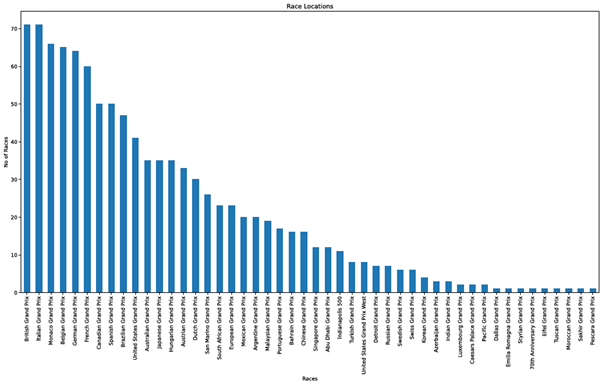
Pandas offers inbuilt functionality to make plots using Data Frames. Let’s look at how to create a bar chart to show the number of races held in each venue.
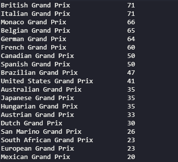
The value_counts function enables us to count the unique values of a particular column, which is the “name” column of the dataset in this instance. Then, we can create a separate variable to store the counted data, and using that, we can plot a bar chart with the figsize, title, and x,y labels options. The kind parameter is used to select the chart type. The charts will be generated using matplotlib library as the default backend.
# Print the count
print(races_dataframe['name'].value_counts())

# Obtain the count of each venue
plotdata = races_dataframe['name'].value_counts()

# Plot the data as a bar chart
plotdata.plot(kind="bar", figsize=(20,10), title="Race Locations", xlabel="Races", ylabel="No of Races")
Output – Print Statement
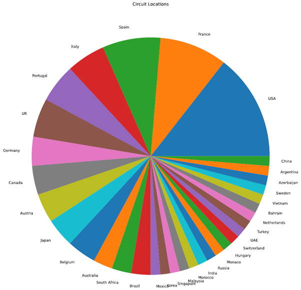
Next, we will create a pie chart using the circuit data set. Using the country column, we can analyze the number of race circuits distributed across each participating country. To create a pie chart, we have to configure the chart kind as “pie.â€
# Print the count
print(circuits_dataframe['country'].value_counts())

# Obtain the count of each venue
plotdata = circuits_dataframe['country'].value_counts()

# Plot the data as a pie chart
# Disable the legend and ylabel
plotdata.plot(kind="pie", figsize=(30,15), title="Circuit Locations", legend=False, ylabel="")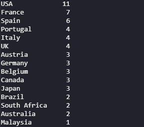

As you can see from the above examples, the data can be visualized by plotting the data frame. This is only a subset of what we can achieve through plotting, and there’s the ability to refine this further using additional filters and formatting. Have a look at the official documentation for more information about the plotting function.
Create a Table using Matplotlib
In the previous example, we learned how to create an HTML table using pandas data frames. However, if you need more granular control over the table, it’s better to generate the table via the matplotlib library.
For this example, we will query 10 records from the GridDB database in the “circuits†collection and create a data frame using those data.
circuits_data.query("select * LIMIT 10")
Using the data frame as the base data set, we can create the table as shown in the following code block. There, we create a plot object with subplots, assign the data frame values to the required columns (cellText and colLabels) and formatting. Then add the title, footer, and finally save the table as a png image file.
# Create the plot object
fig, ax =plt.subplots(
    figsize=(20, 6),
    linewidth=2,
    tight_layout={'pad':1})

# Turn off the axis
ax.axis('off')
# Set background color
ax.set_facecolor("#ffffff")

table = ax.table(
    # Define cell values
    cellText=circuits_dataframe.values,
    # Define column headings
    colLabels=circuits_dataframe.columns,
    # Column Options - color and width
    colColours=['skyblue']*8,
    colWidths=[0.03,0.06,0.1,0.05,0.04,0.06,0.06,0.135],
    loc="center")

# Set the font size
table.auto_set_font_size(False)
table.set_fontsize(10)

# Scale the table
table.scale(1.8, 1.8)

# Add title
plt.suptitle("Circuits Collection", size=25, weight='light')

# Add footer
plt.figtext(0.95, 0.05, "GridDB Data Collection", horizontalalignment='right', size=6, weight='light')

# Draw and save the table as a png
plt.draw()
plt.savefig('table.png',dpi=150)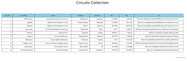
Matplotlib is the most widely used Python library for data visualization. It can be used to create simple tables and charts to complex 3D graphs while providing complete control over each aspect of the visualization. You can refer to more information about Matplotlib from the matplotlib documentation.
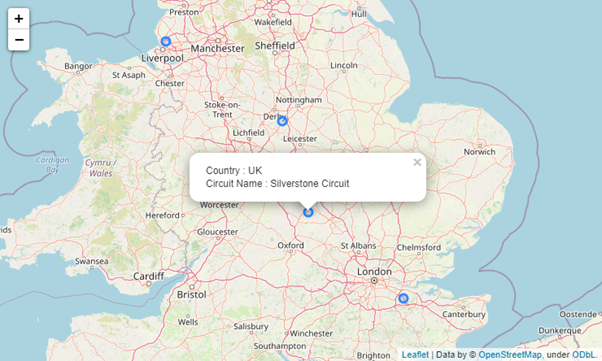
Creating Map using Folium Library
Folium is a Python visualization library that can be used to create maps. It combines Python with leaflet.js to create maps. This combination enables users to bind data that has been transformed via Python to an interactive leaflet map. In this section, let’s map the locations of the race circuits in a world map using latitude and longitude data obtained from the “circuits” collection in GridDB.
In the following code block, we have created a world map object and a cluster to include all the circuit locations using the MakeCluster function. Then we iterate the data frame and extract the latitude(lat) and longitude(lng) to create individual markers for each location and add them to the cluster. Additionally, we extract the name and country data in each iteration to include in a clickable popup.
# Create map object
world_map= folium.Map()

# Create marker cluster
marker_cluster = MarkerCluster().add_to(world_map)

# Create marker for each coordinates
for i in range(len(circuits_dataframe)):
        # Get latitude and longitude from data frame
        latitude = circuits_dataframe.iloc[i]['lat']
        longitude = circuits_dataframe.iloc[i]['lng']

        # Set circle radius
        radius=5

        # Create the popup
        popup_text = """Country : {}<br /> Circuit Name : {}<br />"""
        popup_text = popup_text.format(
                                        circuits_dataframe.iloc[i]['country'],
                                        circuits_dataframe.iloc[i]['name'])
        test = folium.Html(popup_text, script=True)
        popup = folium.Popup(test, max_width=250,min_width=250)

        # Add marker to marker_cluster
        folium.CircleMarker(location=[latitude, longitude], radius=radius, popup=popup, fill =True).add_to(marker_cluster)

# View the Map
world_map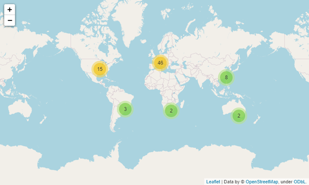
Folium is a powerful yet simple library that can be easily adapted to visualize data on a map. For more information, check out the folium documentation to begin your journey of data visualization through maps.
Conclusion
In this article, we have covered the basics of data visualization. By combining the data retrieved from GridDB collections, we analyzed the data and then created tables, charts, and maps to visualize them to understand those data better. Pandas, matplotlib, and folium are only a few of the powerful libraries available in Python to analyze and visualize data. Data analytics is a fascinating subject where one could spend his whole life learning it. I hope that this article tempted you to dive deep into the world of data analytics and data visualization.
Source Code
Here is the source code SOURCE CODE
If you have any questions about the blog, please create a Stack Overflow post here https://stackoverflow.com/questions/ask?tags=griddb .
Make sure that you use the “griddb” tag so our engineers can quickly reply to your questions.