
In this blog post, we’ll show how easy it is to visualize data stored in GridDB with Grafana.
Setup Grafana
To start off with, Grafana has good installation documentation here but the basic procedure for CentOS 7 is as follows:
Create the Grafana yum repository file:
$ sudo cat > /etc/yum.repos.d/grafana.repo << EOF
> [grafana]
> name=grafana
> baseurl=https://packages.grafana.com/oss/rpm
> repo_gpgcheck=1
> enabled=1
> gpgcheck=1
> gpgkey=https://packages.grafana.com/gpg.key
> sslverify=1
> sslcacert=/etc/pki/tls/certs/ca-bundle.crt
> EOF
Install the packages with yum, if prompted to verify GPG keys, respond with “y”:
$ sudo yum -y install grafana
Start Grafana and configure it to start on boot:
$ sudo /bin/systemctl enable grafana-server.service
$ sudo /bin/systemctl start grafana-server.service
You can now head over to http://
Set up GridDB Grafana-JSON Connector
We’ve created a simple Python Flask application that connects to GridDB and provides endpoints that are accessed from by the Grafana JSON Data Source plugin. You can download it here: GridDB Grafana JSON Connector (1884 downloads ) . For the sake of simplicity, there are a few constraints without modifying the connector:
- Can only query time series containers.
- The time series container’s key must be named “timestamp”.
First, install GridDB’s Python Client. We wrote a blog about it here.
After unzipping the file:
$ cd griddb_grafanajson_connector
$ nohup app.py &
The connector will log to /tmp/griddb_grafanajson_connector.log and is accessible from via http://
Install Grafana JSON Data Source plugin
Grafana JSON Data Source Plugin can be installed with the grafana-cli tool. Restarting Grafana is required after.
$ sudo grafana-cli plugins install simpod-json-datasource
$ sudo systemctl restart grafana-server.service
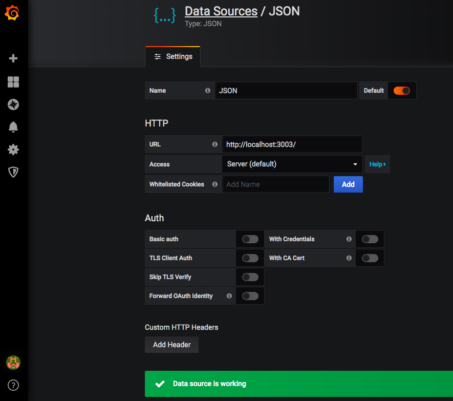
Now, navigate to your Grafana installation in a web browser and select “Add Datasource”. If JSON isnt in the list, you can search for it and select it as the data source you wish to add.
Enter http://localhost:3003 into the URL field and click “Save & Test”.
Create a Data Visualization
Now select “New Dashboard” from the Grafana homepage and a new dashboard will open with a new panel. Within the new panel, select “Add Query”.
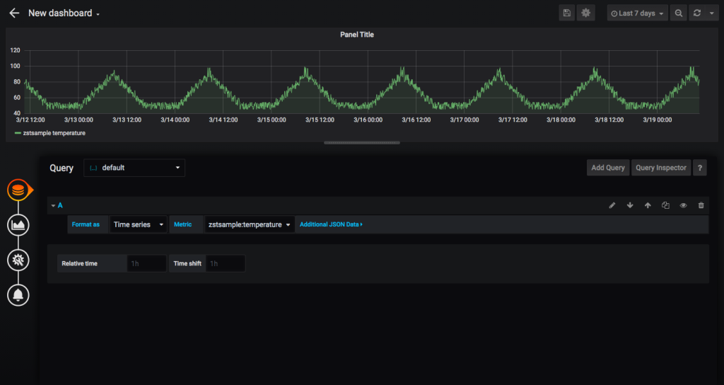
Now you can add metrics to the panel, the format the connector expects is
Add Annotations
Now if you want to add an annotation to your data visualizations, go to “Dashboard Settings” (the gear icon in the title) and then “Annotations” and “New Annotation”.
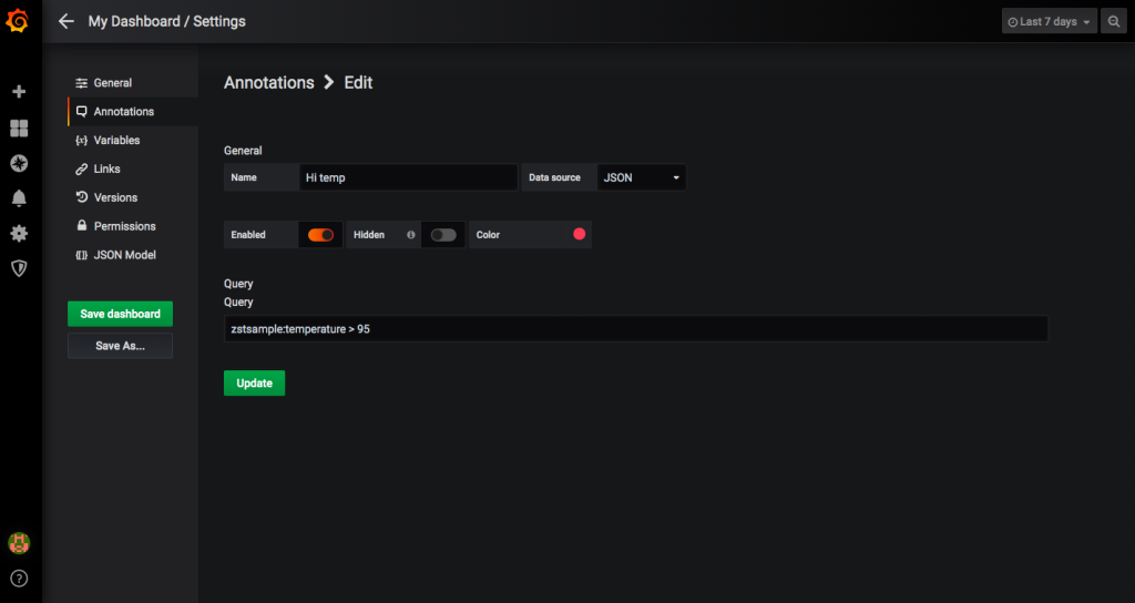
Create a name for your annotation, select “JSON” as the data source and input a query. Like the metrics, the format is “
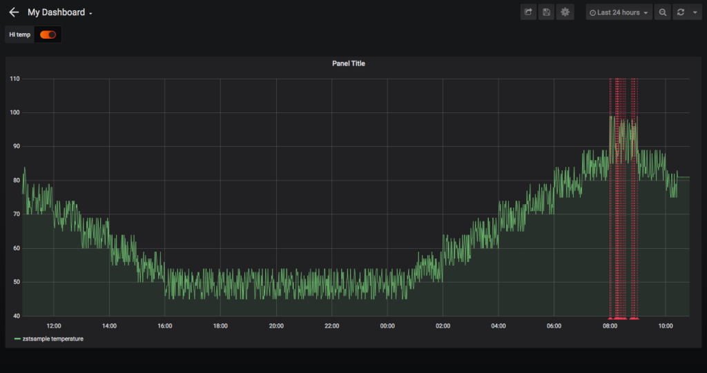
The annotated data visualization now looks like this:
Visualize Data Aggregations
Our data set, from an environmental sensor, has a motion field that is set to True when the sensor detects motion and false otherwise. We could plot each motion event easily, but seeing the number of motion events per hour is an easier to quantify visualization. Using GridDB’s aggregations and multi query, we add a custom function to the GridDB Grafana JSON Connector:
def count_motion(container, start, end ):
    results=[]
    cn = gridstore.get_container(container)
    i = 0;
    lsQ=[]
    datapoints=[]
    interval_start= start - start%(3600*1000)
    interval_end= start + 3600*1000
    intervals=[]
    while interval_end < end:
        tql = "select count(*) where timestamp > TO_TIMESTAMP_MS("+str(interval_start)+") and timestamp < TO_TIMESTAMP_MS("+str(interval_end)+") and motion"
        print("AGG:"+tql)
        query = cn.query(tql)
        i=i+1
        lsQ.append(query)
        interval_start = interval_start + 3600*1000
        interval_end = interval_end + 3600*1000

    gridstore.fetch_all(lsQ)

    interval=start
    for q in lsQ:
        rs = q.get_row_set()
        rs.timestamp_output_with_float = True
        columns = rs.get_column_names()

        if rs.has_next():
            row = rs.next()
            datapoints.append([ row.get(griddb.Type.LONG), interval])

        else:
            datapoints.append([0, interval])

        if interval == start:
            interval=interval - start%(3600*1000) + 3600*1000
        else:
            interval=interval + 3600*1000

    datapoints.append([datapoints[len(datapoints)-1][0], end])

    return {'target': '%s' % (container+" motion count"),  'datapoints': datapoints }
This function iterates for every hour of the selected time range, counting the number of motion events. To enable the function, we alter the main query function with an if-statement:
if column == "count_motion":
    results.append(count_motion(container, start, end))
else:
    results.append(query_column(container, column, freq, start, end))
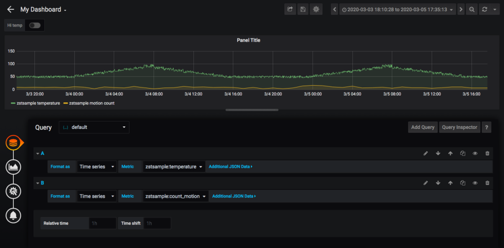
Adding another query to the panel, we can see just how much traffic is in a given area at a certain time:
We've shown a variety of data visualizations and -- given how easy it is to modify the connector -- you can create ever more complex visualizations using GridDB aggregations and queries.