Introduction
Data is general is a large heap of numbers, to a non-expert these numbers may be more confusing than they are informative. With the advent of big data, even experts have a difficult time making sense of data. This is where visualization comes in. Data visualization can be thought of as the graphical representation of information. Visual elements like charts, graphs and maps are often key to understanding trends in data and making data driven decisions. A good visualization is often the best way to communicate results , after all, “a picture is worth a thousand wordsâ€. In this post we will look into some key elements of visualization using python and GridDB.
Before we can get into visualization, it is important to have a database that can handle big data easily. This is where GridDB comes in. GridDB is an open source time series database optimized for IoT and Big Data. GridDB is high, scalable, reliable, ensures high performance and is optimised for IoT. Moreover, GridDB is easy to use with a number of popular programming languages like C, python and java. Installation is pretty simple, and is well documented here. To checkout the python-gridDB client please refer to this video.
In this post we will create a few simple visualizations using the matplotlib library in python.
Setup
Quick setup of GridDB Python Client on Ubuntu 20.04:
1. Install GridDB
Download and install the deb from here.
2. Install C client
Download and install the Ubuntu from here.
3. Install requirements
A) Swig
wget https://prdownloads.sourceforge.net/swig/swig-3.0.12.tar.gz
tar xvfz swig-3.0.12.tar.gz
cd swig-3.0.12
./configure
make
sudo make install
B) Pcre
sudo apt-get install -y libpcre2-dev C) Install python client
wget
https://github.com/griddb/python_client/archive/0.8.1.tar.gz

tar xvzf 0.8.1.tar.gz
Make sure you have python-dev installed for the corresponding python version. If you are using python 3.6 then you
may need to add the repository first
sudo add-apt-repository ppa:deadsnakes/ppa Then
sudo apt-get install python3.6-dev
Installing the python-client
cd python_client-0.8.1/
make
We also need to point to the correct locations
export LIBRARY_PATH=$LIBRARY_PATH:/usr/share/doc/griddb-c-client [insert path to c_client]
export  PYTHONPATH=$PYTHONPATH:[insert path to python_client]
export LIBRARY_PATH=$LD_LIBRARY_PATH:[insert path to c_client/bin]
Python libraries
We will use python 3.6 for this post. Installing matplotlib, numpy, statsmodel and pandas is a simple pip install.
pip install matplotlib
pip install numpy
pip install pandas
pip install statsmodels
Now we can get to the visualization .
GridDB provides a nice interface to access time series data. We can simply connect to a GridDB cluster and then dump all the data to a pandas dataframe. This post goes into the details of how to access data from a GridDB cluster using python. For a quick reference, we can simply declare a GridDB cluster and perform sql queries on it. For example,
query = ts.query("select * where timestamp > TIMESTAMPADD(HOUR, NOW(), -6)")
Data Analysis and Visualization
Step 1: Downloading Dataset
We will use a publicly available dataset from Kaggle. For this post we have picked the shampoo sales data. This dataset contains sales of shampoo over a three year period at the month level. Thus, the two columns in this dataset are sales and month-year.
Step 2: Importing Libraries
We first import relevant libraries i.e pandas for loading the dataset, matplotlib for visualizations and statsmodel for some time series analysis. The plot object in matplotlib is called pylot which we import as plt. We will talk about the time series import in more detail later in the post.
import pandas as pd
from matplotlib import pyplot as plt
from statsmodels.tsa.seasonal import seasonal_decompose
Step 3: Data Loading and Processing
First we load the data. For this we use the read_csv functionality in pandas.
df = pd.read_csv("sales-of-shampoo-over-a-three-ye.csv")
Alternatively, we can use GridDB to get this dataframe.
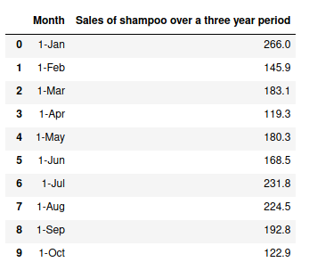
The data has two columns “Month†and “Sales of shampoo over a three year periodâ€.
Next we split the Month column which has the format year-month column into two columns year and month.
df[['year','month']] = df.Month.str.split("-",expand=True)
Now we can move on to the visualizations.
Step 4: Visualization
Line Plot
First we use a simple line plot with year-month on the x axis and sales on the y axis. The figsize determines the size of the figure, line style determines the type of line we use, markers tells us which marker to use (s for squares). The colors for the line and markers can be set using the colour and markerfacecolor option respectively and the size of the marker can be set with markersize. Furthermore we rename the labels of the plot. More references to the various arguments that can be passed to plot can be found here.
df.plot(x='Month',y='Sales of shampoo over a three year period',figsize=(15,6),linestyle='-', marker='s', markerfacecolor='b',color='y',markersize=11)
plt.xlabel('Year-Month')
plt.ylabel('Sales')
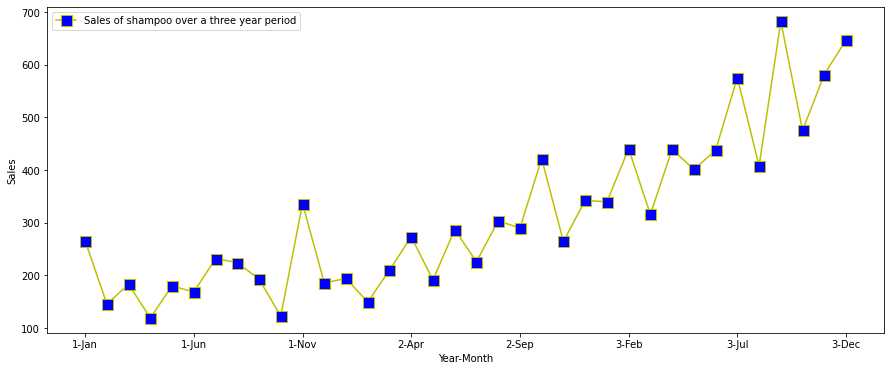
We can see that there is a year over year increase in shampoo sales, so there is a clear increasing trend in the data. We also note that the highest sales in each year are consistently around November. This indicates there is some seasonality in the datasets well.
Next we average the data over a month and see the trend.
dfm =df.groupby('month').mean().reset_index().sort_values(by=['month'])
dfm["month_number"] = pd.to_datetime(dfm["month"], format= "%b").dt.month

dfm = dfm.sort_values(by=['month_number'])

dfm.plot(x='month',y='Sales of shampoo over a three year period',figsize=(15,6),linestyle='-', marker='s', markerfacecolor='b',color='y',markersize=11)

plt.xlabel('Year-Month')
plt.ylabel('Mean Sales')
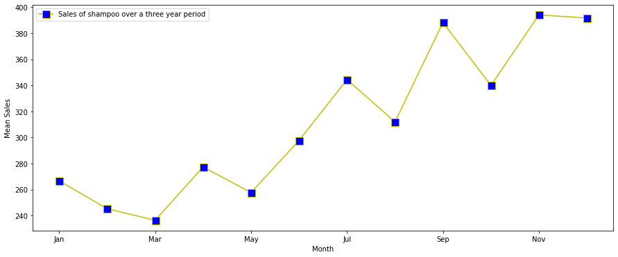
We see that the sales indeed peek around November and decline.
Another nice way of visualising this is through a 2D heat map.
x=dfm['month_number']
y=dfm['Sales of shampoo over a three year period']
plt.hist2d(x, y)
plt.xlabel('Month')
plt.ylabel('Mean Sales')

Next we plot some basic time series based charts.
Lag Plot
A lag plot is a simple plot where the y axis has a certain amount to lag (default 1) to the x axis. Lag plots can be used to check if a dataset is random or not. In time series datasets we should see a trend
pd.plotting.lag_plot(df['Sales of shampoo over a three year period'])

We can see that there is an upward linear trend with some outliers.
Autocorrelogram or Autocorrelation Plot
Autocorrelogram are another way of checking for randomness in data. We compute autocorrelation for the data values at varying time lags. The plot shows lag along the x-axis and the correlation on the y-axis. Dotted lines indicate any correlation values above those lines are statistically significant.
pd.plotting.autocorrelation_plot(df['Sales of shampoo over a three year period'])
We see that there is a positive autocorrelation in the dataset for low lags. The higher lags don't make sense as we have data for only three years. A nicer plot is provided by the statmodel library.
import statsmodels.api as sm
sm.graphics.tsa.plot_acf(df["Sales of shampoo over a three year period"])
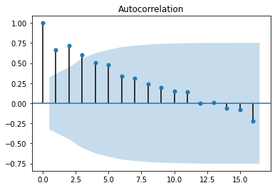
Now we can see the strong positive correlation upto lag = 12.
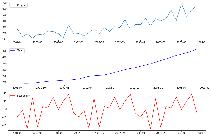
Seasonality
Here is where the statmodel ts functions will come handy. We will do a simple seasonality analysis to see the trend in data. The seasonal_decompose is used to plot the seanlity. However, ts requires the data to have a dateIndex so we create a dummy DateIndex.
df["month_number"] = pd.to_datetime(df["month"], format= "%b").dt.month
df.year = df.year.astype("int")
df["date"] = pd.to_datetime(((df.year+2000)*10000+df.month_number*100+1).apply(str),format='%Y%m%d')
df = df.set_index("date")
from statsmodels.tsa.seasonal import seasonal_decompose


decomp = seasonal_decompose(x=df[["Sales of shampoo over a three year period"]], model='additive')
est_trend = decomp.trend
est_seasonal = decomp.seasonal

fig, axes = plt.subplots(3, 1)
fig.set_figheight(10)
fig.set_figwidth(15)
axes[0].plot(df["Sales of shampoo over a three year period"], label='Original')
axes[0].legend()
axes[1].plot(est_trend, label='Trend',color="b")
axes[1].legend()
axes[2].plot(est_seasonal, label='Seasonality',color='r')
axes[2].legend()
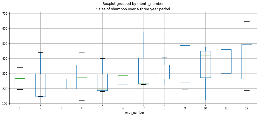
Alternative we can plot boxplots as the month level
df.boxplot(figsize=(15,6),by='month_number',column='Sales of shampoo over a three year period')

We can see an upward trend and mild seasonality of peaks in November. However, the dataset is too small to make
conclusive statements about the seasonality.
Conclusion
In this post we first learned how to set up GridDB and python. Next we discussed some common visualization methods for time series. Finally, we did some trend, autocorrelation and seasonality analysis and plotted corresponding plots. For more advanced visualization and dashboarding check out this post.