Introduction and Purpose
Zeppelin is an open-source data science and data visualization tool. It has a lot in common with Jupyter Notebook that we used in our previous posts a few times. Zeppelin works with all Python packages for data science.
We are still convinced by the power of Jupyter but we have to admit that Zeppelin offers a better interface for those who need to build eye-catching visual reports. If you remember, in Jupyter, the single notes – code blocks, their outputs, and free text notes – are placed above each other. Sometimes, this would make you scroll endlessly through the notebook before finding the entries that you need. In Zeppelin, you can put them next to each other creating dashboards that are particularly helpful for monitoring reports and end users.
Besides, in Zeppelin, you do not have to code the charts. They can be built using the graphical user interface.
The Use Case
We will use data from IoT devices. These devices regularly send data that contains timestamps, events, for instance, alerts, and some measurements.
Objectives
The objective of this tutorial is to show the advantages of Zeppelin for GridDB users.
Prerequisites
To repeat this tutorial, you will need to implement instructions from one of our previous blog posts (no worries, they are pretty short and straightforward!). The tutorial explains how to run GridDB in a Docker container. It also shows how to install Docker.
Getting Started With Zeppelin
Download and Install Zeppelin
On your machine, open your command line tool, for instance: * shell for Windows; * Terminal for a Mac computer.
Type in the following command:
git clone https://github.com/roenschg/griddb-zeppelin-quikstart.git
It will create a target folder on your machine and start downloading Zeppelin from its GitHub repository into it.
Keep an eye on the progress in your command line tool. Once the download is finished, you can proceed with wrapping your Zeppelin into a Docker container. Make sure that Docker Desktop is running.
Still in your favorite command line tool, type in the command that tells it to go to the target folder (just in case, you are not already there by default, which can happen):
cd griddb-zeppelin-quikstart/
Now, use these commands to build the container. Type in the second command only if the first one has finished its execution successfully.
docker-compose build docker-compose up
At this stage, our preparations are completed. The container has been built and is running. You can start your analysis by opening the following URL in your browser: http://localhost:8080
You will land in an example note. In Zeppelin, notes are the same as notebooks in Jupyter. They contain paragraphs: those are the same as cells in Jupyter. If you do not know Jupyter, here is an alternative explanation: notes are files that contain your data, your code chunks, and your results, including data charts. Paragraphs are visual elements that contain one of the aforementioned.
Give your note a name and proceed to the instructions below.
Connecting to GridDB
You can use Python’s JayDeBeApi connector to connect to your GridDB database:
import jaydebeapi

conn = jaydebeapi.connect("com.toshiba.mwcloud.gs.sql.Driver",
                           "jdbc:gs://griddb:20001/defaultCluster/public?notificationMember:127.0.0.1:20001",
                           ["admin", "admin"],
                          "/usr/share/java/gridstore-jdbc-4.5.0.jar",)
Insert it into the first paragraph of your note and press Run or use Shift+Enter.
Building Your Dashboard
Before we proceed to data analysis and visualization and begin with creating other paragraphs, let’s learn how to organize them.
Hover over the top or bottom edge of this visual element to make +Add Paragraph appear. Click to add more paragraphs.
Hover over the top right corner of the paragraph until you see the gear icon. Click on it. You will see a few options for formatting and running the code. Width is the parameter that you can play with to make your note look like a dashboard. The maximum width is 12 (whatever measure it is, plays no role). So, depending on the width of your screen, you can reduce the maximum width to some point. Let’s say, to six. It will make the paragraph shrink to its half and move to the left side making some free space next to it on the right.
Do the same to a paragraph above or below this one. Once you’ve adjusted it too, one of the paragraphs will jump into the free space next to the other paragraph which is smaller than 12. By doing so, you can place paragraphs in a row. Decrease the width parameter accordingly to get three or four paragraphs into the same row. Build two or three rows to avoid turning back to it during your main course of analysis.
Data Analysis
Getting Some Data Into Zeppelin
Now, you can create your first dashboard. For this, access your GridDB table using an SQL query with one of the pandas functions to feed the data directly into a dataframe:
sql = ("SELECT * FROM iotdata WHERE TIMESTAMP(timestamp) < TIMESTAMP_ADD(DAY, NOW(), -5)")
iotdf = pd.read_sql_query(sql, conn)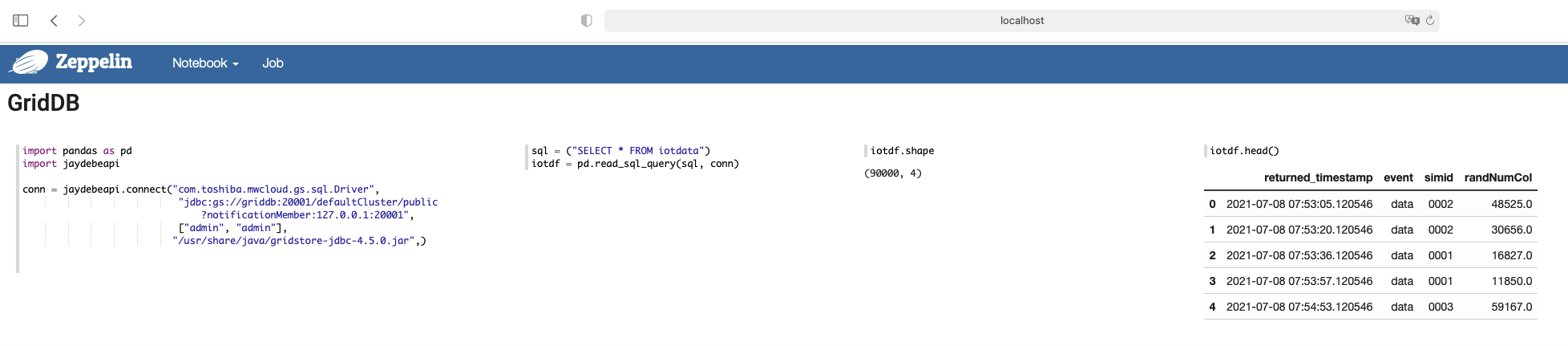
Then, use this command to show the first rows of your data frame:
z.show(iotdf)You will see this: 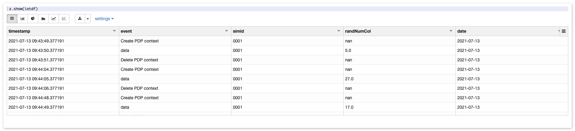
Building Your First Charts
Contrary to Jupyter, you do not need to write Python code to build charts in Zeppelin. As you may have noticed, z.show() created a first visualization where you can switch between a table view and different chart types.
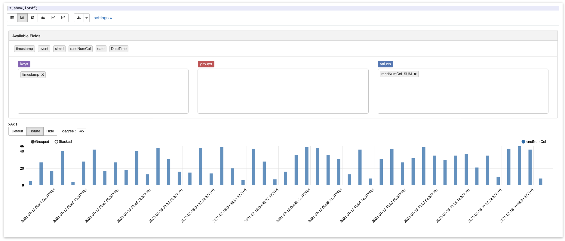
If you click on settings, you’ll land into a view that allows you to aggregate your data without a code by drag-and-dropping columns with non-numeric dimensions (event and count of event in our case) into the groups space.
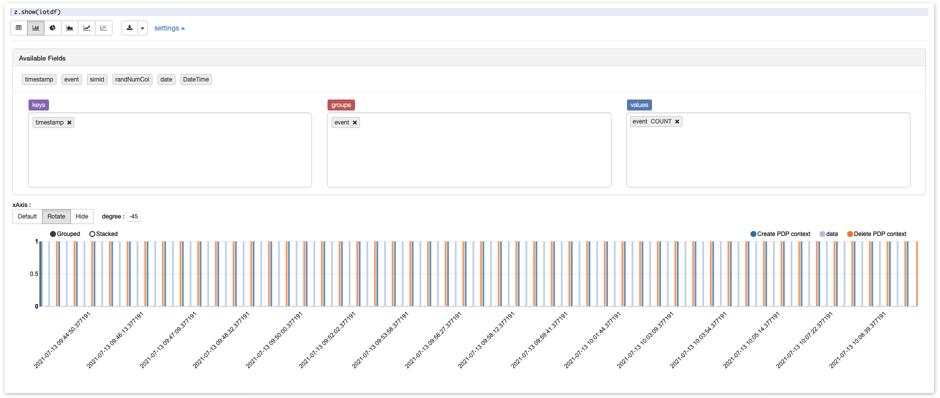
This allows you to look for patterns in your data and check if they look like expected (a repeated pattern in our case).
Indeed, you can use Python code to group and visualize your data if the GUI features cannot provide the aggregation you need. This piece of code will aggregate the data frame by day, count the number of events, and plot the data accordingly:
dayevents = iotdf.groupby(by = ['date']).count()
dayevents = dayevents.reset_index()
dayevents = dayevents.drop(columns = ['event', 'simid', 'randNumCol'])

import matplotlib.pyplot as plt
a = dayevents.date
b = dayevents.timestamp
plt.plot(a, b, 'ro')
plt.xticks(rotation=90)
z.show(plt)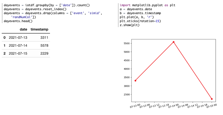
You can use any other functions – sum, mean, etc. – to customize the aggregation. Do not forget to reset index after you’ve grouped the data, otherwise, the grouping column will be shown as the row index, and you won’t be able to use it for plotting.
Afterwards
When you are done with the analysis for today, remember to close the running Docker container by using this command in your command line tool:
docker-compose stop
When you want to re-open it, use:
cd griddb-zeppelin-quikstart/ docker-compose up -d
Conclusion
Whether you prefer low-code or heavy-code data visualization tools, with Zeppelin, you can have both.