
Introduction
In the part-1 of the blog, we implemented GridDB python script to save and retrieve the Twitter data. In this blog, we will continue with the sentiment analysis and visualization of the sentiment data. We will calculate the sentiment values for each and every tweet, store the sentiment values, and visualize them to draw useful insights for the popular fashion brands. Furthermore, we will also implement some data science algorithms like Hierarchical Cluster and visualize it using Dendrograms. In the end, we will use the python folium library to visualize the positive and negative teets geographically which will helps the fashion brands to target a particular geographical for efficient market growth.
Prerequisites
We will use Python3 libraries like Textblob to calculate the quantitative values for the polarity and subjectivity of each and every tweet text. Also, we will use matplotlib and folium as charting tools for sentiment visualization. We will use scipy library for performing hierarchical clustering on the sentiment dataset.
Data Structure Schema
| Field Name | Data Type(GridDB) | Notes |
|---|---|---|
| Serial No | INTEGER | |
| Screen Name | STRING | Twitter Author Name |
| Twitter ID | STRING | Twitter handle |
| Tweet | STRING | Tweet text |
| Date | STRING |
In the part-1 of the blog, we implemented GridDB containers to save and fetch the Twitter data. The retrieved tweet data is stored in a data frame variable as follows.
# Define the container names
tweet_dataaset_container = excel_sheet_name
# Get the containers
tweet_data = gridstore.get_container(tweet_dataaset_container)

# Fetch all rows - tweet_container
query = tweet_data.query("select *")
rs = query.fetch(False)
print(f"{tweet_dataaset_container} Data")

# Iterate and create a list
retrieved_data = []
while rs.has_next():
   data = rs.next()
   retrieved_data.append(data)

print(retrieved_data)

# Convert the list to a pandas data frame
tweet_dataframe = pd.DataFrame(retrieved_data,
                                 columns=['sno', 'twitter_name', 'twitter_id', 'tweet', 'date'])

# Get the data frame details
print(tweet_dataframe)
tweet_dataframe.info()
We will continue to find the sentiment score first, and then later visualize the data for sentiment analytics.
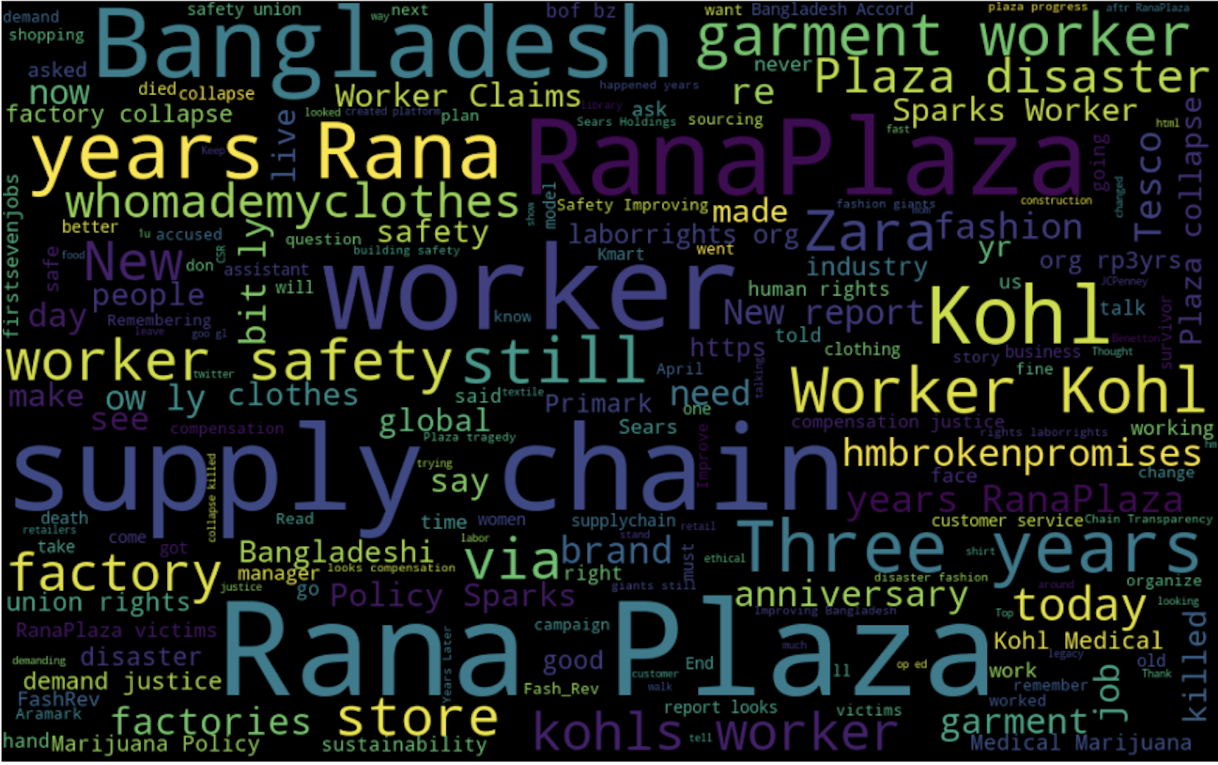
Showing Tweets data as WordClouds
We can have an overview of the popular keywords which are used frequently during tweet mining for fashion brands. For this, we implement word cloud on the entire dataset.
from wordcloud import WordCloud, STOPWORDS
import matplotlib.pyplot as plt
stopwords = set(STOPWORDS)

def show_wordcloud(data, title = None):
    wordcloud = WordCloud(
        background_color='white',
        stopwords=stopwords,
        max_words=200,
        max_font_size=40,
        scale=3,
        random_state=1 # chosen at random by flipping a coin; it was heads
    ).generate(str(data))

    fig = plt.figure(1, figsize=(12, 12))
    plt.axis('off')
    if title:
        fig.suptitle(title, fontsize=20)
        fig.subplots_adjust(top=2.3)

    plt.imshow(wordcloud)
    plt.show()

show_wordcloud(tweet_dataframe)
The equivalent WordCloud for the entire dataset contains important keywords like Worker Safety, Supply Chain Disaster, Bangladeshi Worker, etc.
Calculating Sentiment Values of Tweet Dataset
The polarity and subjectivity values of the tweets depend upon the individual lexicons of the tweet stated. The final sentiment score is the sum of the sentiment value of all lexicons present in the tweet. Textblob is a python library that works on the similar above logic and returns the numerical sentiment value of tweets. Let us calculate the sentiment values using textblob by iterating through each tweet.
from textblob import TextBlob  # For getting the quantitative value for the polarity and subjectivity

import re  # For the calculation of regular expressions

# a function to clean the tweets using regualr expression
def clean_tweet(tweet):
    '''
    Utility function to clean the text in a tweet by removing
    links and special characters using regex.
    '''
    return ' '.join(re.sub("(@[A-Za-z0-9]+)|([^0-9A-Za-z  t])|(w+://S+)", " ", tweet).split())


for tweet in tweets:
        analysis = TextBlob(clean_tweet(tweet))
        pol = analysis.sentiment.polarity
        sub = analysis.subjectivity
        pol_round = '%.3f' % pol
        sub_round = '%.3f' % sub
In the above code snippet, we calculated the polarity and subjectivity values of tweets, after cleaning them. Please note that the polarity value is considered as the final sentiment of the score of that particular tweet though subjectivity value defines how well the tweet matches with the given context. We will continue the visualization of these polarity values using matplotlib.
Visualization of Sentiment Data using Matplotlib
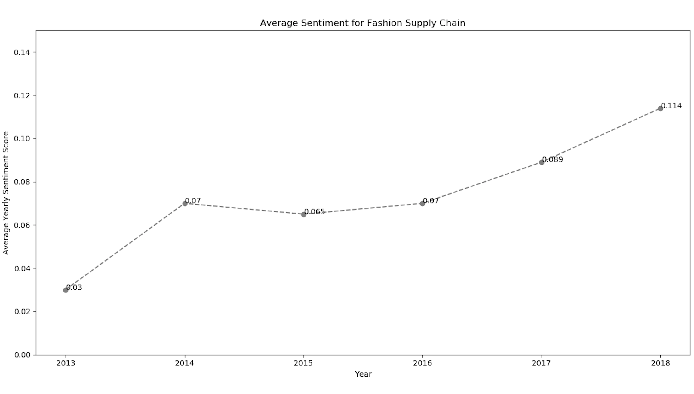
Since we now have the numerical sentiment values of tweets, we can plot them using matplotlib to find the pattern from 2013-2018.
import matplotlib.pyplot as plt  # For plotting the graphs and charts

# plotting the line-chart for the average polarity with the supply-chain-incidents
plt.title("Average Sentiment for Fashion Supply Chain")
plt.xlabel("Year")
plt.ylabel("Average Yearly Sentiment Score")
plt.ylim(-0.3, 0.3)
plt.plot(list_sheetnames, average_polarity_sheets)
plt.show()
The line chart for the above code snippet shows the sentiment values with the respective year.
We have also implemented the matplotlib library to visualize the sentiment values exclusively for each of the fashion brands. Using the above code snippet for matplotlib line-chart, we got the sentiment positive trend for brands like Zara and Gap.
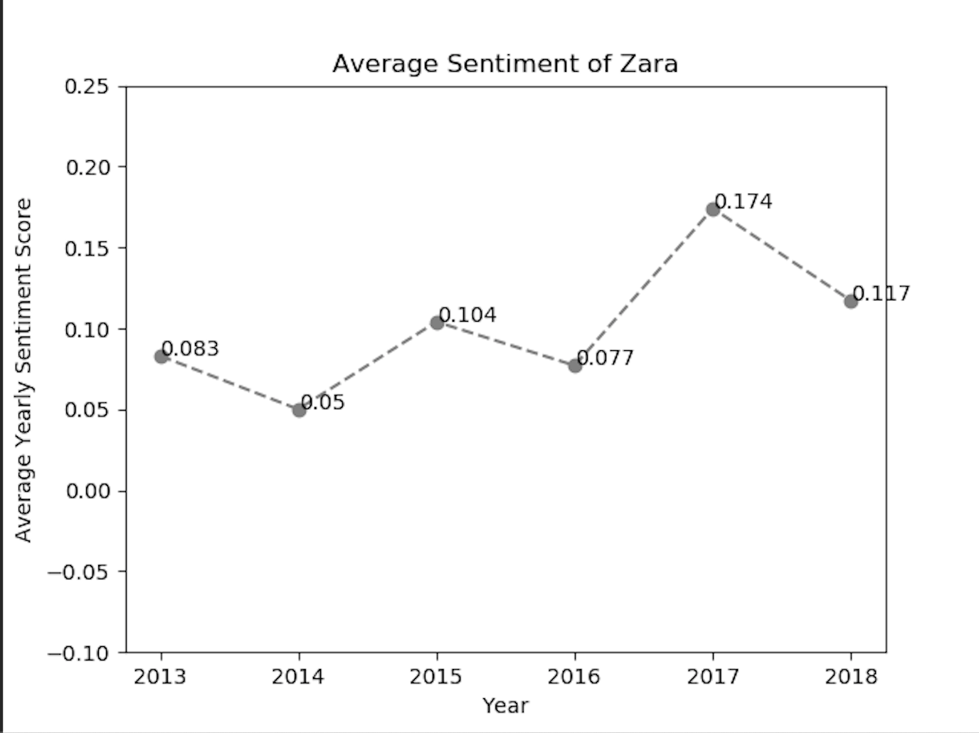
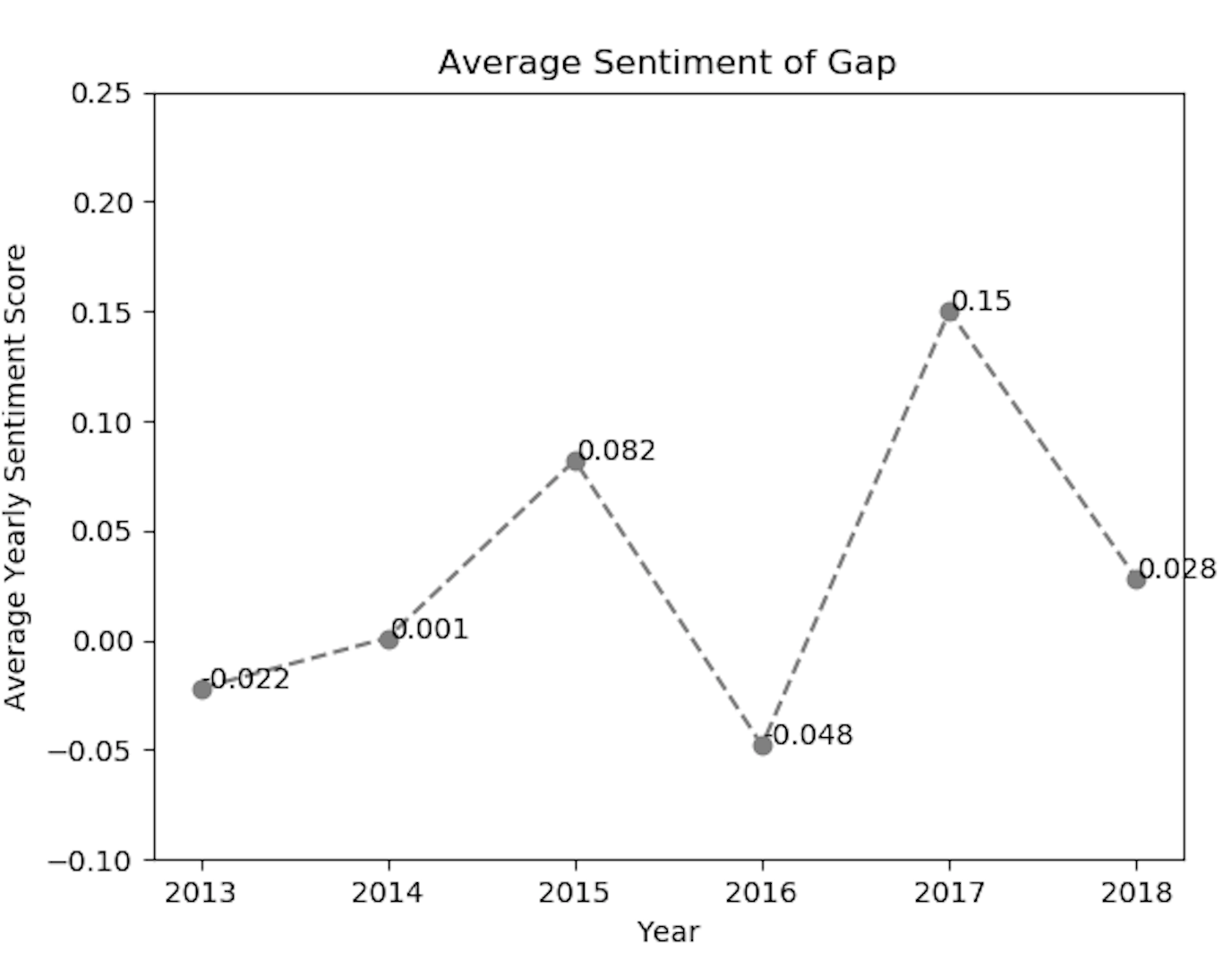
As we can analyze from the above sentiment line-charts, the sentiment of twitter customers of the fashion brands, has reacted positively or negatively in the given year.
Hierarchical Clustering and Dendrograms
To draw more analytics from the sentiment data, we can perform hierarchical clustering on the sentiment data values, and further plot the respective dendrograms. This will be useful from the data-science perspective to create clusters for the given tweet sentiment values. Let us first define our python function to draw a dendrogram from the given data.
from scipy.cluster.hierarchy import cophenet  # used in hierarchical clustering
from scipy.cluster.hierarchy import dendrogram, linkage  # used in making dendrograms
from scipy.spatial.distance import pdist  # calculating the correlative distance
from sklearn.cluster import MeanShift


def fancy_dendrogram(*args, **kwargs):
    max_d = kwargs.pop('max_d', None)
    if max_d and 'color_threshold' not in kwargs:
        kwargs['color_threshold'] = max_d
    annotate_above = kwargs.pop('annotate_above', 0)

    ddata = dendrogram(*args, **kwargs)

    if not kwargs.get('no_plot', False):
        for i, d, c in zip(ddata['icoord'], ddata['dcoord'], ddata['color_list']):
            x = 0.5 * sum(i[1:3])
            y = d[1]
            if y > annotate_above:
                plt.plot(x, y, 'o', c=c)
                plt.annotate("%.3g" % y, (x, y), xytext=(0, -5),
                             textcoords='offset points',
                             va='top', ha='center')
        if max_d:
            plt.axhline(y=max_d, c='k')
    return ddata
The python script for the hierarchical clustering visualization using the matplotlib is given below.
 # performing heirarchical clustering on the each of the supply chain events
    X = array(get_polarity_subjectivity_list(polarity, subjectivity))
    ms = MeanShift()
    ms.fit(X)
    labels = ms.labels_
    cluster_centers = ms.cluster_centers_
    n_clusters_ = len(np.unique(labels))
    # now saving it in the "hierarchical_clustering_data.xls" file
    pol_x = (cluster_centers[0][0] + cluster_centers[1][
        0]) / 2  # applying the coordinate geometry centre of two coordinates for the first two cluster points
    sub_y = (cluster_centers[0][1] + cluster_centers[1][1]) / 2
    ws2.write(i + 1, 0, i + 1)
    ws2.write(i + 1, 1, list_sheetnames[i])
    ws2.write(i + 1, 2, pol_x)
    ws2.write(i + 1, 3, sub_y)
    ws2.write(i + 1, 4, n_clusters_)
    # writing all the cluster points
    result_point = ""
    for k in range(n_clusters_):
        result_point = result_point + " ( " + str(round(cluster_centers[k][0], 3)) + " , " + str(
            round(cluster_centers[k][1], 3)) + " )"

    ws2.write(i + 1, 5, result_point)
    # now plotting the hierarchical clustering with the cluster points
    colors = 10 * ['r.', 'g.', 'b.', 'c.', 'k.', 'y.', 'm.']
    for j in range(len(X)):
        plt.plot(X[j][0], X[j][1], colors[labels[j]], markersize=10)

    plt.scatter(cluster_centers[:, 0], cluster_centers[:, 1], marker='x', color='k', s=150, linewidths=5, zorder=10)
    plt.title(list_sheetnames[i])
    plt.xlabel("Polarity---------------------->")
    plt.ylabel("Subjectivity------------------>")
    plt.show()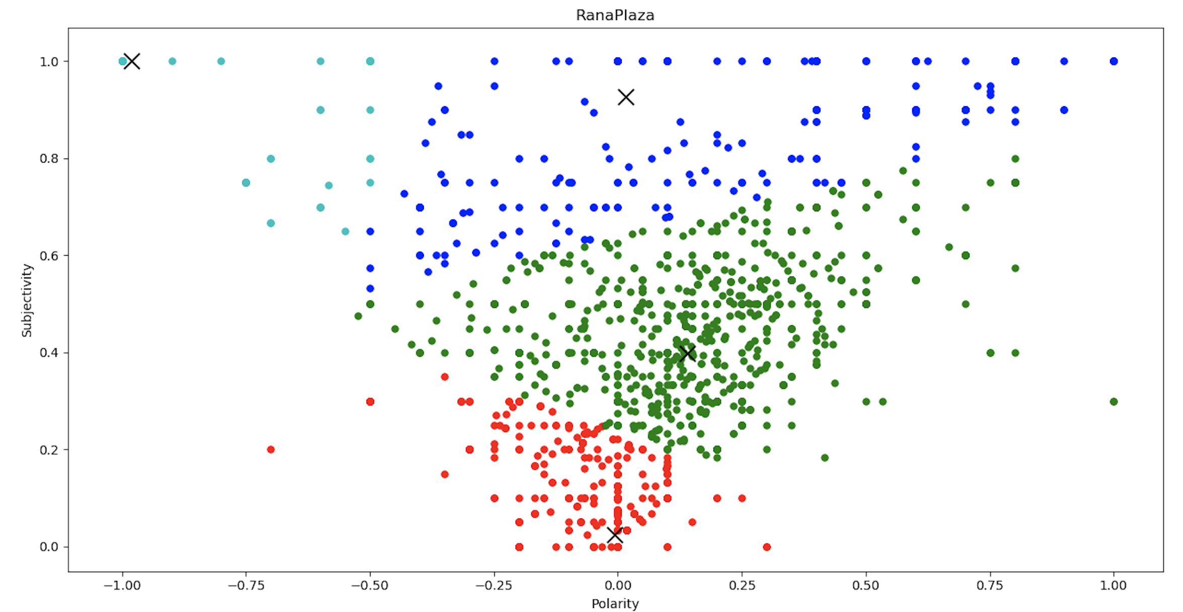
From the clustering chart, we can conclude that the sentiment values can be classified into 4 clusters, as per the sentiment polarity and subjectivity values.
Now we have the 4 clusters with their mean distance, we can feed it into the dendrograms function to plot the same.
 Y = pdist(score)
    Z = linkage(Y, 'ward')
    c, coph_dists = cophenet(Z, Y)  # c contains the coorelative distance for the clusters
    # calculating the full dednrogram
    plt.figure(figsize=(25, 10))
    plt.title("Dendrogram : " + list_sheetnames[i])
    plt.xlabel('sample index')
    plt.ylabel('distance')
    fancy_dendrogram(
        Z,
        truncate_mode='lastp',
        p=12,
        leaf_rotation=90.,
        leaf_font_size=12.,
        show_contracted=True,
        # annotate_above=10,
        max_d=1.5
    )
    plt.show()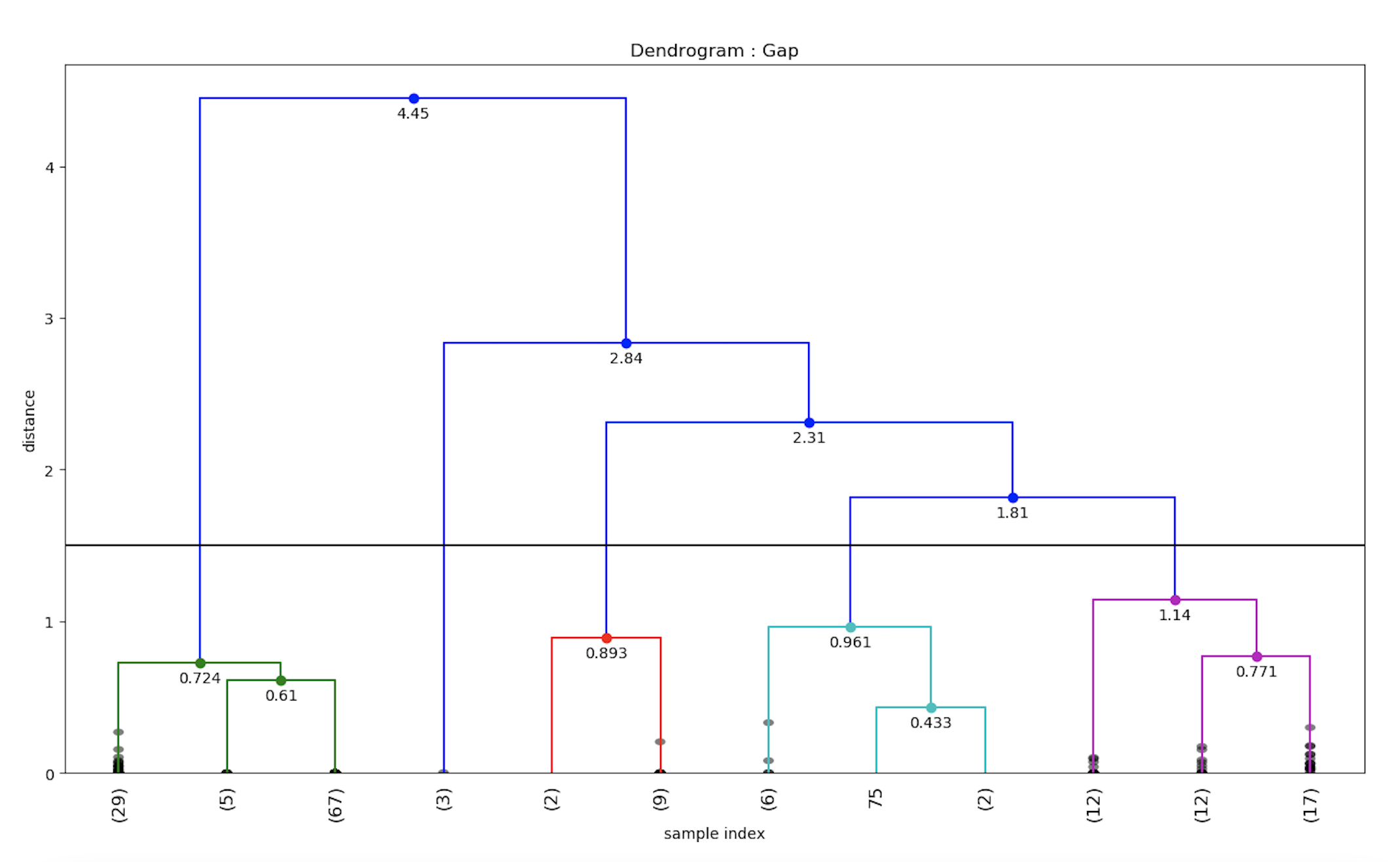
Similarly, the dendrogram for Zara brand sentiment values can be calculated.
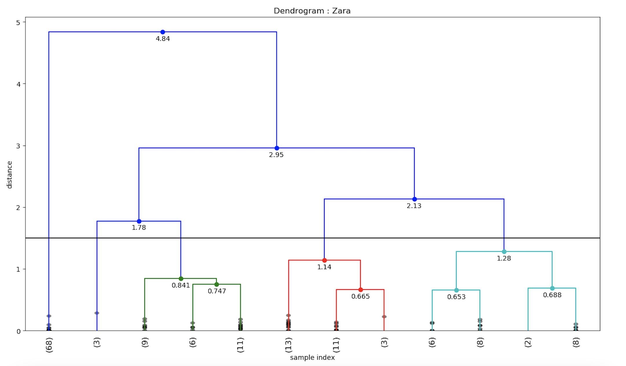
Hence, we implemented the popular Hierarchical clustering on our twitter dataset and visualized it using dendrograms.
Geographical Visualization of Twitter Sentiment Data
To visualize the sentiment data geographically, we will use the python folium library to plot the geo-coordinates with the corresponding sentiment values.
import folium  # plotting the coordinates on the map

# now making a data-frame with markers to show on the map
    data = pd.DataFrame({
        'lat': latitudes,
        'lon': longitudes,
        'name': places,
        'sentiment': sentiments,
    })
    # now make an empty map
    m = folium.Map(location=[20, 0], zoom_start=2)
    # popup will be used when a particular marker will be clicked,
    # it will display the sentiment value along with the corresponding place

    for j in range(0, len(data)):
        try:
            if data.iloc[j]['sentiment'] > 0:
                folium.Marker([data.iloc[j]['lat'], data.iloc[j]['lon']],
                              popup="Sentiment :  " + str(round(data.iloc[j]['sentiment'], 3)) + " nLocation :" + str
                              (data.iloc[j]['name']),
                              icon=folium.Icon(color='green')).add_to(m)
            elif data.iloc[j]['sentiment'] < 0:
                folium.Marker([data.iloc[j]['lat'], data.iloc[j]['lon']],
                              popup="Sentiment :  " + str(round(data.iloc[j]['sentiment'], 3)) + " nLocation: " + str
                              (data.iloc[j]['name']),
                              icon=folium.Icon(color='red')).add_to(m)
            else:
                folium.Marker([data.iloc[j]['lat'], data.iloc[j]['lon']],
                              popup="Sentiment :  " + str(round(data.iloc[j]['sentiment'], 3)) + " nLocation : " + str
                              (data.iloc[j]['name']),
                              icon=folium.Icon(color='blue')).add_to(m)
        except:
            # print("error"+str(j))
            pass
    m.save(list_sheetnames_geo[i] + "_geo.html")
After running the above python folium script, the geographical maps are stored in html files. We have created the geographical visualization maps for each of the fashion brands.
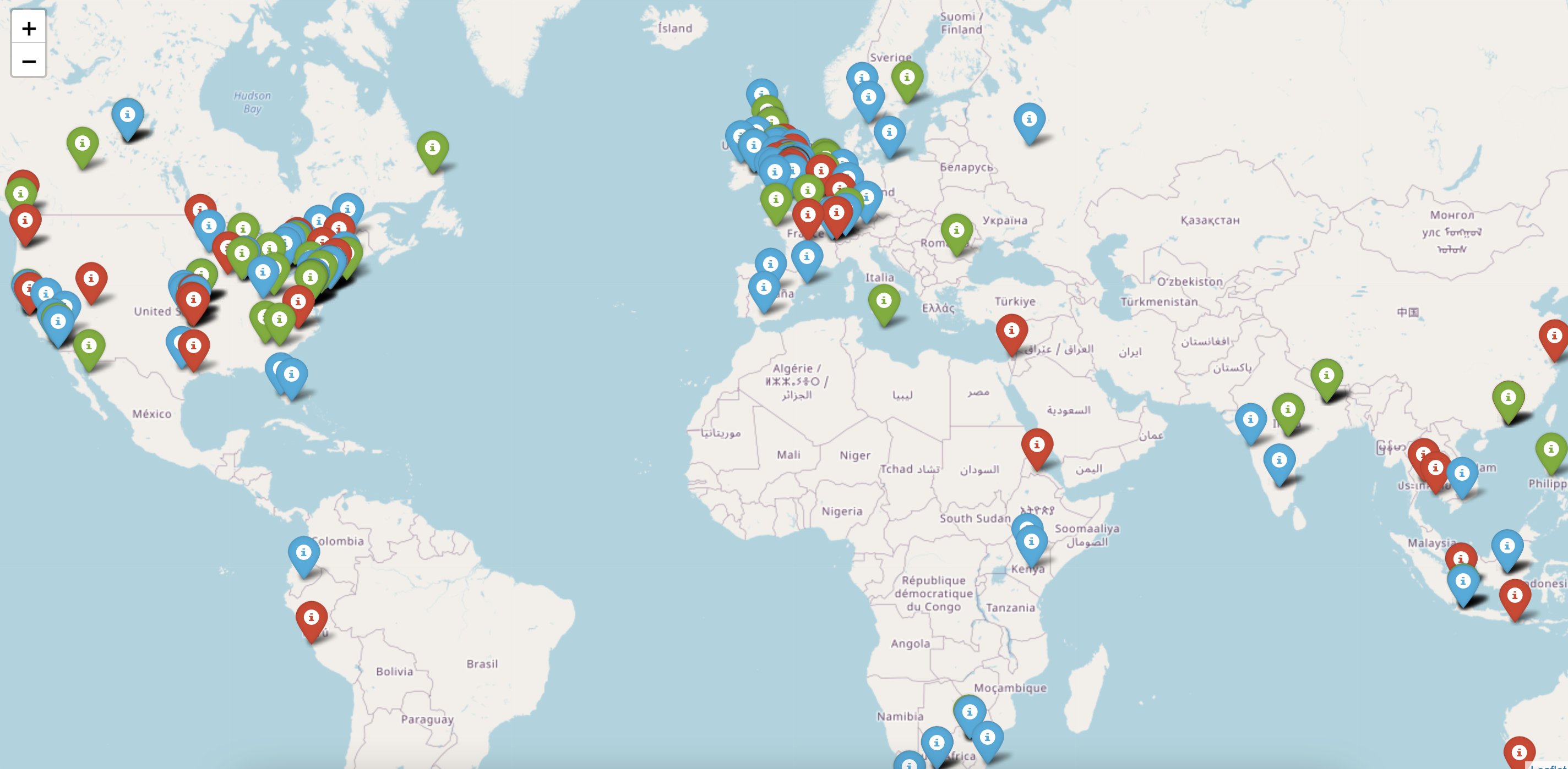 The sentiment distribution looks like this across the globe for Rana Plaza incident response. As we can see the red marker depicts the negative sentiment whereas the green ones correspond to positive sentiment. We can zoom in to a particular area to find the detailed distributio of sentiment values. For example, the detailed sentiment distribution for the fashion brands in UK area looks like this.
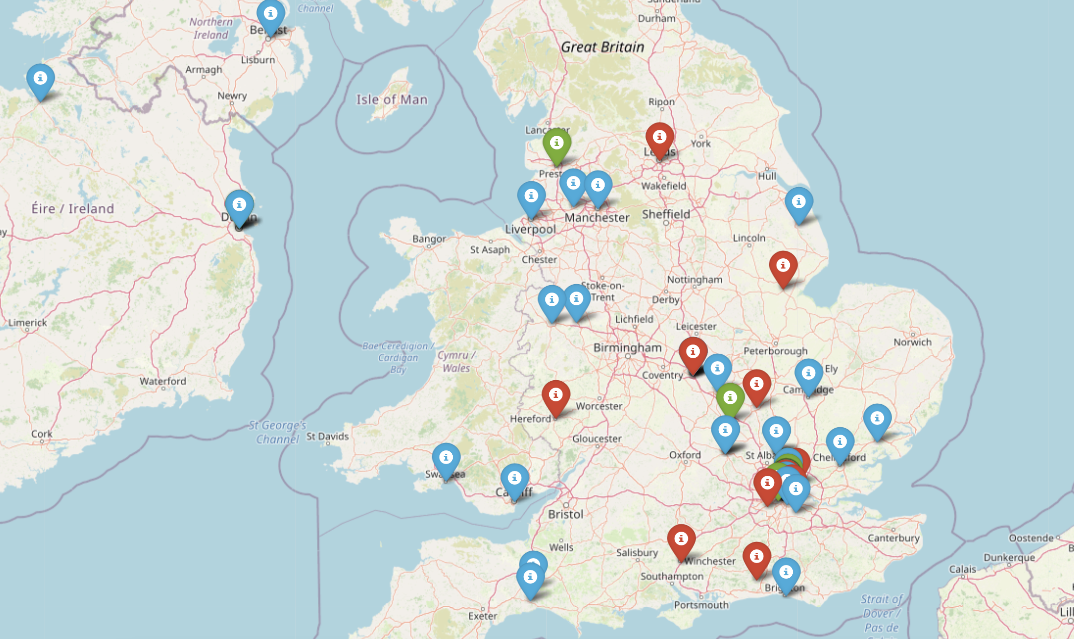
The geographical distribution helps fashion brands to focus on their weak areas where the customers are unhappy with their products and services.
Conclusion:
We performed sentiment analysis on the twitter dataset and visualized the sentiment using line chart, wordclouds, dendrograms and plotted on the geographical map. In the part -1 of the blog, we discussed how to fetch and retrieve the twitter data using GridDB. Hence, We can deploy cloud triggers to automate the sentiment analysis and export the sentiment insights to the various fashion brands for better marketing practices.
Source Code Github