In this tutorial, we will be exploring a dataset containing customers’ information such as Marital Status, Education, Income, etc. Getting an insight into the kinds of customers a firm deals with helps to provide better and customized services. Therefore, customer analysis and segmentation play a crucial role in a business.
The outline for this tutorial is as follows:
- About the Dataset
- Importing the necessary libraries
- Exploratory Data Analysis
- Plotting the Correlation
- Encoding the data
- Scaling the data
- Dimensionality reduction
- CLustering
- Visualizing the clusters
- Observation
- Conclusion
1. About the Dataset
The dataset used for this tutorial is publicly available on Kaggle. The total number of instances (or rows) are 2240 whereas the total number of attributes (or columns) is 29. As mentioned above, each attribute corresponds to a person trait important for customer classification such as Marital Status, Income, Customer ID, etc.
Go ahead and download the dataset! We will next be importing libraries to begin our analysis.
2. Importing the necessary libraries
import numpy as np
import pandas as pd
import datetime
import matplotlib
import matplotlib.pyplot as plt
from matplotlib import colors
import seaborn as sns
from sklearn.preprocessing import StandardScaler
from sklearn.cluster import AgglomerativeClustering
from mpl_toolkits.mplot3d import Axes3D
from matplotlib.colors import ListedColormap
from sklearn import metrics
from sklearn.preprocessing import LabelEncoder
from sklearn.decomposition import PCA
In case you run into a package installation error, you can install it by typing pip install package-name in the command line. Alternatively, if you’re using a conda virtual environment, you can type conda install package-name.
Loading our dataset and Exploratory Data Analysis (EDA)
Let’s go ahead and load our CSV file.
Using GridDB
To store large amounts of data, a CSV file can be cumbersome and chaotic. GridDB serves as a great alternative as it is open-source and a highly scalable database. It is optimized for IoT and Big Data so that you can store your time-series data effectively. It utilizes an in-memory data architecture along with parallel processing for higher performance. You can Download GridDB from their official website.
By using the GridDB-Python client, we can load our data directly into the Python environment as a dataframe.
import griddb_python as griddb
import pandas as pd

sql_statement = ('SELECT * FROM marketing_campaign')
movie_review_test = pd.read_sql_query(sql_statement, cont)
Note that the cont variable has the container information where our data is stored. Replace the marketing_campaign with the name of your container. You can also refer to the tutorial on reading and writing to GridDB for more information.
Using Pandas
If you do not have GridDB, you can load the file using Pandas.
data = pd.read_csv('marketing_campaign.csv', sep="t")We’ll display the first five rows using the head command to get a gist of our data.
data.head()data.head()| ID | Year_Birth | Education | Marital_Status | Income | Kidhome | Teenhome | Dt_Customer | Recency | MntWines | … | NumWebVisitsMonth | AcceptedCmp3 | AcceptedCmp4 | AcceptedCmp5 | AcceptedCmp1 | AcceptedCmp2 | Complain | Z_CostContact | Z_Revenue | Response | |
|---|---|---|---|---|---|---|---|---|---|---|---|---|---|---|---|---|---|---|---|---|---|
| 0 | 5524 | 1957 | Graduation | Single | 58138.0 | 0 | 0 | 04-09-2012 | 58 | 635 | … | 7 | 0 | 0 | 0 | 0 | 0 | 0 | 3 | 11 | 1 |
| 1 | 2174 | 1954 | Graduation | Single | 46344.0 | 1 | 1 | 08-03-2014 | 38 | 11 | … | 5 | 0 | 0 | 0 | 0 | 0 | 0 | 3 | 11 | 0 |
| 2 | 4141 | 1965 | Graduation | Together | 71613.0 | 0 | 0 | 21-08-2013 | 26 | 426 | … | 4 | 0 | 0 | 0 | 0 | 0 | 0 | 3 | 11 | 0 |
| 3 | 6182 | 1984 | Graduation | Together | 26646.0 | 1 | 0 | 10-02-2014 | 26 | 11 | … | 6 | 0 | 0 | 0 | 0 | 0 | 0 | 3 | 11 | 0 |
| 4 | 5324 | 1981 | PhD | Married | 58293.0 | 1 | 0 | 19-01-2014 | 94 | 173 | … | 5 | 0 | 0 | 0 | 0 | 0 | 0 | 3 | 11 | 0 |
5 rows à 29 columns
len(data)2240
As mentioned earlier, we have a total of 2240 instances. Let’s eliminate any missing values since they can behave abnormally during mathematical operations.
data = data.dropna()
len(data)
2216
We had 24 missing instances in our dataset. Let’s also convert the Date attribute of our dataset to the DateTime format as it will later be used for calculating the time a customer has been active.
data["Dt_Customer"] = pd.to_datetime(data["Dt_Customer"])
dates = []
for i in data["Dt_Customer"]:
    i = i.date()
    dates.append(i)
We will be creating a new attribute – Customer_dur to calculate the duration for which a customer has been associated with the firm. For the sake of simplicity, we will be extracting the date of the most recent customer and using it to calculate the duration for others.
days = []
d1 = max(dates)
for i in dates:
    delta = d1 - i
    days.append(delta)
data["Customer_dur"] = days
data["Customer_dur"] = pd.to_numeric(data["Customer_dur"], errors="coerce")
Great! Now let’s have a look at the next attribute – Marital Status. From the head command, it seems like there are more than two categories.
data["Marital_Status"].value_counts()Married 857
Together 573
Single 471
Divorced 232
Widow 76
Alone 3
Absurd 2
YOLO 2
Name: Marital_Status, dtype: int64
There are 8 further categories of this attribute. However, we will be grouping them together to ease out our segmentation process. We will be creating a binary attribute – Living_With having either of the two values – Partner or Alone.
data["Living_With"]=data["Marital_Status"].replace({"Married":"Partner", "Together":"Partner", "Absurd":"Alone", "Widow":"Alone", "YOLO":"Alone", "Divorced":"Alone", "Single":"Alone",})Now that we have a derivative feature, Marital_Status serves as a redundant attribute. Let’s go ahead and drop that. We’ll also be dropping some columns that contain promotions’ and deals’ information as it is not relevant for customer segmentation.
cols_del = ['Marital_Status', 'AcceptedCmp3', 'AcceptedCmp4', 'AcceptedCmp5', 'AcceptedCmp1','AcceptedCmp2', 'Complain', 'Response']
data = data.drop(cols_del, axis=1)
Let’s have a look at how many categories does the Education attribute hold.
data["Education"].value_counts()Graduation 1116
PhD 481
Master 365
2n Cycle 200
Basic 54
Name: Education, dtype: int64
We will repeat the same step with the Education attribute as well. In this case, the categories will be Undergraduate, Graduate, Postgraduate.
data["Education"]=data["Education"].replace({"Basic":"Undergraduate","2n Cycle":"Undergraduate", "Graduation":"Graduate", "Master":"Postgraduate", "PhD":"Postgraduate"})We will be creating some new features derived from the original ones for easy calculations in the later sections. These features are as follows:
Age: can be derived from theYear_of_Birth.Spent: sum of all the edible products (wine, fruits, fish, etc.).Children: sum ofKidhome and Teenhome.Family_Size: We’ll use theLiving_Withattribute along with theChildrenattribute.Is_Parent: Binary attribute with values 0 or 1 derived from theChildrenattribute.
data["Age"] = 2021-data["Year_Birth"]
data["Spent"] = data["MntWines"]+ data["MntFruits"]+ data["MntMeatProducts"]+ data["MntFishProducts"]+ data["MntSweetProducts"]+ data["MntGoldProds"]
data["Children"]=data["Kidhome"]+data["Teenhome"]
data["Family_Size"] = data["Living_With"].replace({"Alone": 1, "Partner":2})+ data["Children"]
data["Is_Parent"] = np.where(data.Children> 0, 1, 0)
Like previously, we’ll drop the redundant attributes.
to_drop = ["Dt_Customer", "Z_CostContact", "Z_Revenue", "Year_Birth", "ID"]
data = data.drop(to_drop, axis=1)
After all the changes, our data looks like –
data.describe()| Income | Kidhome | Teenhome | Recency | MntWines | MntFruits | MntMeatProducts | MntFishProducts | MntSweetProducts | MntGoldProds | … | NumWebPurchases | NumCatalogPurchases | NumStorePurchases | NumWebVisitsMonth | Customer_dur | Age | Spent | Children | Family_Size | Is_Parent | |
|---|---|---|---|---|---|---|---|---|---|---|---|---|---|---|---|---|---|---|---|---|---|
| count | 2216.000000 | 2216.000000 | 2216.000000 | 2216.000000 | 2216.000000 | 2216.000000 | 2216.000000 | 2216.000000 | 2216.000000 | 2216.000000 | … | 2216.000000 | 2216.000000 | 2216.000000 | 2216.000000 | 2.216000e+03 | 2216.000000 | 2216.000000 | 2216.000000 | 2216.000000 | 2216.000000 |
| mean | 52247.251354 | 0.441787 | 0.505415 | 49.012635 | 305.091606 | 26.356047 | 166.995939 | 37.637635 | 27.028881 | 43.965253 | … | 4.085289 | 2.671029 | 5.800993 | 5.319043 | 4.423735e+16 | 52.179603 | 607.075361 | 0.947202 | 2.592509 | 0.714350 |
| std | 25173.076661 | 0.536896 | 0.544181 | 28.948352 | 337.327920 | 39.793917 | 224.283273 | 54.752082 | 41.072046 | 51.815414 | … | 2.740951 | 2.926734 | 3.250785 | 2.425359 | 2.008532e+16 | 11.985554 | 602.900476 | 0.749062 | 0.905722 | 0.451825 |
| min | 1730.000000 | 0.000000 | 0.000000 | 0.000000 | 0.000000 | 0.000000 | 0.000000 | 0.000000 | 0.000000 | 0.000000 | … | 0.000000 | 0.000000 | 0.000000 | 0.000000 | 0.000000e+00 | 25.000000 | 5.000000 | 0.000000 | 1.000000 | 0.000000 |
| 25% | 35303.000000 | 0.000000 | 0.000000 | 24.000000 | 24.000000 | 2.000000 | 16.000000 | 3.000000 | 1.000000 | 9.000000 | … | 2.000000 | 0.000000 | 3.000000 | 3.000000 | 2.937600e+16 | 44.000000 | 69.000000 | 0.000000 | 2.000000 | 0.000000 |
| 50% | 51381.500000 | 0.000000 | 0.000000 | 49.000000 | 174.500000 | 8.000000 | 68.000000 | 12.000000 | 8.000000 | 24.500000 | … | 4.000000 | 2.000000 | 5.000000 | 6.000000 | 4.432320e+16 | 51.000000 | 396.500000 | 1.000000 | 3.000000 | 1.000000 |
| 75% | 68522.000000 | 1.000000 | 1.000000 | 74.000000 | 505.000000 | 33.000000 | 232.250000 | 50.000000 | 33.000000 | 56.000000 | … | 6.000000 | 4.000000 | 8.000000 | 7.000000 | 5.927040e+16 | 62.000000 | 1048.000000 | 1.000000 | 3.000000 | 1.000000 |
| max | 666666.000000 | 2.000000 | 2.000000 | 99.000000 | 1493.000000 | 199.000000 | 1725.000000 | 259.000000 | 262.000000 | 321.000000 | … | 27.000000 | 28.000000 | 13.000000 | 20.000000 | 9.184320e+16 | 128.000000 | 2525.000000 | 3.000000 | 5.000000 | 1.000000 |
8 rows à 21 columns
4. Plotting the correlation
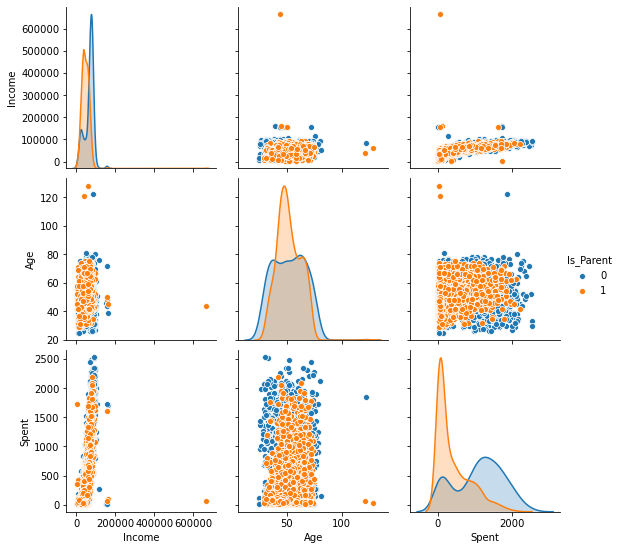
We will now plot these newly created features pair-wise while using the Is_Parent as the main classification attribute.
To_Plot = [ "Income", "Age", "Spent", "Is_Parent"]
plt.figure()
sns.pairplot(data[To_Plot], hue= "Is_Parent")
plt.show()
<Figure size 432x288 with 0 Axes>
We can see that we have a few outliers such as:
-
Age>100is highly unlikely. This implies that some of the data instances might be old. Also, the majority of the data is concentrated below the threshold of 80. So, we’ll eliminate the few instances that cross that threshold -
Income>600000has only one instance.
We’ll go ahead and delete that.
data = data[(data["Age"]<90)]
data = data[(data["Income"]<600000)]len(data)2212
5. Encoding the data
Categorical variables need to be encoded before a machine learning task as the string value can not be directly used in mathematical operations. Let’s print out the categorical attributes in our dataset.
s = (data.dtypes == 'object')
object_cols = list(s[s].index)

object_cols
['Education', 'Living_With']
We will use the scikit-learn’s Label Encoder which encodes the target values into classes: 0 to n-1. In our case, Education has three categories, so the values will be denoted by 0,1,2 respectively. Similarly, Living_With is a binary attribute, therefore, the values will take the form of 0 or 1.
LE=LabelEncoder()
for i in object_cols:
data[i]=data[[i]].apply(LE.fit_transform)data.head()| Education | Income | Kidhome | Teenhome | Recency | MntWines | MntFruits | MntMeatProducts | MntFishProducts | MntSweetProducts | … | NumCatalogPurchases | NumStorePurchases | NumWebVisitsMonth | Customer_dur | Living_With | Age | Spent | Children | Family_Size | Is_Parent | |
|---|---|---|---|---|---|---|---|---|---|---|---|---|---|---|---|---|---|---|---|---|---|
| 0 | 0 | 58138.0 | 0 | 0 | 58 | 635 | 88 | 546 | 172 | 88 | … | 10 | 4 | 7 | 83894400000000000 | 0 | 64 | 1617 | 0 | 1 | 0 |
| 1 | 0 | 46344.0 | 1 | 1 | 38 | 11 | 1 | 6 | 2 | 1 | … | 1 | 2 | 5 | 10800000000000000 | 0 | 67 | 27 | 2 | 3 | 1 |
| 2 | 0 | 71613.0 | 0 | 0 | 26 | 426 | 49 | 127 | 111 | 21 | … | 2 | 10 | 4 | 40780800000000000 | 1 | 56 | 776 | 0 | 2 | 0 |
| 3 | 0 | 26646.0 | 1 | 0 | 26 | 11 | 4 | 20 | 10 | 3 | … | 0 | 4 | 6 | 5616000000000000 | 1 | 37 | 53 | 1 | 3 | 1 |
| 4 | 1 | 58293.0 | 1 | 0 | 94 | 173 | 43 | 118 | 46 | 27 | … | 3 | 6 | 5 | 27734400000000000 | 1 | 40 | 422 | 1 | 3 | 1 |
5 rows à 23 columns
6. Scaling the data
It is also important to note that these numerical values differ in scale. This could lead to a biased model which gives much significance to one attribute over the other. Therefore, it is important to map them on a similar scale.
Standard Scaler removes the mean and scales the features to unit variance. More information on how unit variance is calculated can be found here.
scaler = StandardScaler()
scaler.fit(data)
scaled_data = pd.DataFrame(scaler.transform(data),columns= data.columns)scaled_data.head()| Education | Income | Kidhome | Teenhome | Recency | MntWines | MntFruits | MntMeatProducts | MntFishProducts | MntSweetProducts | … | NumCatalogPurchases | NumStorePurchases | NumWebVisitsMonth | Customer_dur | Living_With | Age | Spent | Children | Family_Size | Is_Parent | |
|---|---|---|---|---|---|---|---|---|---|---|---|---|---|---|---|---|---|---|---|---|---|
| 0 | -0.893586 | 0.287105 | -0.822754 | -0.929699 | 0.310353 | 0.977660 | 1.552041 | 1.690293 | 2.453472 | 1.483713 | … | 2.503607 | -0.555814 | 0.692181 | 1.973583 | -1.349603 | 1.018352 | 1.676245 | -1.264598 | -1.758359 | -1.581139 |
| 1 | -0.893586 | -0.260882 | 1.040021 | 0.908097 | -0.380813 | -0.872618 | -0.637461 | -0.718230 | -0.651004 | -0.634019 | … | -0.571340 | -1.171160 | -0.132545 | -1.665144 | -1.349603 | 1.274785 | -0.963297 | 1.404572 | 0.449070 | 0.632456 |
| 2 | -0.893586 | 0.913196 | -0.822754 | -0.929699 | -0.795514 | 0.357935 | 0.570540 | -0.178542 | 1.339513 | -0.147184 | … | -0.229679 | 1.290224 | -0.544908 | -0.172664 | 0.740959 | 0.334530 | 0.280110 | -1.264598 | -0.654644 | -1.581139 |
| 3 | -0.893586 | -1.176114 | 1.040021 | -0.929699 | -0.795514 | -0.872618 | -0.561961 | -0.655787 | -0.504911 | -0.585335 | … | -0.913000 | -0.555814 | 0.279818 | -1.923210 | 0.740959 | -1.289547 | -0.920135 | 0.069987 | 0.449070 | 0.632456 |
| 4 | 0.571657 | 0.294307 | 1.040021 | -0.929699 | 1.554453 | -0.392257 | 0.419540 | -0.218684 | 0.152508 | -0.001133 | … | 0.111982 | 0.059532 | -0.132545 | -0.822130 | 0.740959 | -1.033114 | -0.307562 | 0.069987 | 0.449070 | 0.632456 |
5 rows à 23 columns
7. Dimensionality reduction
We now have the scaled data but the total number of columns is still large to deal with. A higher number of columns lead to higher dimensions which makes it harder to work with. For the sake of simplicity, we will be reducing the total number of columns to 3 as some of them are already redundant.
Principal Component Analysis (PCA) is one of the popular techniques used for dimensionality reduction as it minimizes information loss.
pca = PCA(n_components=3)
pca.fit(scaled_data)
pca_data = pd.DataFrame(pca.transform(scaled_data), columns=(["c1","c2", "c3"]))pca_data.describe().T| count | mean | std | min | 25% | 50% | 75% | max | |
|---|---|---|---|---|---|---|---|---|
| c1 | 2212.0 | -2.549698e-16 | 2.878377 | -5.969394 | -2.538494 | -0.780421 | 2.383290 | 7.444304 |
| c2 | 2212.0 | -3.924929e-17 | 1.706839 | -4.312236 | -1.328300 | -0.158123 | 1.242307 | 6.142677 |
| c3 | 2212.0 | 6.936384e-17 | 1.221957 | -3.530349 | -0.828741 | -0.021947 | 0.799472 | 6.614546 |
8. Clustering
Now that our data has been cleaned and reduced to 3 dimensions, we can go ahead and divide it into clusters. For this tutorial, we will be using Agglomerative Clustering from the scikit-learn library. Agglomerative Clustering is a recursive method of clustering that uses linkage distance. More information can be found here.
The number of clusters is chosen as 4. However, for real-world models, there are approaches such as the Elbow method to anticipate the ideal number of clusters for a sample of data.
ac = AgglomerativeClustering(n_clusters=4)
customer_ac = ac.fit_predict(pca_data)
Let’s add this data to our original dataframes.
pca_data["Clusters"] = customer_ac
data["Clusters"]= customer_ac
9. Visualizing the clusters
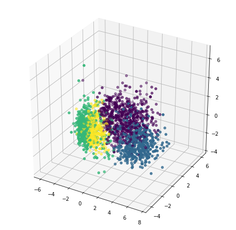
Great! It is now time to plot our clusters and see how they look in 3D.
x =pca_data["c1"]
y =pca_data["c2"]
z =pca_data["c3"]

fig = plt.figure(figsize=(8,8))
ax = plt.subplot(111, projection='3d')
ax.scatter(x, y, z, s=20, c=pca_data["Clusters"])
plt.show()
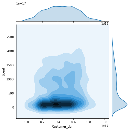
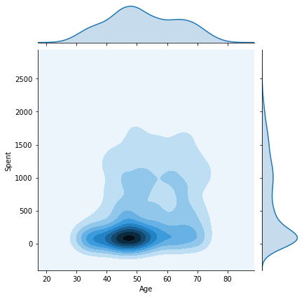
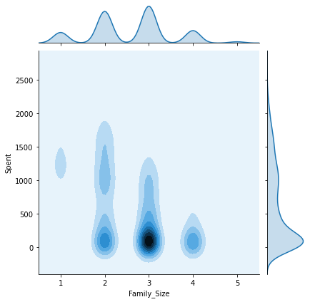
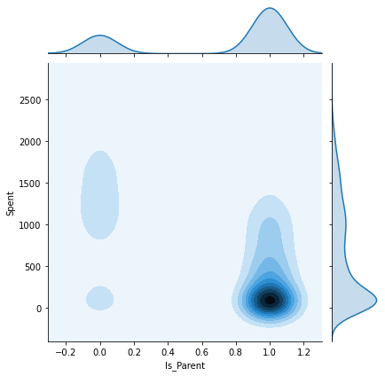
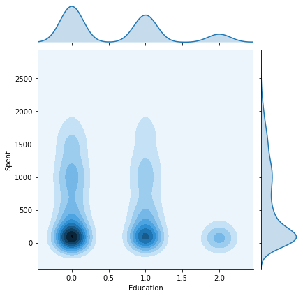
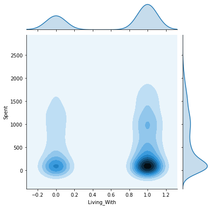
We will now plot the pairwise plots of the Spent attribute with the other attributes we created previously in this tutorial. This will give us an insight as to how the final results are affected by each attribute and what kind of customers belong to each cluster.
columns = [ "Customer_dur", "Age", "Family_Size", "Is_Parent", "Education","Living_With"]
h = data["Clusters"]
for col in columns:
    plt.figure()
    sns.jointplot(x=data[col], y=data["Spent"], hue=h, kind="kde")
    plt.show()
C:UsersShripriyaanaconda3libsite-packagesseaborndistributions.py:434: UserWarning: The following kwargs were not used by contour: 'hue'
cset = contour_func(xx, yy, z, n_levels, **kwargs)
<Figure size 432x288 with 0 Axes>
C:UsersShripriyaanaconda3libsite-packagesseaborndistributions.py:434: UserWarning: The following kwargs were not used by contour: 'hue'
  cset = contour_func(xx, yy, z, n_levels, **kwargs)


<Figure size 432x288 with 0 Axes>
C:UsersShripriyaanaconda3libsite-packagesseaborndistributions.py:434: UserWarning: The following kwargs were not used by contour: 'hue'
  cset = contour_func(xx, yy, z, n_levels, **kwargs)


<Figure size 432x288 with 0 Axes>
C:UsersShripriyaanaconda3libsite-packagesseaborndistributions.py:434: UserWarning: The following kwargs were not used by contour: 'hue'
  cset = contour_func(xx, yy, z, n_levels, **kwargs)


<Figure size 432x288 with 0 Axes>
C:UsersShripriyaanaconda3libsite-packagesseaborndistributions.py:434: UserWarning: The following kwargs were not used by contour: 'hue'
  cset = contour_func(xx, yy, z, n_levels, **kwargs)


<Figure size 432x288 with 0 Axes>
C:UsersShripriyaanaconda3libsite-packagesseaborndistributions.py:434: UserWarning: The following kwargs were not used by contour: 'hue'
  cset = contour_func(xx, yy, z, n_levels, **kwargs)


<Figure size 432x288 with 0 Axes>
10. Observation
Some key insights from the above joint plots:
- Cluster 0: Certainly a parent, 40-70 age group, family size of 2-4.
- Cluster 1: Not a parent, 30-80 age group, family size of 1-2.
- Cluster 2: The majority of customers are a parent, all age groups from 20-80, family size of 1-3.
- Cluster 3: Certainly a parent, 35-75 age group, family size of 2-5.
The Customer_dur attribute spans all across the clusters and is not specific to one, therefore we get a widely spread shaped.
Note: The seaborn library is not updated to its latest version on the system where the tutorial was executed and therefore, some features like contour did not behave as expected. However, if you have an updated environment, the above graphs will be much clearer with distinct lines and cluster labels.
11. Conclusion
In this tutorial, we explored customer profiles and see how it can affect a firm’s business. We also segmented the customers using Agglomerative Clustering. In the end, we identified some key features corresponding to each cluster. Finally, we introduced an alternative for storing large amounts of data in a highly efficient and scalable way – GridDB!
This code has been inspired from Kaggle
If you have any questions about the blog, please create a Stack Overflow post here https://stackoverflow.com/questions/ask?tags=griddb .
Make sure that you use the “griddb” tag so our engineers can quickly reply to your questions.

