Introduction
Data is a source of insights. To extract these insights, the data should be analyzed and understood. However, it is difficult to analyze numerical. The easiest way to extract insights from data is through data visualization.
Data visualization involves presenting data using charts and graphs. This way, it becomes easy for users to understand data, even non-technical users.
In this article, we will be discussing how to visualize data using GridDB and Streamlit. The data to be visualized shows the percentage of population fully and partly vaccinated against Covid-19 in 12 different countries.
Requirements
For this article, ensure that you have installed Streamlit, GridDB, and its Python client.
To install GridDB, visit its official documentation here and follow the installation steps.
To install Streamlit, you can use the Python’s pip package manager by running the following command:
pip3 install streamlit --userIngest
We should now load the data into the GridDB server. Although it is possible to read the data directly from the CSV file, we can take advantage of GridDB’s hybrid in-memory architecture to increase the speed of the application. We will also be able to load the necessary data into dataframes, boosting the performance of our queries.
First, let’s import the libraries to be used:
import pandas as pd
import griddb_python as griddb
Next, let’s initialize the GridDB container to be used:
factory = griddb.StoreFactory.get_instance()

# Initialize the GridDB container
try:
    gridstore = factory.get_store(host=host_name, port=your_port,
            cluster_name=cluster_name, username=your_username,
            password=your_password)

    info = griddb.ContainerInfo("Vaccination_Data",
                    [["country", griddb.Type.STRING],["fully-vaccinated",griddb.Type.FLOAT]], ["partly-vaccinated",griddb.Type.FLOAT]],
                    griddb.ContainerType.COLLECTION, True)
    cont = gridstore.put_container(info)
Ensure that you substitute the above credentials with the specifics of your GridDB installation.
The container will have three columns namely country, fully-vaccinated and partly-vaccinated.
The data has been stored in a CSV file named vaccination.csv. Let us load it into the GridDB container:
data = pd.read_csv("vaccination.csv")
    #Load data
    for x in range(len(data)):
        ret = cont.put(data.iloc[x, :])
    print("Data loaded successfully")

except griddb.GSException as ex:
    for x in range(e.get_error_stack_size()):
        print("[", x, "]")
        print(ex.get_error_code(x))
        print(ex.get_location(x))
        print(ex.get_message(x))
Retrieve the Data
Let us now retrieve the data from GridDB. We will write an SQL query for that:
sql_statement = ('SELECT * FROM Vaccination_Data')
output = pd.read_sql_query(sql_statement, cont)
The read_sql_query function of Pandas will convert the retrieved data into a dataframe object.
Create a Dashboard
Now that the data is ready, we can use it to create visualizations. First, let’s import the Streamlit library:
import streamlit as stWe can give the dashboard a title and a description. We will use st.title and st.write for these respectively:
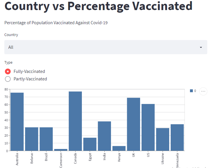
st.title('Country vs Percentage Vaccinated')

st.write('Percentage of Population Vaccinated Against Covid-19')
Next, let’s add a select box to the dashboard. The select box will provide a drop-down button that allows users to choose a counrty. We will use the st.selectbox() method to create it as shown below:
select = st.selectbox("Country", ["All", "Australia", "Belarus", "Brazil", "Cameroon", "Canada", "Egypt", "India", "Kenya", "Ukraine", "UK", "US", "Venezuela" ])We can also create radio buttons to help users to choose between fully and partly vaccinated:
radio = st.radio("Type", ["Fully-Vaccinated", "Partly-Vaccinated" ])Let us add functionality to the select box and the radio buttons:
if select != "ALL":
    sql_statement = sql_statement + " AND Country = '"+select+"'"

if radio != "ALL":
    sql_statement = sql_statement + " AND Type = '"+select+"'"
Let us generate a bar chart that shows the percentage of population vaccinated against Covid-19 in different countries. We can use the st.bar_chart() method for this as shown below:
st.bar_chart(data=output)Run the Project
To see the dashboard, you should run the project. Use the following command:
streamlit run myapp.pyOpen the generated URL on your web browser to view the dashboard. You can also play around with the select box and the radio buttons to see different results on the dashboard.