
Understanding consumer behavior is important because it assists marketers in understanding what motivates consumers to make purchases. Each consumer follows his or her own set of buying patterns. By recognizing, analyzing, and measuring buying patterns, businesses can gain a better understanding of their target audience and potentially expand their reach.
The repo for this blog can be found here: https://github.com/griddbnet/Blogs/tree/exploring_consumer_purchases
The objective of this blog is to analyze the buying behavior of Google Merchandise Store customers using the power of GridDB. The results of the analysis might lead to more actionable operational changes and better use of marketing budgets for those companies who choose to use data analysis on top of Google analytics data.
The outline of the tutorial is as follows:
- Dataset overview
- Importing required libraries
- Loading the dataset
- Data Cleaning and Preprocessing
- Analysing with data visualization
- Conclusion
Prerequisites and Environment setup
This tutorial is carried out in Anaconda Navigator (Python version – 3.8.3) on Windows Operating System. The following packages need to be installed before you continue with the tutorial –
-
Pandas
-
NumPy
-
plotly
-
Matplotlib
-
Seaborn
-
griddb_python
-
scipy
-
json
-
squarify
-
random
You can install these packages in Conda’s virtual environment using conda install package-name. In case you are using Python directly via terminal/command prompt, pip install package-name will do the work.
GridDB installation
While loading the dataset, this tutorial will cover two methods – Using GridDB as well as Using Pandas. To access GridDB using Python, the following packages also need to be installed beforehand:
- GridDB C-client
- SWIG (Simplified Wrapper and Interface Generator)
- GridDB Python Client
1. Dataset Overview
The dataset contains information about visits to GStore (Google swag online store), each row is a unique visit and each user has a unique ‘fullVisitorId’.
1) fullVisitorId– A unique identifier for each user of the Google Merchandise Store.
2) channelGrouping – The channel via which the user came to the Store.
3) date – The date on which the user visited the Store.
4) device – The specifications for the device used to access the Store.
5) geoNetwork – This section contains information about the geography of the user.
6) socialEngagementType – Engagement type, either “Socially Engaged” or “Not Socially Engaged”.
7) totals – This section contains aggregate values across the session.
8) trafficSource – This section contains information about the Traffic Source from which the session originated.
9) visitId – An identifier for this session. This is part of the value usually stored as the _utmb cookie. This is only unique to the user. For a completely unique ID, you should use a combination of fullVisitorId and visitId.
10) visitNumber – The session number for this user. If this is the first session, then this is set to 1.
11) visitStartTime – The timestamp (expressed as POSIX time).
12) hits – This row and nested fields are populated for any and all types of hits. Provides a record of all page visits.
13) customDimensions – This section contains any user-level or session-level custom dimensions that are set for a session. This is a repeated field and has an entry for each dimension that is set.
14) totals – This set of columns mostly includes high-level aggregate data.
https://www.kaggle.com/competitions/ga-customer-revenue-prediction/data?select=train.csv
2. Importing Required Libraries
import griddb_python as griddb

import gc
import numpy as np
import pandas as pd
from pandas.io.json import json_normalize
from scipy.stats import norm
import json
import datetime
import random

import squarify
import seaborn as sns
import matplotlib.pyplot as plt
from plotly.offline import init_notebook_mode, iplot
import plotly.graph_objs as go
from plotly import tools

import warnings
warnings.filterwarnings('ignore')
%matplotlib inline
3. Loading the Dataset
Let’s proceed and load the dataset into our notebook.
3.a Using GridDB
Toshiba GridDB™ is a highly scalable NoSQL database best suited for IoT and Big Data. The foundation of GridDB’s principles is based upon offering a versatile data store that is optimized for IoT, provides high scalability, tuned for high performance, and ensures high reliability.
To store large amounts of data, a CSV file can be cumbersome. GridDB serves as a perfect alternative as it in open-source and a highly scalable database. GridDB is a scalable, in-memory, No SQL database which makes it easier for you to store large amounts of data. If you are new to GridDB, a tutorial on reading and writing to GridDB can be useful.
Assuming that you have already set up your database, we will now write the SQL query in python to load our dataset.
factory = griddb.StoreFactory.get_instance()

Initialize the GridDB container (enter your database credentials)
try:
    gridstore = factory.get_store(host=host_name, port=your_port,
            cluster_name=cluster_name, username=admin,
            password=admin)

    info = griddb.ContainerInfo("customer_data",
                    [["channelGrouping", griddb.Type.STRING],["geoNetwork", griddb.Type.STRING],["device", griddb.Type.STRING],
                     ["date", griddb.Type.TIMESTAMP],["sessionId", griddb.Type.STRING],["socialEngagementType", griddb.Type.STRING],
                     ["totals", griddb.Type.STRING],["trafficSource", griddb.Type.STRING],["visitStartTime", griddb.Type.TIMESTAMP],
                     ["fullVisitorId", griddb.Type.INTEGER],["visitNumber", griddb.Type.INTEGER],["visitId", griddb.Type.INTEGER],
                    griddb.ContainerType.COLLECTION, True)
    cont = gridstore.put_container(info)
    data = pd.read_csv("False.csv")
    #Add data
    for i in range(len(data)):
        ret = cont.put(data.iloc[i, :])
        print("Data added successfully")
Data added successfully
The read_sql_query function offered by the pandas library converts the data fetched into a panda data frame to make it easy for the user to work.
sql_statement = ('SELECT * FROM customer_data.csv')
df = pd.read_sql_query(sql_statement, cont)
Note that the cont variable has the container information where our data is stored. Replace the credit_card_dataset with the name of your container. More info can be found in this tutorial reading and writing to GridDB.
When it comes to IoT and Big Data use cases, GridDB clearly stands out among other databases in the Relational and NoSQL space. Overall, GridDB offers multiple reliability features for mission-critical applications that require high availability and data retention.
3.b Using pandas read_csv
We can also use Pandas’ read_csv function to load our data. Both of the above methods will lead to the same output as the data is loaded in the form of a pandas dataframe using either of the methods.
df = pd.read_csv("customer_data.csv")df.head()| channelGrouping | date | device | fullVisitorId | geoNetwork | sessionId | socialEngagementType | totals | trafficSource | visitId | visitNumber | visitStartTime | |
|---|---|---|---|---|---|---|---|---|---|---|---|---|
| 0 | Organic Search | 20160902 | {“browser”: “Chrome”, “browserVersion”: “not a… | 1131660440785968503 | {“continent”: “Asia”, “subContinent”: “Western… | 1131660440785968503_1472830385 | Not Socially Engaged | {“visits”: “1”, “hits”: “1”, “pageviews”: “1”,… | {“campaign”: “(not set)”, “source”: “google”, … | 1472830385 | 1 | 1472830385 |
| 1 | Organic Search | 20160902 | {“browser”: “Firefox”, “browserVersion”: “not … | 377306020877927890 | {“continent”: “Oceania”, “subContinent”: “Aust… | 377306020877927890_1472880147 | Not Socially Engaged | {“visits”: “1”, “hits”: “1”, “pageviews”: “1”,… | {“campaign”: “(not set)”, “source”: “google”, … | 1472880147 | 1 | 1472880147 |
| 2 | Organic Search | 20160902 | {“browser”: “Chrome”, “browserVersion”: “not a… | 3895546263509774583 | {“continent”: “Europe”, “subContinent”: “South… | 3895546263509774583_1472865386 | Not Socially Engaged | {“visits”: “1”, “hits”: “1”, “pageviews”: “1”,… | {“campaign”: “(not set)”, “source”: “google”, … | 1472865386 | 1 | 1472865386 |
| 3 | Organic Search | 20160902 | {“browser”: “UC Browser”, “browserVersion”: “n… | 4763447161404445595 | {“continent”: “Asia”, “subContinent”: “Southea… | 4763447161404445595_1472881213 | Not Socially Engaged | {“visits”: “1”, “hits”: “1”, “pageviews”: “1”,… | {“campaign”: “(not set)”, “source”: “google”, … | 1472881213 | 1 | 1472881213 |
| 4 | Organic Search | 20160902 | {“browser”: “Chrome”, “browserVersion”: “not a… | 27294437909732085 | {“continent”: “Europe”, “subContinent”: “North… | 27294437909732085_1472822600 | Not Socially Engaged | {“visits”: “1”, “hits”: “1”, “pageviews”: “1”,… | {“campaign”: “(not set)”, “source”: “google”, … | 1472822600 | 2 | 1472822600 |
4. Data Cleaning and Preprocessing
There are 12 original columns, but four of them have a json object that can be converted:
device: 16 new columns, geoNetwork: 11 new columns, totals: 6 new columns, trafficSource: 14 new columns
def load_df(nrows=None):

    Columns = ['device', 'geoNetwork', 'totals', 'trafficSource']
    df = pd.read_csv('customer_data.csv',
                     converters={column: json.loads for column in Columns},
                     dtype={'fullVisitorId': 'str'}, nrows=nrows)

    for column in Columns:
        column_as_df = json_normalize(df[column])
        column_as_df.columns = [f"{column}_{subcolumn}" for subcolumn in column_as_df.columns]
        df = df.drop(column, axis=1).merge(column_as_df, right_index=True, left_index=True)
    return df
Combining the two datasets into one and adding the columns text and title into one column.
df = load_df()
df.head()| channelGrouping | date | fullVisitorId | sessionId | socialEngagementType | visitId | visitNumber | visitStartTime | device_browser | device_browserVersion | … | trafficSource_adwordsClickInfo.criteriaParameters | trafficSource_isTrueDirect | trafficSource_referralPath | trafficSource_adwordsClickInfo.page | trafficSource_adwordsClickInfo.slot | trafficSource_adwordsClickInfo.gclId | trafficSource_adwordsClickInfo.adNetworkType | trafficSource_adwordsClickInfo.isVideoAd | trafficSource_adContent | trafficSource_campaignCode | |
|---|---|---|---|---|---|---|---|---|---|---|---|---|---|---|---|---|---|---|---|---|---|
| 0 | Organic Search | 20160902 | 1131660440785968503 | 1131660440785968503_1472830385 | Not Socially Engaged | 1472830385 | 1 | 1472830385 | Chrome | not available in demo dataset | … | not available in demo dataset | NaN | NaN | NaN | NaN | NaN | NaN | NaN | NaN | NaN |
| 1 | Organic Search | 20160902 | 377306020877927890 | 377306020877927890_1472880147 | Not Socially Engaged | 1472880147 | 1 | 1472880147 | Firefox | not available in demo dataset | … | not available in demo dataset | NaN | NaN | NaN | NaN | NaN | NaN | NaN | NaN | NaN |
| 2 | Organic Search | 20160902 | 3895546263509774583 | 3895546263509774583_1472865386 | Not Socially Engaged | 1472865386 | 1 | 1472865386 | Chrome | not available in demo dataset | … | not available in demo dataset | NaN | NaN | NaN | NaN | NaN | NaN | NaN | NaN | NaN |
| 3 | Organic Search | 20160902 | 4763447161404445595 | 4763447161404445595_1472881213 | Not Socially Engaged | 1472881213 | 1 | 1472881213 | UC Browser | not available in demo dataset | … | not available in demo dataset | NaN | NaN | NaN | NaN | NaN | NaN | NaN | NaN | NaN |
| 4 | Organic Search | 20160902 | 27294437909732085 | 27294437909732085_1472822600 | Not Socially Engaged | 1472822600 | 2 | 1472822600 | Chrome | not available in demo dataset | … | not available in demo dataset | True | NaN | NaN | NaN | NaN | NaN | NaN | NaN | NaN |
5 rows × 55 columns
# converting date column into a proper format
def convert_to_datetime(frame):
    frame['date'] = frame['date'].astype(str)
    frame['date'] = frame['date'].apply(lambda x : x[:4] + "-" + x[4:6] + "-" + x[6:])
    frame['date'] = pd.to_datetime(frame['date'])
    return frame

df = convert_to_datetime(df)
#converting totals_transactionRevenue into int64 datatype and filling missing values as 0
df['totals_transactionRevenue'] = df['totals_transactionRevenue'].fillna(0).astype('int64')5. Analysing with data visualization
To Analyse data we will code different plot using all the existing attributes using multiple libraries like plotly, matplotlib and seaborn.
#Analysing missing data
def missing_plot(frame, set_name, palette):
    nan_ratio = frame.isna().sum()/len(frame)
    nan_ratio = nan_ratio.to_frame().reset_index().rename({'index': 'column', 0: 'Percentage'},axis=1)
    nan_ratio.sort_values(by=['Percentage'], ascending=False, inplace=True)
    plt.figure(figsize=(8,6))
    plt.title("% Columns Missing Values")
    ax = sns.barplot(x='Percentage', y='column', orient='h',
                     data=nan_ratio[nan_ratio['Percentage'] > 0],
                     palette= palette)

missing_plot(df, 'df', 'Greens_d')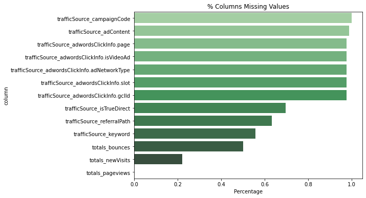
Most missing values are in trafficSource.
# This plot shows the number of visits for each channel
def barplot_percentage(count_feat, color1= 'rgb(55, 83, 109)',
                       color2= 'rgb(26, 118, 255)',num_bars= None):

    df_channel = 100*df[count_feat].value_counts()/len(df)
    df_channel = df_channel.to_frame().reset_index()
    if num_bars:
        df_channel = df_channel.head(num_bars)

    trace0 = go.Bar(
        x=df_channel['index'],
        y=df_channel[count_feat],
        name='df set',
        marker=dict(color=color1)
    )


    layout = go.Layout(
        title='{} grouping'.format(count_feat),
        xaxis=dict(
            tickfont=dict(size=14, color='rgb(107, 107, 107)')
        ),
        yaxis=dict(
            title='Percentage of visits',
            titlefont=dict(size=16, color='rgb(107, 107, 107)'),
            tickfont=dict(size=14, color='rgb(107, 107, 107)')
        ),
        legend=dict(
            x=1.0,
            y=1.0,
            bgcolor='rgba(255, 255, 255, 0)',
            bordercolor='rgba(255, 255, 255, 0)'
        ),
        barmode='group',
        bargap=0.15,
        bargroupgap=0.1
    )

    fig = go.Figure(data=[trace0], layout=layout)
    iplot(fig)
barplot_percentage('channelGrouping')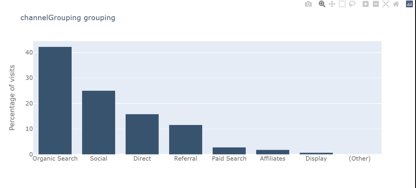
# Now we will analyse the time series data
tmp_df = df['date'].value_counts().to_frame().reset_index().sort_values('index')
tmp_df = tmp_df.rename(columns = {"date" : "visits"}).rename(columns = {"index" : "date"})
# Plot visits
trace1 = go.Scatter(x=tmp_df.date.astype(str), y=tmp_df.visits,
opacity = 0.8, line = dict(color = '#ff751a'), name= 'df')
traces = [trace1]
layout = dict(
title= "Visits by date",
xaxis=dict(
rangeselector=dict(
buttons=list([
dict(count=1, label='1m', step='month', stepmode='backward'),
dict(count=3, label='3m', step='month', stepmode='backward'),
dict(count=6, label='6m', step='month', stepmode='backward'),
dict(step='all')
])
),
rangeslider=dict(visible = True),
type='date'
)
)
fig = dict(data= traces, layout=layout)
iplot(fig)
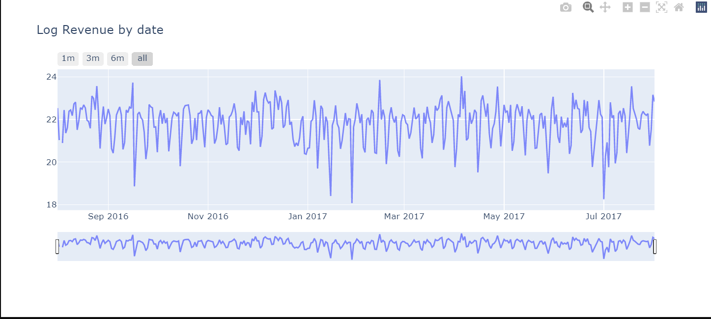
# Revenue by time
df_date_sum = df.groupby('date')['totals_transactionRevenue'].sum().to_frame().reset_index()
# Plot
trace_date = go.Scatter(x=df_date_sum.date.astype(str),
y=df_date_sum['totals_transactionRevenue'].apply(lambda x: np.log(x)), opacity = 0.8)
layout = dict(
title= "Log Revenue by date",
xaxis=dict(
rangeselector=dict(
buttons=list([
dict(count=1, label='1m', step='month', stepmode='backward'),
dict(count=3, label='3m', step='month', stepmode='backward'),
dict(count=6, label='6m', step='month', stepmode='backward'),
dict(step='all')
])
),
rangeslider=dict(visible = True),
type='date'
)
)
fig = dict(data= [trace_date], layout=layout)
iplot(fig)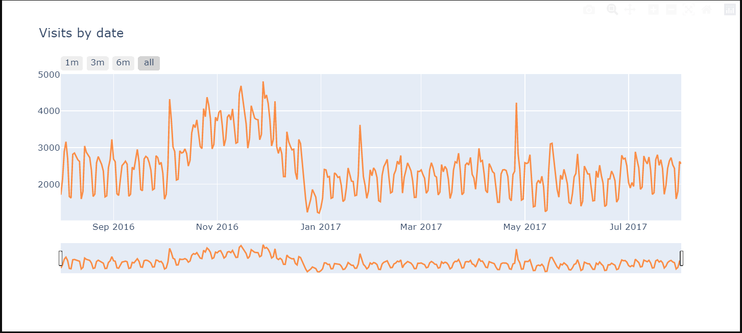
Analysing Revenue
# Flag visits with revenue
df['has_revenue'] = df['totals_transactionRevenue'].apply(lambda x: 1 if x > 0 else 0)
channel_order = ['Referral', 'Display', 'Paid Search', 'Direct', 'Organic Search', '(Other)', 'Social', 'Affiliates']
plt.figure(figsize=(10,4))
plt.title("% visits with revenue / channel")
sns.barplot(x='channelGrouping', y='has_revenue', data=df, order=channel_order, palette='Greens_d')
revenue_channel = df.groupby('channelGrouping')['totals_transactionRevenue'].sum()
revenue_channel = revenue_channel.to_frame().reset_index()
plt.figure(figsize=(10,4))
plt.title("Mean revenue / channel")
ax = sns.barplot(x='channelGrouping', y='totals_transactionRevenue', data=revenue_channel, order=channel_order, palette='Greens_d')[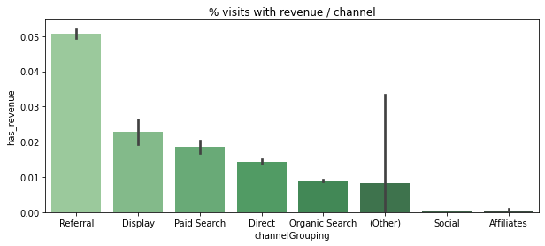

df['revenue_status']=df.totals_transactionRevenue.apply(lambda x: 0 if x==0 else 1)
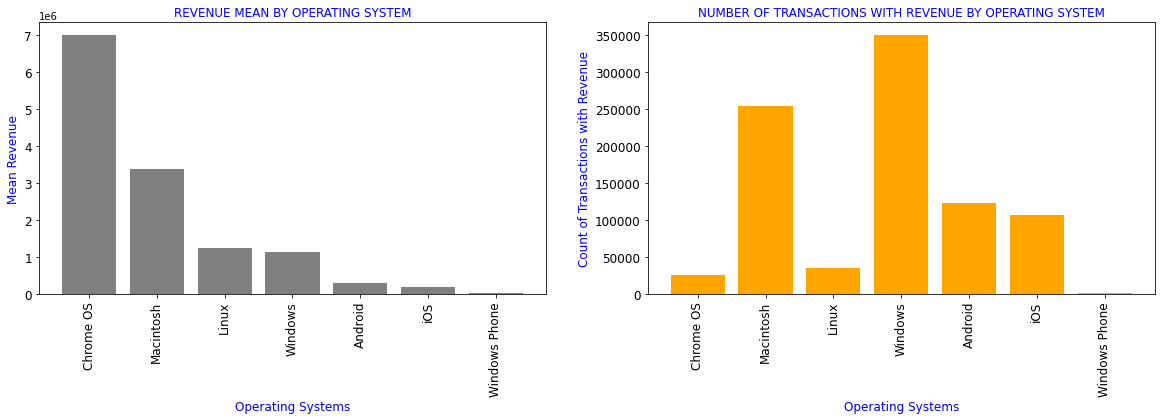
#Revenue generated by different Operating systems
df_OS=df[['device_operatingSystem','totals_transactionRevenue','revenue_status']].groupby(df.device_operatingSystem).aggregate({'totals_transactionRevenue':['mean'],
'revenue_status':['count']}).reset_index()
df_OS.columns=['device_operatingSystem','totals_transactionRevenue_mean','revenue_status_count']
df1=df_OS.sort_values(by='totals_transactionRevenue_mean',ascending=False)[df_OS.totals_transactionRevenue_mean>0]
display(df1.style.format(formatter))
plt.subplots(figsize=(20,5))
plt.subplot(1,2,1)
plt.title('REVENUE MEAN BY OPERATING SYSTEM',color='b',fontsize=12)
plt.xlabel('Operating Systems',color='b',fontsize=12)
plt.ylabel('Mean Revenue',color='b',fontsize=12)
plt.bar(range(len(df1)),df1.totals_transactionRevenue_mean,color='grey')
plt.xticks(range(len(df1)),df1.device_operatingSystem,rotation=90,fontsize=12)
plt.yticks(fontsize=12)
plt.subplot(1,2,2)
plt.title('NUMBER OF TRANSACTIONS WITH REVENUE BY OPERATING SYSTEM',color='b',fontsize=12)
plt.xlabel('Operating Systems',color='b',fontsize=12)
plt.ylabel('Count of Transactions with Revenue',color='b',fontsize=12)
plt.bar(range(len(df1)),df1.revenue_status_count,color='orange')
plt.yticks(fontsize=12)
plt.xticks(range(len(df1)),df1.device_operatingSystem,rotation=90,fontsize=12)
plt.show()
| device_operatingSystem | totals_transactionRevenue_mean | revenue_status_count | |
|---|---|---|---|
| 3 | Chrome OS | 6984005.39 | 26337 |
| 7 | Macintosh | 3372381.41 | 253938 |
| 6 | Linux | 1253365.30 | 35034 |
| 16 | Windows | 1134945.73 | 350072 |
| 1 | Android | 293330.32 | 123892 |
| 19 | iOS | 205887.71 | 107665 |
| 17 | Windows Phone | 21710.53 | 1216 |
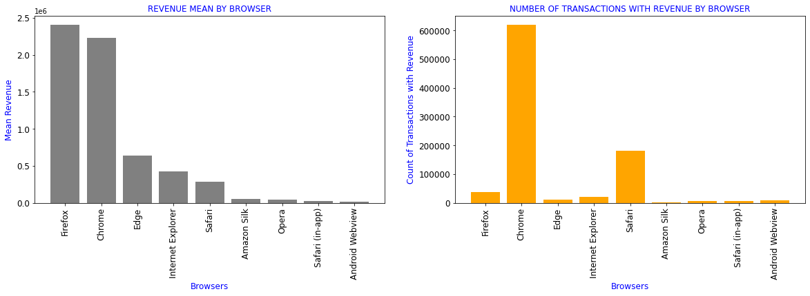
Revenue generated by different Browsers
df_browser=df[['device_browser','totals_transactionRevenue','revenue_status']].groupby(df.device_browser).aggregate({'totals_transactionRevenue':['mean'],
                                                                                                              'revenue_status':['count']}).reset_index()
df_browser.columns=['device_browser','totals_transactionRevenue_mean','revenue_status_count']
df1=df_browser.sort_values(by='totals_transactionRevenue_mean',ascending=False)[df_browser.totals_transactionRevenue_mean>0]
formatter = {'totals_transactionRevenue_mean':'{:4.2f}'}
display(df1.style.format(formatter))

plt.subplots(figsize=(20,5))
plt.subplot(1,2,1)
plt.title('REVENUE MEAN BY BROWSER',color='b',fontsize=12)
plt.xlabel('Browsers',color='b',fontsize=12)
plt.ylabel('Mean Revenue',color='b',fontsize=12)
plt.bar(range(len(df1)),df1.totals_transactionRevenue_mean,color='grey')
plt.xticks(range(len(df1)),df1.device_browser,rotation=90,fontsize=12)
plt.yticks(fontsize=12)


plt.subplot(1,2,2)
plt.title('NUMBER OF TRANSACTIONS WITH REVENUE BY BROWSER',color='b',fontsize=12)
plt.xlabel('Browsers',color='b',fontsize=12)
plt.ylabel('Count of Transactions with Revenue',color='b',fontsize=12)
plt.bar(range(len(df1)),df1.revenue_status_count,color='orange')
plt.xticks(range(len(df1)),df1.device_browser,rotation=90,fontsize=12)
plt.yticks(fontsize=12)
plt.show()
| device_browser | totals_transactionRevenue_mean | revenue_status_count | |
|---|---|---|---|
| 16 | Firefox | 2409461.27 | 37069 |
| 11 | Chrome | 2229505.52 | 620364 |
| 15 | Edge | 635273.89 | 10205 |
| 20 | Internet Explorer | 426092.90 | 19375 |
| 40 | Safari | 287511.21 | 182245 |
| 3 | Amazon Silk | 53458.11 | 561 |
| 36 | Opera | 38162.33 | 5643 |
| 41 | Safari (in-app) | 22448.18 | 6850 |
| 6 | Android Webview | 14602.67 | 7865 |
Analysing multiple attributes as per different location
def plotmap(frame, z_var, countries_col, title, colorscale, rcolor=True):
data = [ dict(
type = 'choropleth',
autocolorscale = False,
colorscale = colorscale,
showscale = True,
reversescale = rcolor,
locations = frame[countries_col],
z = frame[z_var],
locationmode = 'country names',
text = frame[countries_col],
marker = dict(line = dict(color = '#fff', width = 2))
)
]
layout = dict(
height=680,
#width=1200,
title = title,
geo = dict(
showframe = False,
showcoastlines = False,
projection = dict(type = 'mercator'),
),
)
fig = dict(data=data, layout=layout)
iplot(fig)
colorscale = [[0, 'rgb(102,194,165)'], [0.005, 'rgb(102,194,165)'],
[0.01, 'rgb(171,221,164)'], [0.02, 'rgb(230,245,152)'],
[0.04, 'rgb(255,255,191)'], [0.05, 'rgb(254,224,139)'],
[0.10, 'rgb(253,174,97)'], [0.25, 'rgb(213,62,79)'], [1.0, 'rgb(158,1,66)']]
# Plot world map - total visits
tmp = df["geoNetwork_country"].value_counts().to_frame().reset_index()
plotmap(tmp, 'geoNetwork_country', 'index', 'Total visits by Country', colorscale, False)
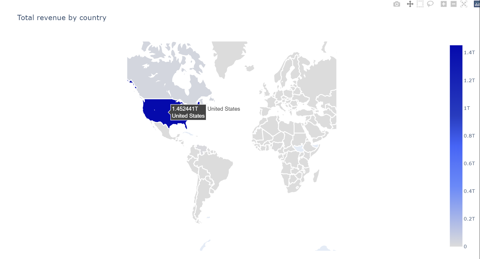
colorscale = [[0,"rgb(5, 10, 172)"],[0.35,"rgb(40, 60, 190)"],[0.5,"rgb(70, 100, 245)"],\
[0.6,"rgb(90, 120, 245)"],[0.7,"rgb(106, 137, 247)"],[1,"rgb(220, 220, 220)"]]
# Plot world map - total revenue
tmp = df.groupby("geoNetwork_country").agg({"totals_transactionRevenue" : "sum"}).reset_index()
plotmap(tmp, 'totals_transactionRevenue','geoNetwork_country', 'Total revenue by country', colorscale)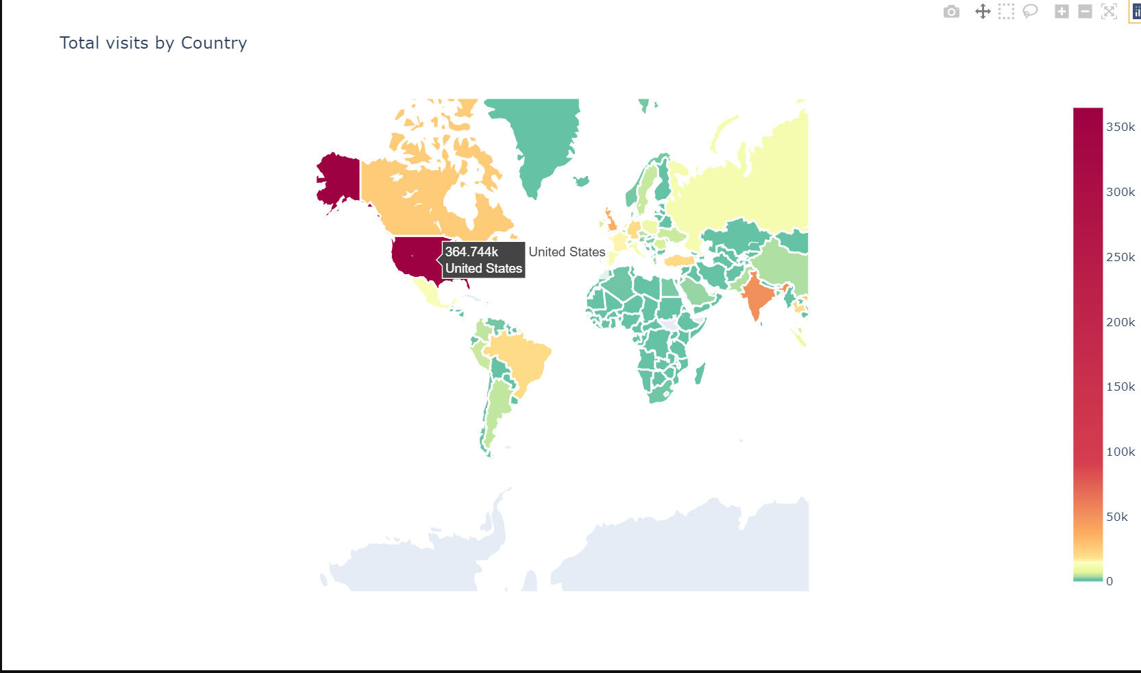
# Using squarify to plot an interesting distribution
df.loc[df["geoNetwork_city"] == "not available in demo dataset", 'geoNetwork_city'] = np.nan
number_of_colors = 20
color = ["#"+''.join([random.choice('0123456789ABCDEF') for j in range(6)])
             for i in range(number_of_colors)]

city_tree = df["geoNetwork_city"].value_counts() #counting

print("Description most frequent Citys: " )
print(city_tree[:15])

city_tree = round((city_tree[:30] / len(df['geoNetwork_city']) * 100),2)

plt.figure(figsize=(14,5))
g = squarify.plot(sizes=city_tree.values, label=city_tree.index,
                  value=city_tree.values,
                  alpha=.4, color=color)
g.set_title("'TOP 30 Citys - % size of total",fontsize=20)
g.set_axis_off()
plt.show()
Description most frequent Cities:
Mountain View 40884
(not set) 34262
New York 26371
San Francisco 20329
Sunnyvale 13086
London 12607
San Jose 10295
Los Angeles 8670
Bangkok 7709
Chicago 7444
Ho Chi Minh City 7342
Istanbul 6330
Bengaluru 5468
Toronto 5223
Hanoi 5032
Name: geoNetwork_city, dtype: int64
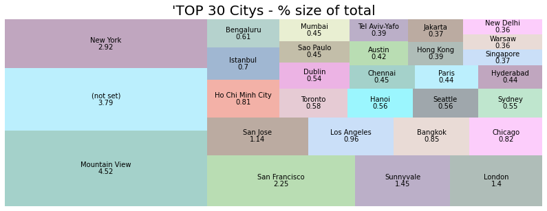
Nicely distributed clients that accessed the store. The top 5 cities are:
Mountain View, New York, San Francisco, Sunnyvale, London `\
barplot_percentage('geoNetwork_networkDomain', num_bars= 10,
                   color1='rgb(38, 115, 77)', color2='rgb(102, 204, 153)')
Let’s analyse the Device Category
plt.figure(figsize=(14,5))

plt.subplot(1,2,1)
sns.countplot(df["device_deviceCategory"], palette="hls")
plt.title("Device Category Count", fontsize=10)
plt.xlabel("Category", fontsize=12)
plt.ylabel("Count", fontsize=12)
plt.xticks(fontsize=10)

plt.subplot(1,2,2)
sns.boxenplot(x="device_deviceCategory", y = 'totals_transactionRevenue',
              data=df[df['totals_transactionRevenue'] > 0], palette="hls")
plt.title("Device Category Revenue Distribuition", fontsize=10)
plt.xlabel("Category", fontsize=12)
plt.ylabel("Revenue(Log)", fontsize=12)
plt.xticks(fontsize=10)

plt.subplots_adjust(hspace = 0.9, wspace = 0.5)

plt.show() 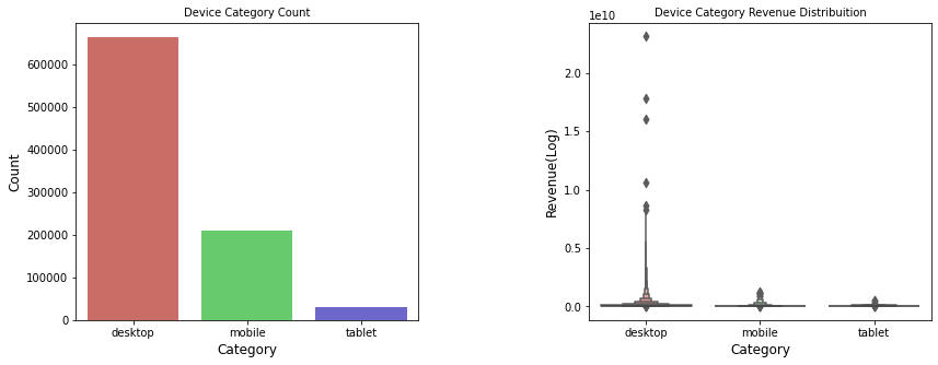
desktop represents 73.5%, mobile represents 23.12%, and tablet represents 3.38%
6. Conclusion
In this tutorial we analysed and explored customer purchasing data using Python and GridDB. We examined two ways to import our data, using (1) GridDB and (2) Pandas. For large datasets, GridDB provides an excellent alternative to import data in your notebook as it is open-source and highly scalable.
If you have any questions about the blog, please create a Stack Overflow post here https://stackoverflow.com/questions/ask?tags=griddb .
Make sure that you use the “griddb” tag so our engineers can quickly reply to your questions.